It’s been a long time since I’ve visualized text on paths.
What concerns for CEOs are increasing?
Recently at Washington Post, the team of data journalists Alyssa Fowers, Federica Cocco, Aaron Gregg and Leslie Shapiro created a great text analysis and corresponding text visualizations of quarterly earnings calls (thanks JS for bringing this to my attention). In these calls, CEOs talk about their financial results in the last quarter and related business concerns.
The crux of the analysis is identifying changes in keyword usage quarter over quarter: words that are used more are becoming a greater concern, words that are used less are of decreasing concern. The visualization innovation is not to simply plot those isolated words, but in the context of the phrase they were spoken in; with keyword slope indicating the change. And it creates these awesome little sloping “keyword in context” visualizations, such as this:
The little trendline chart can be dispensed with, and longer phrases depicted, such as this one:
The individual sloped words – discipline and strength – are both words becoming a greater concern to CEOs. The extra context tells us that (financial) discipline was used to create (financial) strength (and that this was urgent). Nice.
What other text on paths?
I’ve previously written about text on paths, such as microtext line charts and parallel coordinate charts in the book Visualizing with Text and this blog (e.g. post). So, it’s great to see Washington Post experimenting with text on paths.
It got me asking about other ways text on a path might be used in visualizations?
When working with phrases and sentences, you essentially have a line of text. Which is great for visualizations that use lines. But many visualization algorithms prefer circular or squarish proportions (e.g. beeswarm plots, force-directed graphs, Dorling cartograms, circle packing, bubble plots, treemaps, unit visualizations). Here’s a beeswarm plot indicating popular quotations over time, bubble size indicates the length of the quotation, and color for category:
Circles are central to beeswarm plots. How to use text? In all the blog posts prior to this and in the book I’ve typically squished the text into these shapes using word wrapping (e.g. beeswarms in Wordsplot). Word wrapping keeps text horizontal which can help reading, but lots of word wraps don’t help reading.
Instead, the perimeter of a circle is a path that text could be placed on. Furthermore, lots of logos use text placed around circles–here’s a few of them:
So, why not turn bubbles into rings of text (interactive).
Rings of popular quotations, and their authors, over time.
Here’s a closeup:
Closeup of some popular quotations.
An interesting artifact of text rings is that circle size is proportional to the length of the quotation. Most quotations are short (presumably making them more memorable). These can be extremely short, e.g. four words for Jean-Paul Sartre’s “Hell is other people,” or MLK Jr.’s “I have a dream.” Laurel Thatcher Ulrich’s is six wonderful words with an unexpected ending: “Well behaved women seldom make history”, which is interesting to compare to Gandhi is more wordy, but still only 10 words for “Be the change you wish to see in the world.” Interestingly, Gandhi and Thatcher Ulrich’s circles are similarly sized: Gandhi’s is 10 syllables, Thatcher Ulrich is also 10 syllables.
There’s a lot more that could be done. There’s an unused center which is either nice whitespace or opportunity for other data, for example, picturesof the speaker in the center; or context regarding the quote. The origin of Thatcher Ulrich’s quote might not be what you think.
So what?
Text on slopes, lines, or rings. There are lots of possibilities.
This is just a quick sketch — it’s now getting easier to explore ideas like this in code via LLM. In this case, the time to write and iterate on prompts was shorter than the time to write the blog post:-) There was a bit of iteration to get the quotation and author to fit in the same circle, and then a couple rabbit holes, such as, little test to see if Claude could do an x-axis to chop out a big, mostly empty, gap in time (50AD – 1500 AD); and then augment the visualization with the happy bee (previously). Either I’m getting more comfortable designing visualizations with LLMs or the LLMs are getting even better at writing visualization code. Likely both.
TLDR? Use this link for a visualization of the 800 movies in the National Film Registry. Any movie with the movie emoji 🎥will link directly to that movie (or clip) on Internet Archive or Library of Congress. Find classic movies, see similar films, click to watch or read about them. You’ll get a visualization that looks like this, you may need to use browser-zoom and/or scrolling if your screen is small:
Longer answer:
I’ve been fiddling with the dataset of movies in the National Film Registry (from the Library of Congress) for a while, including using LLMs throughout the entire process. The first step was simply to scrape the data and process it into a form that I could use (using an LLM to write a script to scrape and process the data). In addition to the movie title and year, each movie includes a description: e.g.
“Seventh Heaven” (also referred to as “7th Heaven”), directed by Frank Borzage and based on the play by Austin Strong, tells the story of Chico (Charles Farrell), the Parisian sewer worker-turned-street cleaner, and his wife Diane (Janet Gaynor), who are separated during World War I, yet whose love manages to keep them connected. “Seventh Heaven” was initially released as a silent film but proved so popular with audiences that it was re-released with a synchronized soundtrack later that same year. The popularity of the film resulted in it becoming one of the most commercially successful silent films as well as one of the first films to be nominated for a Best Picture Academy Award. Janet Gaynor, Frank Borzage, and Benjamin Glazer won Oscars for their work on the film, specifically awards for Best Actress, Best Directing (Dramatic Picture), and Best Writing (Adaptation), respectively. “Seventh Heaven” also marked the first time often-paired stars Janet Gaynor and Charles Farrell worked together.
Themes by decades: a dead-end
It’s an interesting dataset with all this qualitative data (paragraph per movie). But how to depict all those movies? The immediate response is to slot all those movies into standard movie categories: horror, drama, action, comedy, scifi, adult, children, etc., … but that just uses standard conventions. I wanted something a bit more nuanced, perhaps using the qualitative data.
To do a quick viz to get a sense of the data, I plotted it as a timeseries based on release date, with length of commentary on the y-axis, little stars based on title length, and color by year (using an LLM to write the code):
Films over time in the National Film Registry.
It’s pretty standard viz and not very interesting. But the axis has tick marks per decade: perhaps a decade-based analysis? An LLM could process the paragraphs into themes per decade—that might provide a zeitgeist of various decades as reflected in film: decades of angst, decades of hope, etc. After prompting an LLM to create themes with descriptions, then align those with the visualization, plus add some interaction linking movies to themes and vice versa, and some color coding, here’s the result:
Films by decade (left) with top three themes per decade aligned (right).
The visualization nicely aligns the themes (table on right side) with the movie dots (scatterplot on left side), with a shared axis of decades (thanks LLM). But the themes are under-whelming: e.g. Silent Comedy Era, City Life & Progress, Blaxploitation & Black Cinema. There is an interactive linkage between the two: click on theme (right), highlights and labels corresponding movies (left); then point at a movie for the paragraph. In the snapshot above, the theme “SciFi” in 1980’s has been clicked, highlighting movies such as E.T., Bladerunner, Back to the Future, and Star Trek has a tooltip. If the goal of this design is to understand a theme in it’s context, there is no way to see the contextual movies in a decade without tedious mouse-over across each movie. And the screen is already full of text, so it becomes difficult to fit more contextual text in. Design-wise, this is a fail.
Team LLM: designer, data processor, viz maker, code explainer
I decided to go all in with an LLM-centric approach, using several simultaneous LLMs: 1) Design assistant LLM, to ideate on design ideas, 2) Data processor LLM, to fetch and enrich data, 3) Visualization code generator LLM, to build and refine the overall visualization, 4) Code explainer LLM, to help me understand and enhance bits of code.
The design assistant LLM was instructed to suggest visualizations for movie data. Those suggestions needed to use the descriptions per movie, and furthermore was not allowed to suggest visualizations that used standard movie categorization. It suggested many possibilities: scatterplot (narrative structure vs observational to expressive, with time animation), timeline with bands (similar to what I’d just done), ternary plot with time slider, heatmap timeline of emotional tone over decades, semantic embedding e.g. t-sne or UMAP, parallel coordinates, semantic embedding with decade contours.
Even though I explicitly asked it to use text-centric representations, the LLM pushed back, following it’s training material (i.e. current visualization texts recommend against too much text). So I pushed back, and decided that movie titles would be good to incorporate: many people will recognize a movie by it’s title, and the title will automatically trigger memories. By exposing the titles, the visualization should be more engaging.
One common thread (bias) across all suggestions from the LLM is to extract quantitative values from the text. Semantic embedding seemed interesting: a semantic embedding takes text, such as paragraphs, and converts those into a many dimensional vector. Then, those vectors can be processed so that things that are near each other in the high-dimensional space will be near each other in a plot; and things far away from each other in the high-dimensional space are far away in the plot. The LLM data processor wrote a script to process paragraph descriptions into document vectors, and the visualization generator LLM created a UMAP visualization of the result, including movie titles as marks instead of dots, and a graticule to indicate how the UMAP projection compressed and stretched space in computing the projection (i.e. a stretchy grid behind the dots). Here’s the underwhelming result:
800 movie titles, clustered largely into a single blob.
Essentially, there appears to be one cluster, and a bunch of outliers. Projection visualizations are finicky to various parameters, so I had the explainer LLM outline the parameters and fiddled much. But at best I only achieved two distinct clusters. This might be due to a lot of common words about how movies are discussed within a single paragraph, and might need much better text processing to differentiate between the descriptions.
Looking back over the other visualization suggestions, I noted that the designer LLM had suggested a wide variety of metrics across the different visualization suggestions. Instead of clustering based on words, other movie attributes could be used. Working together the designer LLM we came up with 20 attributes, such as:
Narrative_Abstraction: ranging from a simple linear narrative, an episodic narrative (e.g. flashbacks), or abstract narrative (e.g. stream of consciousness).
Fictionality: ranging from a direct recording of the realworld, to staged recording intended to be like the realworld, to a recording entirely unlike the realworld.
Comic emphasis: ranging from none, to light, to slapstick.
Etc.
Then, we need to get values for each of those, for all the movies. We could derive those values from the paragraph of text. Or, since the LLM is trained on the entire Internet, ask the LLM to use all of its training knowledge to generate meaningful values for each attribute for each movie. Using the latter approach, the data processor LLM (Gemini) generated 20 attributes x 800 movies in half an hour (i.e. 16,000 values). A quick spot check on these suggested they seemed appropriate, but a thorough analysis was not done. Then, these new vectors are used with the same UMAP visualization. A slightly better layout of the movie results (with a number of tooltips displayed):
Now there are at least five distinct clusters. There are actually more clusters but there’s a fundamental design problem making it difficult to see them. The clustering layout code is pulling similar items close together. But the text collision code is pushing items too close together apart so the text doesn’t overlap. As a result adjacent clusters end up blending together and similar clusters aren’t distinct. Fiddling with parameters is insufficient.
Something different is needed.
High dimensional projections squish high-dimensional data down to two dimensions. The distance between points on the 2D plane is not uniform. In one part of the plot, two adjacent points may be extremely close in their original vector space, in another part of the plot, two adjacent points may be far apart. Locally, points can be compared, but observations related to distance between points in one part of the vis are not relevant in another region of plot. The UMAP layout is too focused on the placement of individual points for our needs.
Thus, why not throw away the projection of individual points? Instead, cluster the individual movies directly; depict each cluster in a way that is distinct, compact, and with each title readable; and, keep adjacent clusters near each other. (I did something similar in Chapter 10 of Visualizing with Text, but displayed only top keywords in each cluster, not hundreds of movie titles and thousands of words).
The design LLM suggests a data science clustering program to prepare the data (i.e. leveraging Python libraries for clustering), and a separate visualization program (using D3 and HTML for interactive visualization). Hence the data processing LLM creates a clustering program; and the visualization LLM creates a boxes with text plus graph-layout viz. Here’s the result after a few iterations:
Early iteration of clusters as boxes of films, related boxes adjacent to each other.
Iterations are required to tweak many things, e.g. don’t allow clusters that have 80% of the dataset, fill in data for movies that are missing vectors, add descriptions for each cluster (i.e. identify which attributes are most different for each cluster compared to the rest of the data), enhance data with valid urls from other sources when there is no movie or essay available to click through in the original dataset, adjust color scales, multiple columns per cluster to make them more square, adjust collision bias, add a color legend, add a cluster legend, darken colors, add halos to make text more legible, and so on.
One interesting iteration was to work with the designer LLM to create better human-readable labels for the attributes. The initial names of the attributes included RealityIndexicality, WorldDistance, and Scale. Which is fine for behind-the-scenes data science, but not for a user interface. For example, the preceding attributes were renamed to Fictionality, World_Fantasy, and Scope_of_Action. (And then reprocess all the data, and update the visualization).
The result is the visualization image at the beginning of this post (and this interactive version).
So…. what does this visualization show? It’s a plain-looking visualization: a bunch of boxes jostling around so they stay close but don’t overlap. It’s much less exciting visually than some of those earlier visualizations. But it shows some interesting similarities within and across groups, over time, with all the movie titles clearly readable, with actionable flow via tooltips and click-throughs. Here’s a closeup:
Boxes of clustered films, most similar boxes closest.
The two complete boxes in the center are highly similar. They both contain alot of animation (Shrek is part of the National Film Registry? Really?) and fantastic worlds (King Kong, Flash Gordon). The cluster higher world_fantasy implies the world modeled is more fanastic than the inventive story, and slightly the other way around for cluster higher fictionality (i.e. more emphasis on fictional story or more emphasis on the fictional world).
Below left is a cluster differentiated with future_orientation (2001, Alien, Blade Runner, Matrix). Below right is cluster with lower future_orientation (Robin Hood, Black Pirate,A League of their Own; i.e. movies looking backwards in time). Within clusters we can find some interesting films that might not be part of the same cluster if we’d used strict genres such as horror, scifi, etc., For example, Michael Jackson’s Thriller (a music video), and Apocalypse Now (a non-standard war film leaning towards psychological thriller) are in the same cluster as Alien… that makes sense. And E.T. isn’t in future_orientation, rather E.T. is together with animations such as the Little Mermaid and King Kong, which might also make sense: all fantasies where someone from a different world comes into our world and friction happens.
The boxes are also tinged with the average color of the films contained. In the image above the future_orientation box is more orange—indicating it is composed of more recent films. The two full boxes above (high fictionality) have many purple (old) films and yellow (recent) films; whereas the future_orientation box has many orange (1970’s,80’s) films. This implies high fiction/high world_fantasy skipped a couple decades where the focus was on similar but future_oriented films.
Team LLM reflection
In many of the previous visualizations that I’ve created via LLM in this blog, I’ve had a clear objective of the target visualization upfront. The challenge, for those visualizations, is crafting the appropriate prompt for the LLM, and to do so in a manner without a lot of back-and-forth with the LLM (it is desirable to avoid back-and-forth interaction with the LLM to avoid introducing new bugs).
In this case, the target visualization was not defined. It was a more nebulous: “here’s 800 movies, lots of context, how can we arrange them (without using standard movie categories), to see similarities across movies”. Which calls for an iterative design process allowing for investigation of a variety of different approaches with successive refinement on those approaches to understand what a given design is affording or hindering. Team LLM uses many LLM personas iterating together in a small scale visualization design and development task.
I work with teams of amazing people who are on a well deserved year-end holiday. Team LLM is a poor stand-in compared to those teams. But Team LLM is not bad: you can still iterate with Team LLM, and move back and forth between ideating, sourcing data, modelling data, visualizing data, repeat. Team LLM doesn’t push back the way humans do, so it’s easier to end up in dead-ends. Improving Team LLM’s code incrementally can be frustrating: some directions and tweaks you have give up on, even though human-team would be able to better ascertain the objective of a particular feature and solve for the objective. The multi-team member approach to Team LLM might not be a good idea: one member can break something needed by the next member. Eventually, there will be more ways to weave together human teams and iterative elements from Team LLM.
A recently published paper by Matthew Termuende et al (link) has a noble goal: making English words easier to read. Alas, twas not to be: the authors state “The evidence indicates that, even with a moderate amount of training, these visual interventions always slow down word identification”, using visual interventions such as color, connection, outline, etc.:
First off, it’s awesome that a research paper with a negative finding was published and not rejected.
Secondly, lets not stop this line of research—English is still hard to read for beginners and the problem remains unsolved.
Problem recap
English can be difficult to learn and read as the spelling of the words can be inconsistent with the sound of the words – i.e. graphemes vs. phonemes. We know ph makes an f sound (e.g. pharmacy)—except when it doesn’t (e.g. v in Stephen, or p,h in shepherd, p in diphtheria, or silent in phthalates). Or, the suffix -tion sounds like -shun. And so on.
Furthermore, there have been a number of useful inventions in writing to aid reading, such as spaces between words and punctuation: neither of these “pauses” occur in spoken text. Try listening to a spoken foreign language and attempt to determine the word boundaries. Thus, there may be some form of written enhancement to facilitate understanding the syllables in words. (The authors also consider sub-syllable, which we’ll skip in this post).
The Typographic Challenge
The challenge comes in messing with typography. Typographers skilfully manipulate infinitesimal cues in letterforms and the micro-placement of adjacent letters to facilitate reading. Disrupt these cues and you slow down reading:
1. Spacing. For example, if the spacing between some letters is a bit too tight, you risk letters running together. A common example is rn, which is very close looking to m, even moreso in a sans-serif font. This leads to potential misreading, especially if quickly scanned. This is used in phishing attacks via typosquatting: i.e. URL mispellings that might not be easily noticed. For example, compare bigrnac.com vs bigmac.com in your browser’s address bar.
Or, if the spacing between some letters is a bit too wide, you risk misinterpreting a potential word break, which will slow down reading. It also disrupts typographic color – the perceived evenness of lightness/darkness across blocks of text and impacts readability. Kerning adjusts the spacing between letter pairs to correct for this. Here’s an example (via Adobe): note the big gap between Y and o in the top row, much more tight in the second row:
Therefore, my guess is that adjusting spacing between letters, such as right example in the first image in this post, will negatively impact readability, and thus slow down reading. Similarly, impacting typographic color, such as the left example in the first image with red/black letters, will also slow down reading.
2. Font choice. Another confounding factor might be choice of font. Many sans-serif typefaces are designed as display typefaces, suitable for nice tight titles or headings, but less suitable for readability (i.e. book fonts). The example word shown in the first image, illustration, has tightly packed letters, and the top bar of the s literally touches the cross-bar of t. There are some sans-serif typefaces designed from screen readability but I am wary (e.g. rn problem). In the original paper, the authors use Open Sans, which is a font designed for high legibility, but the author’s version seems a bit more tightly packed than expected.
Instead, many serif typefaces are crafted for readability. Garamond, for example, has stood the test of time for nearly 500 years. Century Schoolbook is specially designed for early readers. Georgia is specifically designed for screen readability.
Possible avenues of research and design exploration
So, what other approaches might one consider for segmentation, but less disruptive to readability?
I have ideas, but they haven’t been proven in rigorous studies, and therefore all of these are hypotheses. (The examples below use the typeface Century Schoolbook.)
1. Hyphenation. In dictionaries, end-of-line word breaks, and compound words, hyphens are often used to indicate splits. This approach relies on an understood convention, but creates big gaps in words, impacting typographic color and probably negatively impacts readability. I had to use double spaces between each word to create a larger gap than the syllable gap. Here’s an example:
1b. Minimalist hyphenation. Instead of a dash, what if the splitting mark was made minimal, such as a bullet? Bullets exist in unicode and can be easily inserted, but have a huge amount of white space around them. There are quite a few bullet variants, the examples below use the bullet operator (unicode U+2219), which is slightly smaller than a bullet (U+2022). The tracking around the bullet can be over-ridden, pulling the adjacent syllables together, reducing the space between words, thus improving the typographic color and presumably improving readability. Typographic design is probably needed to tune the spacing around the dots and testing would be needed to confirm whether readability can be improved, although the approach seems promising in that the typographic color is somewhat maintained (allowing for faster reading), while the dots could be attended to if desired. Here’s an example with default spacing (red x) and override (green tilde):
1c. Interpunct. Of course, this has been done before. A tiny middle dot—an interpunct—has existed for millennia (U+00B7). Originating as a way to separate words during Roman times, it evolved and became a way to create separations within words. We just don’t use them regularly in English, but they are used in some specific use cases in other languages. And they are better than bullets: smaller and, in some professional fonts, designed with kerning as well. Unfortunately, in the version of Century Schoolbook that I am using they are not kerned. Here’s an example showing, top, the default interpunct in Century Schoolbook without any kerning, interpunct in Georgia Pro, and Times Roman, and finally Century Schoolbook again, with the left spacing mirroring the right spacing:
Interpuncts (and bullets) seem promising, although “how much whitespace is needed around them” is an open variable. When asking ChatGPT how to solve this problem given the problem outline above, GPT is convinced that interpunct is the way to go.
2. Underlines. I would have expected underlines to perform well in the original experiment. But they did not. Perhaps because of the adjustments in letter spacing? Perhaps because the underline was the same color and thickness as the letter glyphs? Here’s a more discrete underline, thinner and lighter color. It might be workable although underlines do interfere with the descenders on letters such as g and y which presumably could create ambiguities and slow down reading:
Or perhaps the issue is separation. The underlines are underneath the syllables, and require some cross referencing between the line and the letters, which requires some cognitive effort and thus slow down processing? In which case, underlines will not help speed perception.
2b. Connected letters. The authors did try connecting letters, although their connections are highly unfamiliar:
Unfortunately, I read iNustration in the top image instead of illustration. This kind of potential letter confusion should be a golden rule: do not make letters illegible or confusable. But I do like the idea of connection. And there are some fonts specifically designed for connect adjacent letters together: script fonts. Generally, I avoid script fonts: some can be hard to read and with a decline in cursive writing they will become less familiar. However, some script fonts have been designed with readability in mind, such as Lucida Handwriting. As a highly readable script font, sometimes there are no connecting strokes, for example, after the letter r; and other times there are connecting strokes where we need a gap for segmentation purposes. Here’s a quick mockup adding a few strokes and removing a few strokes to get segmentation:
The gaps vs. connections are almost invisible. They are visible literally, but they are so close to what we perceptually anticipate, they aren’t noticed. Would this work? Over time these subtle breaks might be perceived subconsciously, if the technique became common. This would be difficult to test.
3. Pronunciation markup. If the goal is to aid pronunciation, segmentation alone does not solve the issue of determining the sound associated with various spellings. One could instead imagine interleaved text, such as this historic text medieval document with Latin and English, clearly differentiated by font size and weight:
I used a similar approach for visualizing style transfer. We could do this for the purposes of adjacent segmentation and pronunciation:
In this example, unmodified text is in blue, while the red text presents segmentation (dots), pronunciation (spelling and hard/soft vowel indicator), and stress (bold). If the goal is pronunciation, then this approach is feasible. But, if the goal is to change how we represent text, this maintains the status quo and adds another layer.
Hurdles
In the research paper, users were presented with individual words. In reading, deciphering words may be facilitated by the surrounding context. The authors do note this, and one wonders if a reading experiment vs. word identification yield different results? All my examples are a plausible multi-word phrase. I wonder what paragraphs of syllable segmentation dots, underlines, script, or interleaved text, might speed or hinder reading. But it can also be harder to measure reading: different experiments and different measures are required.
Authoring is also a potential issue. Did I know where the syllables split for the four words I had chosen? No. We certainly would not expect authors to slow down their typing to add segmentation marks, even though we are comfortable typing spaces and punctuation. Fortunately, this would be an easy task for computers to automate, assuming readers were accepting of segmentation marks.
Even if proven, resistance to acceptance could squash segmentation. The history of typography contains complaints throughout the ages following shifts. For example, in 1752, people complained that the new font Baskerville hurt their eyes. In a conversation with Gerard Unger, he mentioned that many people were upset with all the “angry angles” in his typeface designs for newspapers, and these became common within 10 years. With familiarity, acceptance increases.
“One reads well, what one reads the most,” is a quote from a type expert, although I have now forgotten whom. For example, the French in German-occupied France during WWII had difficulty reading the German directives written in blackletter typeface, which was uncommon in France. Even though I am biased to serifs for reading, many people have become adept at reading sans-serifs typefaces in emails, IM’s, mobile UX, etc. Segmentation may seem radical, but could become accepted if initial objections are surmountable.
So What?
If you’ve read this far, why? Why so much discussion about the minutiae of typography, readability, and segmentation?
Quite simply, good design is hard. The range of potential design alternatives in most design problems is huge. In this example the authors tried 12 variants, and I’ve presented six more. Coming up with variants that fit into well established systems is tricky. And there’s many variations: there are multiple ways to connect letters, a huge number of intermediate marks that could be considered, or many variations on a line. Design iteration, feedback from peers and experts, historic examples, etc., there are many possible ways to inspire and guide the design.
Once you achieve a good design, it can seem obvious in retrospect, but some of the “big visualization design successes” in my career were anything but obvious. In one project, we designed more than a dozen visualizations for one class of data—all were rejected by the client. Successive iteration eventually uncovered a few tweaks to create a visualization which has now become commonplace in that industry. A current project has had much success with the latest design—after much effort and engineering based on prior best-practices, all of which worked but all had shortcomings. Tough problems are not solved easily: a greater exploration of the breadth of possibilities may well be warranted.
Force directed graph visualizations seem logical—nodes that are connected are drawn together, nodes that are not connected are pushed apart. Here’s an example:
But there are so many problems with this paradigm! Consider:
A. Long edges are highly salient. A graph with many connections inevitably results in some nodes far apart that are connected. There are lines between these nodes. For close nodes, these are short lines, say 20 black pixels. For distant connected nodes, these are long lines, say 150 pixels black pixels. So, visually, there’s a strong visual cue, for nodes that are far apart. Furthermore, in most other uses of visualization, a difference in length in meaningful, thus we might be inclined to comprehend a difference that isn’t relevant based on length:
So, while we should be focused on tightly packed nodes with many connections, out attention also has to contend with long lines drawing attention. This could be considered the Gestalt principle of proximity in competition with the Gestalt principle of connection. Look at all those long lines around the perimeter of that first image: 2-8! 8-14! 14-12!
B. Ambiguous edges. The force layout doesn’t consider whether an edge between two nodes touches another node between the two connected nodes. There is much potential for confusion by the viewer that the intermediate node is connected to the other two nodes. Again, looking at the above graph: is 0 connected to 15, or are they both connected to 3? How about 10 and 24, maybe they are directly connected? And this is a tiny graph.
There are many more issues, for this post, we’ll focus on just these ones.
Using an LLM to try design ideas
We should try something better. What’s better?
Jonathan Roberts promotes the Five-Sheet Design method (book). That is, in design, there are always many possible solutions, and your first reaction may be less than optimal. In my opinion, in much visualization research the design space is often under-explored, and thus the evaluation of the implementation is too narrow because other alternatives could have been considered. This is true of many design problems, not just visualization.
So here’s a few design ideas. Rather than pen and paper sketches, we can use an LLM to implement them, or at least try. Let’s see what Claude can do:
A. Edge routing
One solution is to use bendy connections and make sure they only touch the start and end points. In graph drawing research there are many algorithms to do this. For example, the electrical pathways on printed circuit boards not only do not touch inadvertent nodes, the pathways also don’t cross. They are sophisticated algorithms, but optimized for electronics, not perception. Can an LLM do at least a simple version? I asked Claude and it came up this:
I wasn’t sure how Claude would try to solve it. It chose to use arcs. Claude’s algorithm to bend the arcs isn’t perfect, as it doesn’t always miss the non-connected nodes. But, it’s an aesthetically pleasing idea—it uses the degree of freedom in arc radius to avoid nodes, and also enables the viewer to traverse a smooth, visually predictable curve between any pair of nodes. And it’s kind of fun: as you drag any node, the arc edges pop with varying curvatures to avoid other nodes. However, it’s counter productive fun: instead of being less salient, these animated edges are even more salient (try it out).
As a diversion, I modified the curves to be animated, modified the layout to not stop, and made 3 graphs — to make an ambient graph visualization some of which may rotate endlessly and some of which may twitch.
Tim Dwyer made a graph library, webcola, compatible with D3 that will use multiple bends in a path to avoid collisions. I asked Claude multiple times, on different days, to use webcola, including giving Claude links to specific webcola edge-routing examples. Alas, Claude could not quite get it working, and with the console spewing endless errors (ray intersections, bounding boxes, type errors) and many iterative attempts with the prompt and reviewing the webcola docs, I gave up (sorry Tim:-(.
B. Edge bundling
I was also curious about edge bundling and what Claude might do. In general, I am cautious about edge bundling in graphs: grouping lots of edges together can make a graph appear more organized, but individual connections are lost. One workaround is to color the edges, assuming that there are not too many edges within a bundle. Claude used simple arcs with bright colors. One side effect is a candy-colored visualization, and the second side-effect that short edges now become long (with tight curvature) as they attempt to bundle with some other edges. I’m not sure this is a good idea – we’re taking a simple idea and making it harder to visually parse the short lines and making it harder to distinguish to individual connections:
C. Gradient tips on edges, (aka drafting lines)
Neither of the above approaches deals with the problem of long lines being more salient.
So, instead I borrow an idea from old-school drafting (i.e. with a pencil). With technical drawings, there are many layers of information. Before CAD, there was only pencil—grey lines. Dimension lines and leader lines are used to annotate sizes, some short, some long. Long lines may cross over other elements, but the middle of the line is not important, the end-points are. Thus, in drawing the dimension line, there’s a hard press at the end, very light though the middle, and hard press at the other end. Visually, long lines aren’t particularly more salient than short lines, since mid-sections of the line fade out.
Can the same idea be used with graphs? Can an LLM figure out the code?
In a few prompts, here’s the result. All edges have a steep gradient within the first 20 pixels, then very light line to end where a reciprocal gradient makes the line opaque again. Once an edge departs it is very light, thus any nodes that it touches along the way are not connected, until it reaches its target node. For example: in the upper middle, 1 and 18 are connected, but not 10 midway between them: the gradient remains light at 10.
Also, long lines are less salient: there is a long line between 7 and 9, but for most of that distance the line is very light. Of course, interactions can be used to highlight lines, for example, such as hover or click on a node (demo).
Are there other design possibilities – the candy-colored bundling suggests other color possibilities, for example, with color gradients based on start node and end node color, although even with these graphs with 25-40 nodes, it becomes difficult to use color for categoric differentiation. Edge width I’ve avoided since it’s often used to encode edge weight. Etc.
Routed arc edges above are an interesting approach but may be difficult to scale to larger graphs. Gradient tips seems to be an interesting novel approach worth more investigation.
So What?
Why should we care about drawing graphs? Computationally, we work with larger graphs every year. At Uncharted, we’ve been working with graphs with hundreds of millions of edges for more than a decade, and a current project has more than two billion. And, technically, there is software for processing and drawing millions of connections for integrated circuits.
But drawing graphs for human perception is difficult! Human vision hasn’t changed much in the last millennia. Basic graph visualization approaches, such as force-directed graphs, haven’t changed much since David Jonker and I wrote the book Graph Analysis and Visualization—now 10 years ago. (Gradient tip edges are inspired in part by David’s link-roses in the later part of the book). Yet, there is a need to analyze and understand much bigger graphs – whether social networks, supply chains, fraud rings, or biologic networks. And if a human is needed to understand these networks, we need to push on new visualization approaches that help human perception. So routed arc edges and gradient edge tips are potential avenues as part of the solution to improve graph visualization.
Narrative visualizations are a popular way to explain data. There has been much research, books, a great documentary, and even The Economist runs a two week course.
Problems with narrative visualization
I’m on the fence about narrative visualization. I understand that it has great value for news organizations to tell data stories. I enjoy passive narrative visualizations where I can read the text and explore visualizations.
But there are many potential issues with narrative visualizations. Enrico Bertini points out some authors may start with a story, then look in the data to find that story.
I have concerns that some narrative visualizations lock you into a story. Scrollytelling — a story where the narrative and visualization are locked to the current scroll position — often feels forced for me. I can’t explore the data on my own. I don’t get a second narrative from a different perspective.
Furthermore, there is the danger that the reader simply accepts the narrative. Even a critical thinker may recall the provided narrative rather than data and patterns. The narrative points out patterns with no effort required by the reader, whereas, critically thinking about the data in the visualizations requires effort. Humans are very susceptible to this nudged bias: a great research paper by Ha-Kyung Kong et al showed how the title on a chart can affect recall and bias.
What are some ways that multiple perspectives can be presented on a dataset?
Enter sidekicks
In many Disney movies, the sidekicks are the helpful guides, explaining things, presumably for younger audience members. They can also be extremely annoying and highly profitable plush toys. K-Pop Demon Hunters, on the otherhand, does not have sidekicks. It does have fans, which play the role of sidekicks. With many fans, the movie can easily cut to any fan, in the moment, for a particular perspective.
Are multiple sidekicks a way to have multiple stories?
Are sidekicks even a good idea?
Using an LLM, we can quickly try out the idea. Here is a bubble plot of birth rates vs death rates by country. The LLM prompt also included directives to: a) create two sets of insights; b) a sidekick (like those in animated films that explain things to the audience), that flies from mark to mark and pauses to display the insight in a comic-book speech-bubble; and, c) UX to toggle between the insights. Here’s an abbreviated animation:
You can try out the fully interactive version with a bee and a bat.
Firstly, I was impressed that Claude created the full visualization, with animation and interaction, in the first shot. I didn’t ask for fun or child-like styling, but Claude automatically created a bouncy animation and Comic Sans font (presumably an extrapolation of sidekick like those in animated films).
What just happened?
There’s a lot to unpack. Let’s use Don Norman’s three levels of design response:
Visceral: (+) An animating bee can immediately invoke a strong visceral response. Not only is there animation, but it’s a friendly, bouncy bee, darting from datapoint to datapoint. It talks in friendly voice, and uses speech bubbles like kids’ comics. Metaphorically, the addition of the bee transforms a neutral bubbleplot into a kind of non-threatening data-garden.
Behavioral: At a behavioral level we’re concerned with how the functionality meets the needs:
1) Understand the data. (~) If our goal is to understand the data, the bee’s insights help us understand some specific data observations in the larger context of the other points within the plot. So the bee + bubbleplot may be better than no visualization at all (in my opinion). But the bee is quite limited – it only visits a few datapoints.
2) Forced linear reading. (-) The sidekick forces the observations to be read in sequence. And I have to wait for the bee at each step. I don’t know which points the bee will visit, and I don’t have any control over where the bee goes.
3) Multiple narratives. (+) There’s also a bat. Click the bat button. The bat visits different data points with different commentary:
The bat is the our second narrative (it’s not quite a narrative, just a sequence of observations, but that’s an artifact of my prompt). Try out the bat and see if there’s a difference between bee and bat perspectives on this data.
Reflective: At a reflective level, there are many more observations.
1) Missed tutorialopportunity. (~) Segel and Heer point out a missed opportunity in many narrative visualizations: explaining the visualization (tacit tutorial). Instead of the bee jumping into observations, the bee could do an introduction to the visualization (what’s the data, how the plot is configured), and it could use a few sample datapoints in this explanation. It could also relate those example datapoints in a more explanatory mode to aid critical thinking: e.g. Japan’s deaths (12.26) outpace births (6.03) by double – countries in this part of the plot have declining populations.
2) Potential to mislead. (-) A friendly bee might be a potential opportunity to wilfully mislead. Perhaps not every observation, but could be used to gain trust, then mix in some misinformation. This is true of every narrative, not just sidekicks.
3) LLM insights easily biased. (-) The bee and the bat have the same directive, except the bee’s insights are friendly, whereas the bat’s insights are alarmist. A single adverb causes very different insights to be generated: including different datapoints and different commentary. Here’s a couple examples to compare:
🐝 Bee
🦇 Bat
Saudi Arabia enjoys one of the lowest death rates at just 2.34 per 1,000 – living the good life!
Japan’s deaths (12.26) outpace births (6.03) by double – an aging society facing severe population decline!
South Korea has the lowest birth rate at 4.57 births per 1,000 – looks like folks are busy with other things!
Russia’s death rate of 12.34 towers over its birth rate of 8.92 – a nation losing people fast!
The second half of each observation is a commentary clause, friendly for the bee, alarmist for the bat. Given this ability to easily tilt the LLM’s findings in the data based on slight modifications in the prompt, we need to be careful of LLM generated commentary.
Much like Enrico’s concern at the beginning of the post, we can start with our story formulated, then ask the LLM to find the supporting data. I am curious: in a recent research paper DataTales by Sultanum and Srinivasan, the LLM was fed the chart type, chart data, and the chart title, for which the LLM then generated story fragments. If the chart title was slanted (per Ha-Kyung Kong), then was the LLM adjusting observations for the story? And would the stories be different if the LLM was fed only the chart type and data; then generated observations, and thereafter generated a chart title?
4) Bias is baked into style. (~) Look more closely back at the table. Even the first half of statement employs words with a sense of style, such as enjoys (from the friendly bee), or towers over (from the alarmist bat). Individual words can be subtly shifted in statements about data. Style can be woven throughout text and is not isolated (see posts on LLM style transfer 1,2).
Furthermore, the LLM is capable of creating visual style. In this visualization, the use of Comic Sans, graphically dominant speech bubbles, and bouncy friendly sidekicks are not neutral. Visual style can be used to convey the message, as any (infographic) designer will attest to. There’s much more that could be explored here.
5) Sidekicks are engaging. (+) The sidekick commentary is sticky and makes me think about the data and the commentary. The situation in Ukraine and Russia is terrible, does this data include casualties from war? What is the bee saying about South Korea: low birth rates and being busy? How can Congo’s birth rate be an insight for both friendly and alarmist statements? At the same time, I manually added an off button – sometimes sidekicks are too much.
So what?
Above are many pros and cons. Are sidekicks and LLM generated commentary net negative or net positive? I think there are probably many other ways to convey multiple narratives than sidekicks. At the same time, visceral reaction – first impressions – can be important to driving engagement.
What does matter, is that narrative visualizations are a powerful way of communicating and illustrating data. LLMs can be used or abused to facilitate this. Sidekicks can be used or abused to facilitate this. Readers need to be aware of potential for bias and misinformation, whether in the narrative content or emotional appeal from sidekicks and associated design.
Cartograms distort the size of spatial objects so that the area of the object encodes a numeric value. With map cartograms, the relative positioning of the objects and their shapes aid rapid identification of object in question, say, England, while the area (and color) can convey quantitative data, such as population per county (and population density):
Cartogram of population in England.
TAble CartOgrams (Tacos) use the same idea with tables: i.e. the cells of tables adjust their size relative to the numeric value associated with that cell. Here’s a simple taco of the periodic table, with cell size indicating relative abundance of that element (link). It’s pretty intuitive:
Cartogram of the periodic table.
Tacos, like all cartograms, can be created computationally. A few authors have written about computing them based on quantitative data, such as William Evans, Andrew McNutt and Mohammad Rakib Hasan.
What about Tacos of qualitative data?
Tables are a fundamental technique to organize data for analysis: timetables, income statements, sports leaderboards, periodic table, tariff rates, adjacency matrices, spreadsheets, pivot tables, etc. Statistical publications are filled with tabular data. And tables can be extended to visualization with techniques such as heatmaps, sparklines, sparkbars, stoplights, text formatting, and so on.
Some tables are filled with text, not just the headers, not just short strings. The text gets truncated, or it wraps and makes its corresponding row and column become very large, creating a lot of white space. When tables of text are sparse, this whitespace causes the table to lose some of its value as a compact representation.
So, we can borrow the idea of a Taco, such that cells with lots of text become big, cells with little or no text become small. Here’s great example of Text-Taco by Pierebean: a table cartogram of glyphs and Cantonese pronunciation:
What’s nice about this Text-Taco, and the prior periodic table Taco, is that the gridlines bend. In some prior work, gridlines are straight line segments – and it then becomes difficult to visually trace gridlines across intersections to follow columns or rows.
It’s also nice that cells with a value of zero do not simply disappear. This aids visually following the grid lines corresponding to the rows and columns rather than having gridlines merge and diverge, thus useful for orientation and navigation. Furthermore, by convention, empty white space conveys that the cell is empty.
LLM and Text Tacos?
I’m assuming Evans, McNutt or Hasan could create the code to make a Text-Taco (with bendy lines and non-zero cell sizes). What about AI: I’ve had success previously with AI-generated text-centric visualizations (Wordsplot). So, it should be easy for an LLM, right?
No.
I’ve been trying on and off for many months. Tacos were supposed to be part of Wordsplot, but were vexingly difficult to prompt, compared to text scatterplots and text beeswarms. So, I let it drop for a few months.
Finally, I’m getting results that look like a Taco. The Taco madlib recipe that I use with Claude Sonnet 4.5 is at the end of this post.
Why should a table be more difficult to prompt, than a funky textual beeswarm visualization?
In general, when something seems difficult to an LLM, it’s useful to consider its training data. There are massive amounts of documentation on the Internet (and thus LLM training data) to create HTML tables. HTML tables have been designed to be extremely flexible, and thus, they can handle almost everything that needs to be represented in a table. AI-gen is pretty good at color-coded tables (1,2).
But you can’t make a Taco with HTML tables. And, there aren’t many examples of Taco code, the way that there are massive amounts of D3 code for things like scatterplots and beeswarms. The challenge, then, becomes creating a prompt to describe how a Taco chart should be created.
There’s lots of ways that I tried to prompt the LLM to create a Taco — all of which lead to fantastic failures. Prompts included variations of:
So that cells with little text become smaller and cells with more text become bigger:
- the gridlines should be drawn as spline-like curves; or
- the table should be treated as a deformable mesh; or
- the gridlines and cells should be adjusted using a force-directed graph approach
And here’s some of the failures:
All the foundation models failed in April of this year: Gemini clearly understand that it needs to organize text, but not much more. ChatGPT clearly understands there is something important about gridlines, but can’t even get close. And Claude understands that there’s a relationship between text and gridlines but can’t get the relationship working. After many failures, I decided to skip Tacos in the earlier Wordsplot blogpost.
I started to revisit Tacos in August. Previously, I thought the LLMs might be able to determine the appropriate layout algorithm given the objective (and hints such as deformation mesh or force directed graph). This time I decided to describe an algorithm, i.e. modifying the cell sizes through an iterative adjustment of the grid intersections (control points):
An iterative algorithm adjusts the control points:
a. The control points move such that big cells (i.e. a large amount of text) push their control points away to make their cell bigger, and cells that are smaller pull their control points in. Keep track of the current cell size as the inner bounding box defined by its four control points.
b. Control points can never move outside the plot area. Control points cannot cross-over adjacent control points. Control points on the perimeter can move along the perimeter.
c. Two buttons control the algorithm. The button, Run many, will repeat the algorithm until barely moving, or after some set number of iterations. The button, Increment, runs a single iteration.
With a description of the algorithm, things like gridlines and cell content can be described before and after, e.g.:
The gridlines use smooth curves and have a control point at each intersection, including the first and last point on each gridline on the perimeter. These control points correspond to corners of each cell. Keep track of these control points and their adjacent cells.
And:
Horizontal and vertical gridlines are drawn as smooth curves through their respective control points.
The divs for the cell text are positioned and sized relative to the inner bounding box of their respective four control points. The divs should be transparent. Divs and text are never rotated.
There are some directives in here that come from failures. E.g. – Tables may rotate text in some cells: the LLM was often inclined to rotate text — not what I wanted. – If undefined, the LLM was inclined to create fewer control points than each intersection — which then cannot be readily resolved. – Etc. And there are additional criteria that could be added, but at the risk of making the prompt and task too complex for the LLM.
Now, September and October 2025, Claude 4.5 Sonnet is doing better, but still not perfect. Sometimes it inverts min/max; sometimes it gets subtracted values backwards. Here’s some of the results:
A text table cartogram (taco) of dialogue between characters in Alice in Wonderland. Speaker on rows, recipient in columns.
I prefer this over figure 12.11 in Visualizing with Text, where I jam this text into a regular table (with some merged cells).
Here’s a Text-Taco of opening sentences for books from classic SciFi authors by theme:
Classic Scifi in a text taco.
You can see a few obvious glitches: text is outside cells, overlapping other cells, out of bounds, etc. But pretty close to the objective (these are problems where the LLM is getting min() and max() functions reversed).
Customer reviews: a practical example
Here’s a example use case that is more common. There are many, many surveys these days. Most collect large amounts of structured data (e.g. on a scale of 1-7 how satisfied where you with each of these items in a very long list). Many also have unstructured text entry fields where you an type in additional comments.
Does anyone actually read those comments?
Is there even a good UX to review all those comments?
Instead, these comments can be collected and displayed in a Text-Taco. LLMs can also be used to categorize those comments, identify emotions, extract salient subsets, summarize comments, and so on. All that could be very useful to understand customers. Here’s some comments from store reviews, organized by product category (rows) and general theme (columns) and colored by emotion:
A Text-Taco of customer reviews. See aggregate patterns, read detailed text, search and highlight phrases.
In this Text-Taco we can see popular products (the row General Assortment has many larger cells); as well as popular themes (Staff Interactions and Store Features columns). There is much joy (yellow). Detailed text can be read — reading detailed comments is very insightful beyond simply counts! In this example, reading the detailed text indicates that ChatGPT, which processed the text into categories, themes, and emotions, had a variety of errors. Simply counting data or relying on quantitative metrics could lead to a significant divergence between what was actually said vs. what might be summarized into simple metrics.
Further, text can be searched, just using built-in browser highlights. In this example, staff is highlighted, showing that staff are commented upon through almost every product and every theme: clearly staff are an important part of the experience with this brand.
Text-Tacos are an interesting visualization technique applicable to qualitative text analysis. They are useful where the source text is binned (coded) in various categories. This kind of short text is prevalent in surveys, and could be highly informative information beyond the normal quantitative survey data. The approach could be extended in many ways – improving the layout algorithm, color-coding the cell backgrounds, color-coding subsets of text of interest within the Taco cells, etc.
Appendix
The Wordsplot-style prompt is below, which mostly works in Claude 4.5 Sonnet. The algorithm, as described, is sub-optimal. For example, it does not stop expanding cells once the text fits. Furthermore, gridlines can become wavy across a range of cells, even in cases when not needed: less curvature is better when there is some degree of freedom. Furthermore, an iterative algorithm is not required: this should be solvable as an optimization problem – with some degrees of freedom, such as empty cells need not necessarily be small.
Create a text-centric data visualization that we will call a text table-cartogram. Use HTML that can be saved and opened in a browser. Use Javascript and D3.js. The dataset is below. The overall background color is #fffbea.
1. This is a table where cells contain text and the gridlines bend so that cells with more text become bigger and cells with less text become smaller.
2. The rows will be _____ (category column)
The columns will be _____ (different category column).
3. Each cell contains text. We will call this text a mark. The text will be a ____ (column with detailed text). If more than one data row fits in a given cell, put it on a separate line in the same cell.
4. Track number of letters in each cell. Set empty cells to one letter, set to a space.
5. The gridlines use smooth curves and have a control point at each intersection, including the first and last point on each gridline on the perimeter. These control points correspond to corners of each cell. Keep track of these control points and their adjacent cells.
6. An iterative algorithm adjusts the grid control points:
6a. The control points move such that big cells (i.e. a large amount of text) push their control points away to make their cell bigger, and cells that are smaller pull their control points in. Keep track of the current cell size as the inner bounding box defined by its four control points.
6b. Control points can never move outside the plot area. Control points cannot cross-over adjacent control points. Control points on the perimeter can move along the perimeter.
6c. Two buttons control the algorithm. The button, Run All, will repeat the algorithm until barely moving, or after some set number of iterations. The button, Increment, runs a single iteration.
7. Horizontal and vertical gridlines are drawn as smooth curves through their respective control points. Gridlines are 1px and a mid grey.
8. The divs for the cell text are positioned and sized relative to the inner bounding box of their respective four control points. The divs should be transparent. Divs and text are never rotated.
9. Diagnostics are imperative to validate that cells with more data are bigger; and that control points do not cross-over adjacent control points. Inspect code, and diagnostics after run, to validate correct performance and adjust code if needed.
(You can also append other attributes, such as color, font weight, font size, etc, as per Wordsplot, e.g.)
COLOR: Color each mark using ______ (column to use for color) mapped to color and include a color legend. Make sure colors have sufficient contrast so that the text legible against the background.
DATA:
(add data here, e.g. tab-delimited format)
My original thesis research was tentatively titled Text and Texture in Visualization. I was quickly dissuaded from such a large scope. I’d previously explored the design space of shape, which, was foundational to both text and texture. I chose to go down the text path.
However, I’ve always been interested in texture and pattern as it’s heavily utilized in historic maps and data visualization plus a rich history in the arts and crafts as well as a strong ecosystem of pattern designers. Here’s a simple example from the 1960’s on coarse newsprint:
Land-use around London 1962, with overlapping patterns. The Future of London. Edward Carter, Penguin books.
Even on poor quality paper, you can see: a) very clear different patterns for different categories of data; b) the neighborhoods are all appropriately sized so that patterns are visible; and b) overlapping textures are easy distinguish. Overlapping textures can be a good design choice and may be preferable to overlapping transparent colors. For example, ovelapping colors combine and may be perceived as new, different colors rather than the constituent components (e.g. yellow over red makes orange). Or, some media don’t support color, e.g. Kindle.
Pattern, not texture
A new preprint by Tingying He, Jason Dykes, Petra and Tobias Isenberg digs into design-space of pattern for data visualization. While pattern and texture are sometimes used interchangeably, as a first step they differentiate between texture and pattern: Texture is a tactile surface characteristic: texture is what we were trying to simulate in early computer graphics. In order to simulate surfaces of brick or fabric, in my first job we created small images (16 x 16!) which tiled seamlessly – i.e. a pattern used to simulate a texture. Pattern is a repeatable graphic that fills a flat surface. Like floor tiles. But with wide variation in the graphical motifs, and the geometric shapes that fit snugly together. In data visualization, we’re talking about the graphical surface – i.e. pattern. We’ll stop using the word texture hereafter.
The preprint has much to recommend (I hope it was accepted). A key element is a design system. It has the notion of an underlying lattice, which is then used to define the placement of lines or point marks, such as symbols, icons, etc. The lines and points can vary visual attributes, such as, weight, orientation, hue, etc., to convey data (in addition to the original lattice configuration). Here’s a portion of it:
While the geometry of the lattice isn’t strictly defined, the authors are inspired by, but not limited to, crystallography. When we think of lattices, the common lattices in crystals are variants of triangles, rectangles, and hexagons (all of which can pack together tightly). We can see these underlying linear, rectangular, and triangular lattices in the terrific designs from pattern designers, such as these simple fabric swatches from Sanderson Design Group (with many more fantastic patterns on their site):
Patterns in lines, grids, diamond, and triangles. (from Sanderson Design)
And, these textures can be utilized in data visualizations. Here’s a few examples:
Left to right: Monkhouse and Wilkinson hex pattern with varying portion of cells filled; map with hachure to indicate landforms, Bertin’s physical visualization with patterns, lyrics with pattern to indicate trailing consonant.
Staying within crystallography, other patterns are feasible, such as quasicrystals: patterns associated with five-fold and ten-fold symmetry, such as Penrose tiles. (sidenote: I have been unsuccessful at using an LLM to generate aperiodic tilings).
But, as the authors note, crystals are constrained by atomic structures, whereas patterns are not; and “may use irregular or non-uniform lattices”. I think this creates for some interesting visualization opportunities:
Rotational and spiral tilings
Some types of patterns exhibit spiral symmetry and thus have an interesting property: a center. Nautilus shells, aloe, sunflower, and cabbage cross-sections are a few natural examples. Various graphical versions exist as well:
Some examples of rotational patterns. From Tilings & Patterns, Grünbaum & Sheppard, 2016, Dover.
Those patterns are widely varied, but a set of radial/spiral patterns could be constructed with similar visual weights and grain density for use in data visualizations:
Other pattern attributes are available, as before (e.g. line weight, color, etc.). However, the addition of a center allows for indication of primary point of interest. This could be useful in pattern-oriented visualizations focusing on points: e.g. earthquake epicenters, capital cities, bubble plots, pie charts, possibly radar charts, and so on. Here’s a map of Canada with a radial pattern per province. It illustrates both the use of radial patterns, and the usual problem of filling areas: regardless of area fill (pattern, color, etc), the fill cannot be seen in tiny areas, such as the province of Prince Edward Island, a small island on the east coast of Canada:
Canada: now available with patterns. But you’ll have to guess the pattern for PEI.
Non-uniform lattices
The examples in He’s paper show both 1D (lines) and 2D patterns (areas). Lines, constrained to 1D, are straight, but are not so constrained when filling a 2D space. A simple example is a sine wave, below parameterized many different ways to create patterns. These parameters, of course, could be used to indicate data, and some are easier to perceive, e.g. line weight and line spacing:
Many of these variants can be thought of as transformations of the coordinate space: frequency, amplitude, offset, are essentially a scale in x, y, or shear of the lattice, then lines applied in this transformed coordinate space. As discussed, but not shown, in the paper, these transformations can be non-linear. The modulated transformation can be thought of as a transformation of the lattice such that the coordinates double-back on themselves in waves (i.e. a frequency modulation that moves in and out of negative values).
While this could be thought of as a function of the line; instead, thinking about this as a transformation of the pattern coordinate space allows for a wide variation in potential patterns which still maintaining periodicity that we expect when using patterns. Modulating lines in 3D polar coordinates can create some fanastic patterns: here’s a few examples I’ve explored:
Here’s a fun pattern of dots of various size on a wavy lattice:
Flow dots by Markus Benesch, in Pattern Design, Lou Andrea Savoir, 2007.
Note that the underlying lattice AND the dots on top have been transformed by the wavy distortion: The dots are visibly distorted (i.e. ellipses) thereby providing an additional visual cue as to directional stretching of the underlying lattice.
Text as pattern
Many visualization patterns use glyphs, e.g. to indicate different types of terrain, such as swamp or forest. Pattern designers also use glyphs such as these dots, squares, lozenges, and other shapes such as these fabric patterns by Janine Vangool of Uppercase for Windham Fabrics:
A selection of fabric swatches with a variety of patterns (from Uppercase magazine, issue #29).
Given my interest in text, note that glyphs in patterns can be text glyphs. The fabric swatches in the top left corner of this image use letters, i.e. text glyphs. Here’s eight pattern swatches, each made with a different alphanumeric character:
You can completely ignore the character and visually differentiate between the patterns: some are angular, some are rounded, some are rectilinear, and so on. Or, you can pause and notice the glyph: the first pattern is the letter A, the second is B and so on. This is very similar to any other symbol used in a map pattern with a few advantages: a) we are more likely to recognize an A, B or S (if we normally read Latin alphabets), whereas icons are sometimes ambiguous; b) the letter can be a mnemonic, e.g. A for Antigua, B for Bermuda, etc.; and c) a letter can be more easily cross-referenced in a legend than a symbol, as the letters can be sorted by alphabetic order, whereas there is no sorting for symbols. I discuss the use of literal symbols (but not as pattern) in my book Visualizing with Text.
So what?
This short post is an introduction to the breadth of possibilities for the use of pattern within data visualizations. He et al provide a nice framework and some useful visualization examples in the appendix. But the design-space for pattern is very big, with many nuances and capabilities. Radial patterns, non-linear distortions, and text glyphs as patterns are just a few cases that push at the boundaries of pattern. With increasing display resolution, accessibilty, industrial display requirements, and other factors, there will be increasing opportunity to consider the use of pattern in data visualization.
How far can visualization be removed from what it records and yet remain grounded in reality?
We sample the real world into discrete quantitative values and categories, then reassemble those according to visualization rules. This is the Frankenstein reflection of reality. We have sampled various parts and we reassemble them: there are some visible seams and other deficiences.
To reduce the seams, we do big data. Ever more data, in ever more detail, will bring us closer to reality. This is the zombie reflection. It reflects a population, not just the individual, but the individuals are just an approximation.
Another way to reduce the gaps, is to craft a very nice design and narrative to go along with the visualization. Perhaps now we are at Dracula – very pretty but with little or no reflection: a narrative is but one path through a chosen subset of the data.
Marey and Muybridge
Let’s go back to the origins of data visualization and how data was captured. In the late 1700’s, William Playfair worked for James Watt, who used a device for directly plotting steam engine efficiency. Playfair adapted the graphical analysis and instead manually plotted economic data collected over years and decades.
Marey
Sometime thereafter, Étienne-Jules Marey began plotting data over time. In visualization circles, he is most famous for the railway schedule plotting time and distance on the cover of Edward Tufte’s book The Visual Display of Quantitative Information.
Thanks to Georges Hattab & RJ Andrews, you can read Marey’s original text translated to English in The Graphic Method. More generally, Marey was a scientist interested in understanding how things changed over time (and space). There are many great examples in his text: height of children, pensions, cholera deaths, sunspots, weather, and medical data, e.g. fevers and pulse rate.
Marey was originally trained in medicine and he helped invent new devices to directly capture data, such as a portable sphygmograph, to directly record heartrate (with the pulse moving a pen, much like Watt’s piston moving a pencil many decades earlier):
Similarly, he records the gait of humans and horses with an electro-mechanical trigger on the feet, raising and lowering a pen on a rotating cylinder of paper (from Marey’s book Movement):
He is able to directly transcribe when the feet are on the ground over time:
This simple binary plot shows times when both feet are on the ground, presumably a slow walk (recording #2); and times when neither foot is on the ground, presumable running (recording #4). In a similar way, Marey was able to record the answer to one of the great intrigues of the mid 19th century: when a horse was galloping, did all four feet ever leave the ground? While he was able to record it, the transformation a horse galloping into a series of dashes left many questions unanswered and presumably doubt about the experimental set up (using newfangled electricity and perhaps whether the switches captured when the hoof was only partially on the ground).
Enter Muybridge.
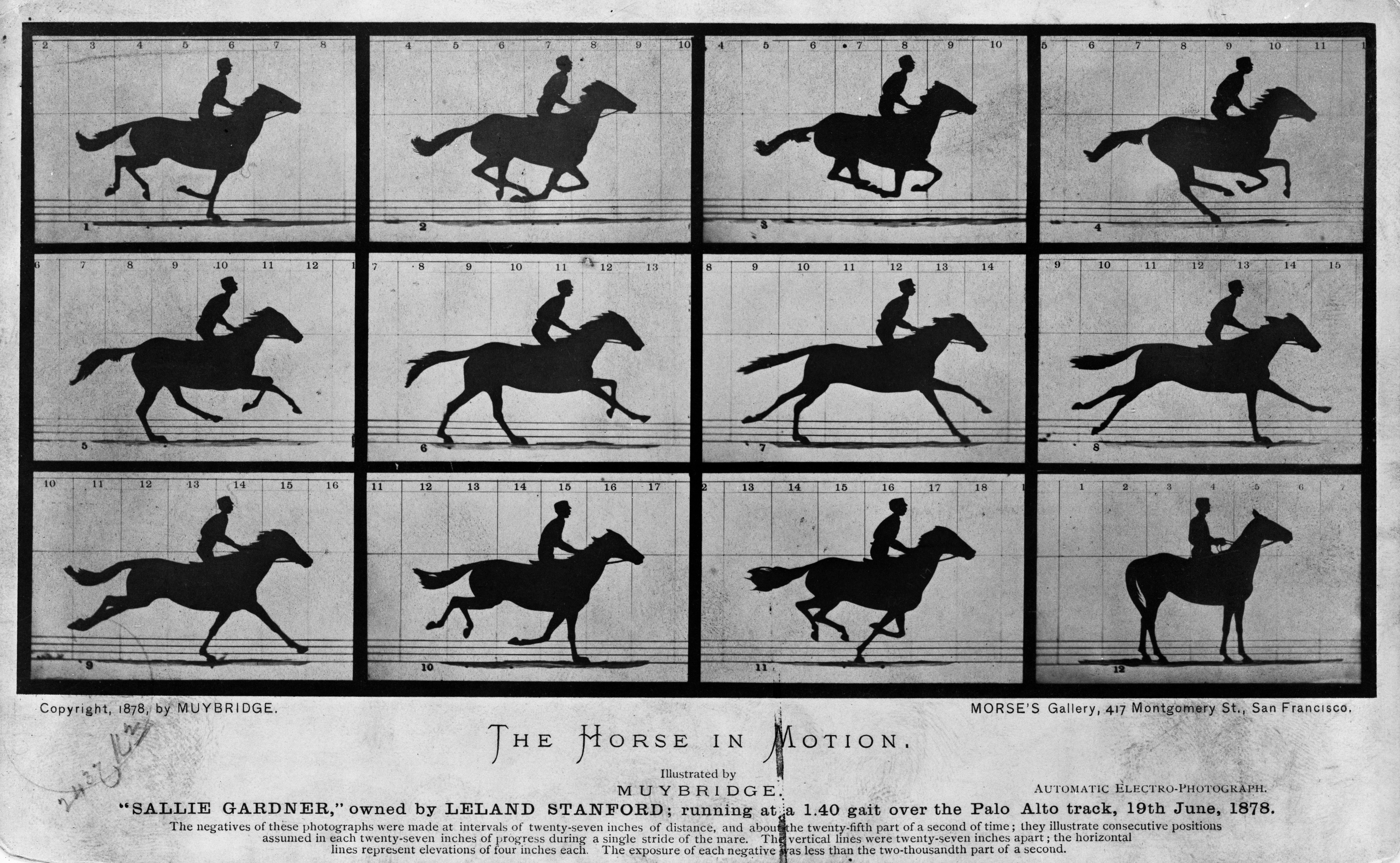
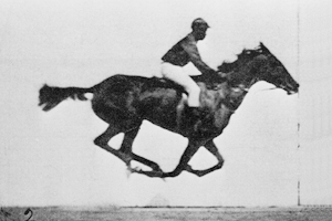
Eadweard Muybridge was a technically-adept, commercial photographer, based in San Francisco. His story is wonderfully told in a new graphic novel by Guy Delislie. By the time of Marey’s recordings, Muybridge was already famous for landscape photographs, such as Yosemite. Wealthy railroad baron Leland Stanford hired Muybridge to photographically capture all four feet of the galloping horse off the ground: a much more direct observation. Muybridge over-delivered. Not only with a single photograph, but a time sequence allowing the viewer to compare relative positions across the sequence:
Both Muybridge and Marey answer the question, but Muybridge’s photographs are immediately understandable and provide a wealth of additional context, such as the relative position of the horse’s limbs throughout the galloping cycle.
Marey was excited by the new photographic technique and adopted it for his own investigations. Both Marey and Muybridge create many more photographs and studies. Marey, invents a photographic gun capable of capturing 12 frames, which he used to study the flight of birds:
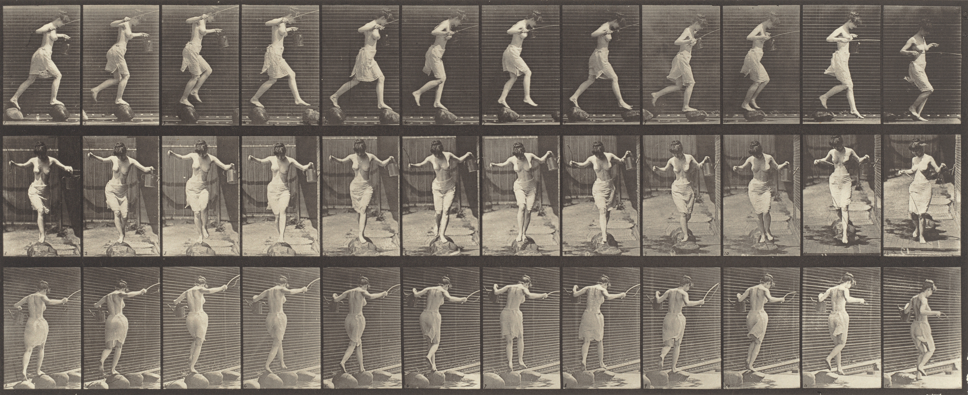
Muybridge creates many sequences of humans and animals in motion:
Muybridge also realizes the images can be shown in rapid succession giving the illusion of movement, leading to him perform lectures and opening the way towards cinema. His images are still used as a reference for animators.
Marey, perhaps due to his scientific background, is more interested in decomposition and analysis, as opposed to recomposition (into cinema). For example, he creates sequences where the parts of the anatomy are made highly reflective, and the rest dark; resulting in strikingly abstract views of motion:
And Marey’s books also move back and forth between photographic sequences and other visualizations in the explanation of various phenomena.
Direct photographic capture of temporal phenomena has evolved significantly: for example, particle physics at CERN, cellular imaging for biology, radiology in medicine, and astronomic imaging.
Observational distance
Marey and Muybridge both achieved fame through visualizations that were not distant from the observed phenomena. In their case, they achived it with direct photographic capture.
In data visualization and analytics, it’s always a challenge to create results that are readily perceived, easily interpreted, and trusted. Each additional data transformation creates distance and opportunity for compounding error.
Looking back over visualizations that I’ve been involved with, many successes have been a result of a conscious effort to reduce the distance between the visualization and the original source data.
One project most directly related to Marey and Muybridge used MLB baseball pitch and hit visualization in 2010. In addition to visualization of thousands of pitches and hits, interactions allow users to easily move back and forth from visualization to video: quantitative data was married to valuable qualitative information in the video — additional information that quantification missed but was highly informational to expert users.
In geographic visualizations, we map quantitized data over top relevant contextual data. It provides a similar role: when we place data on a map, the map includes local context such as rivers and roads to help locate the information, and related data to provide context to the observations.
What are the related data that can help contextualize other datasets? This is a good and important question. For example, identifying relevant news events to major stock market movements provides context in a completely abstract domain.
And what about AI? LLM’s are complete black boxes. As AI answers become pervasive in search engine responses, we see all kinds of errors bubbling up in AI responses, from misinterpretting the question, to fetching the wrong document, to utilizing deliberately misleading content. In order to reduce hallucination, AI-enabled search is now relying on search, retrieval, and summarization. But this leads to questionable sources. Perhaps the better approach might be to leverage more the the AI’s own internal knowledge, weights, and implied sources; in addition to better synthesis across more sources; and, better qualification of relevant sources instead of search-optimized (SEO) sources that have gamed search-response.
References — Good viz books to read this summer!
Muybridge by Guy Delisle. Drawn & Quarterly. 2025. D&Q. Powells.
The Graphic Method. by Étienne-Jules Marey. Georges Hattab & RJ Andrews, ed. Visionary Press. 2022. Visionary. Abebooks.
The Map that Changed the World – The Tale of William Smith and the Birth of a Science. Simon Winchester’s wonderful book. 2001. book. blogpost.
The Ghost Map, The Story of London’s Most Terrifying Epidemic – and How it Changed Science, Cities and the Modern World, Steve Johnson, 2006. book. blogpost.
Hidden Systems: Water, Electricity, the Internet and the Secrets Behind the Systems We Use Every Day. Dan Nott. 2023. book. blogpost.
The Grid: The Fraying Wires between Americans and our Energy Future, Gretchen Bakke. 2017. book. blogpost.
The Life and Legend of James Watt. David Philip Miller. 2019. book. blogpost.
Why aren’t textures used more in data visualizations? They were frequently used in print-based visualizations, such as this nice geologic cross-section from 1845, with dash patterns, dots, squiggles, and combinations thereof:
Dots, dashes, squiggles, and more on old visualizations.
I’ve always been interested in using textures to convey data in visualizations (e.g. 1,2,3). And AI vibe coding makes it easy to experiment. Here’s a quick bar chart showing the box office of all of Pixar’s movies. The texture on the bar indicates the movie review rating: teeny dots = poor rating, big circles = excellent rating. You can see early movies performed well and rated well, but, both box office revenue and reviewers ratings have become more volatile over time:
Pixar’s latest movie, Elio, had a disastrous opening weekend, and there has been much press about Pixar’s strategy to rely more on sequels rather than original content.
The bar chart doesn’t group the sequels together. so we could use a treemap instead. Here’s a really quick treemap:
Before we get into the content, lets discuss the textures. It’s nice that we can use textures – but they are very dominant. Textures can cause a visual vibratory effect (Tingying 2023). And the text needs a halo in order to be legible – but even with the halo, the text has to visually compete with the textures that it is superimposed on top of. Even without the texture, text had to contend with the background color, which completely fills every rectangle and thus requires either the halo or flipping the text from black to white depending on background, etc.
Tint bands, a great idea invented 400 years ago
Instead consider old maps. They didn’t color the full area – instead they used a band of color inset in the border of each area. Here’s a 400 year old Blaeu map:
This inset tint band accomplishes a few things: A. It draws attention to the extents / boundaries of each area. B.The centers are open, meaning much text can be on a white background for improved legibility. C. With the centers open, there’s much more opportunity to additional information without having to worry about contrast with the background.
And, the technique is still commonly used. You can buy modern maps from National Geographic that use this technique.
Tint bands on textures and treemaps
Can we use tint bands on area-based visualizations, such as treemaps, choropleth maps, area charts, and so on?
Sure! Why not?
Here’s the same treemap, now applying a washed-out tint band effect. And, with all the extra whitespace, in the center of each movie I’ve added a plot summary – just in case you haven’t seen Toy Story N:
Reducing the flood fill across the entire rectangle to just the tint band around the perimeter doesn’t affect our ability to see big boxes (Inside Out 2), bright green boxes (the original Toy Story) or small orange boxes (Turning Red, coincidentally:-). (Although some Masters/PhD student could run an experiment to confirm this).
And, we can return to our analysis of Pixar’s sequel strategy. I’ve shifted from circle texture, to a line texture, where line density corresponds with rating (denser lines, higher rating); and orientation (vertical for old movies, slowly rotating to horizontal for the latest movies). There are many possible observations, such as:
A. All the red money-losing movies are standalone movies (which matches the press and Pixar’s observation).
B. The original Toy Story set a very high bar: the brightest green (highest ROI), vertical texture (first movie), tightest texture (highest reviews).
C. Inside Out 2 did great: it’s the last movie in this dataset (horizontal lines), biggest box (most $), bright green (high ROI), and OK reviews (mid-distance line spacing, i.e. better reviews than Monsters University and all the Cars movies).
D. The sequels usually make more money than the originals: i.e. they tend to be much bigger (more box office) and remain green (profitable). For example: Incredibles, Finding Nemo/Dory, Inside Out, Toy Story (except Lightyear). They do somewhat top out, e.g. Cars 3 is about the same as Cars 2; Toy Story 4 is about the same as Toy Story 3. If this top out pattern is true, then Pixar execs might find that there is some franchise fatigue, although a billion dollars of box office revenue on a $250 million dollar budget seems like a pretty good business case to keep making franchises.
E. Texture frequency is the review. Reviews don’t necessarily correlate to box office, but generally a good review tends towards a good box office. The reverse is not true, bad reviews don’t necessarily lead to poor box office (e.g. all the Cars movies). This suggests that Pixar needs a goal of getting awesome reviews particularly for new standalone movies. What leads to awesome reviews? With the tint bands, the space in the center can include additional content, in this case the plot summary. Bringing text into the visualization allows for more context to be provided beyond only quantitative metrics (e.g. see the movie review visualizations in my book Visualizing with Text). In this example, one can read the plot summary: perhaps universal themes resonate across larger audiences rather than small stories with important messages that appeal to niche segments (my guess, I’m not a movie analyst).
So what?
Textures and tint bands may have many good use cases in future visualizations: at a minimum, they reduce the amount of screaming primary colors; and allow space for additional data or annotations within the plot area. They could also help choropleth maps by reducing the perception on the area of the fill: for example, Texas is bigger in land area, but Rhode Island has the same number of senators, once Texas is reduced to a tint band, the overwhelming land discrepancy is less visually dominant when the colors are compared.
Appendix: Tech notes
Textures: For the first pass of textures (bubbles), I asked Claude to use the library texture.js. Texture.js is effective for some simple textures. For lines at arbitrary rotations, texture.js was insufficient. And without texture.js, LLMs generate disconnected textures, or artifacts at texture tile boundaries, such as these:
It’s easy to generate textures with unwanted visual artifacts, e.g. lines that don’t line up between texture tiles, or lines clipped at the boundaries of texture tiles.
Tint bands: require a gradient transparency for the band to fade out. This seemed obvious, to me, to use a SVG mask; but this just created many problems: rectangular mask shapes aren’t part of SVG spec, and creating and applying many masks made the browser computation of the masks extremely slow (i.e. more than 1 minute to draw the treemap on Chrome). Instead, I created a smaller rectangle, inset, with a blurred edge.
LLM Prompt: I generally follow the Wordsplot template. For the marks, to use textures + tint bands, I specify the sequence of primitives that need to stacked:
For each rectangle in the treemap, I want to render a three-layer SVG group:
a) A solid background rectangle (<rect>) with a data-driven fill color.
b) A texture overlay using a diagonal-line. The line spacing is set to column agg_response_score: greater density of lines for higher scores. The line orientation is set to column year, with vertical orientation (12 o'clock) for the first year then incremental clockwise orientation to the final year which should be horizontal orientation (3 o'clock). The lines need to be continuous across tiles, so you may need to create multiple lines per tile to make sure that they will align across tiles such that they appear to be visually continuous.
c) On top is a slightly smaller foreground rectangle with the same fill as the background, blurred using an SVG filter (e.g., feGaussianBlur) to create a soft fade-in edge, so only the border of the texture is visible. The foreground rectangle should be 10px inset on all sides relative to its parent box.
There was some extra fiddling with the output code, for example, the line density was too dense and I reduced that.
Font: While I have my favorite fonts, for text inside the treemap I’m trying Atkinson HyperlegibleNext. It’s got a few quirks, but its high x-height, loose spacing, and geometric shapes could work well for readability at small sizes. (I don’t like the lower case g though).
Here’s link to the generated, tweaked code over on codepen.
I was honoured to do an invited presentation on journey visualization at the recent Institute for Journey Management (I4JM) event in London. A customer journey is the sequence of steps that a customer takes to complete a significant task, such as buying a car, filing an insurance claim, getting mortgage, cancelling a subscription, and so on. The data is complex, because it’s more than just the sequence: a customer may switch from mobile, to web, to call centre, use email, go in person. A login step might be needed on web, but not in person. Personalized content may be served. The customer may change objectives mid-course. There may be many other data elements: was the customer angry on the call, did the sales rep offer helpful advice, what time of day did these steps happen, did Internet influencers impact the decision, did the customer start via an ad campaign, and so on.
From a visualization perspective, the challenge is how to visualize these journeys: each type of journey has a different set of events, and those events might be different across different means of access (web, mobile, contact centre, aka channels). Even a singular type of journey (e.g. buy a car), might be perceived as a linear path by a novice, but when the data is collected, almost every possible permutation will appear: someone may not use any comparison or configuration tools, someone may go back to the starting point multiple times, someone might start their journey at the comparison tool, someone may care about particular specs and engage in a chat Q&A early in the process (I am one of the latter, vehicle length is an early make or break decision point).
We’ve designed and built more than a dozen journey visualizations over the last 15 years. Given the diverse data and many different analytic tasks, it may be no surprise that there are many possible visualizations (the full I4JM presentation is here). Here’s a diagram showing all the ways (in practice) that we have visualized them:
Many different ways to visualize journeys (more detail in this research paper).
From journey complexity to management diagram
This complexity of all the possible journeys and many different kinds of analyses has created a rich industry dealing with many aspects of journey management, such as journey mapping, journey orchestration, journey personalization, journey prediction, and so on. And all this complexity can make it difficult to explain the importance of journeys. When every journey is different, each one needs to be explained separately.
BUT, What if there was an Ur-journey that could simplify journey analysis at a high-level?
Last year, I wrote about strategy management diagrams. Strategy consulting takes complex problems and simplifies them to help organize information, do comparisons, facilitate trade-offs, and aid decision-making. Often diagrams supplement these analyses and there are standardized diagrams for specific types of analyses, such as SWOT, Porter’s Forces, Virtuous Circle, and so on. For example, supply chain management was more complicated, but, then analysts such as Kraljic organized the many aspects of supply chain management into a matrix. How do we get from complex detailed customer journeys into a higher-level standarized Ur-Journey?
Hollywood has the answer
For Hollywood, every story is a journey. And, there’s a singular template for all Hollywood journeys – the Hero’s journey. We all know it intuitively: Act 1, everything is awesome, then it’s not. Our protagonist has some want or need that must be solved. Act 2, there’s a bunch of roadblocks, and some helpful friends. Act 3 has the dramatic conflict and our hero comes out changed.
There’s been a deep analysis of this, going back to ancient myths. The universal Hero’s Journey (e.g. Vogler), has 12 steps, starting with a call, acknowledgement of risks, a mentor, a threshold, etc. Here’s the diagram:
There’s a standard hero’s journey across myths, and Hollywood, e.g. Disney, Star Wars, Harry Potter, etc.
To me, 12 steps seems a bit much for every customer journey, particularly for simple journeys, such as cancel my subscription.
There are simpler variants. Save the Catplot method has somewhere between 7-15 steps, depending on how you roll it up. Video games have a three act structures. For example, side quests have few steps and focus on gameplay: some initial incident, some outline of the objective, the point of actively engaging the sidequest, active gameplay to get through the challenge, a climax (boss level) with some kind of resolution. This is closer to an Ur-journey.
Beyond entertainment, in some of my work on data visualization, I like to use Boyd‘s OODA loop: Observe-Orient-Decide-Act. A continuous loop wherein initial observation uncovers issues, orientation steers the analysis to understand the context and available options, decide on a plan of action, and act to execute the plan, with successive observation to confirm that the action has the intended effect and what else may have changed.
The 5C common customer journey
So what are the common steps in a customer journey? Here’s a proposition:
1. Catalyst. Something triggered the need to go on a journey. It’s a catalyst to start:
An Internet influencer showing something that I never knew I wanted but now must have
My car crashed, and now I need to file an insurance claim
I just figured out I’ve been paying Amazon Prime for 6 months and I don’t want it
I moved, and now need to let my bank know that my address has changed
2. Consideration. I have a need, now I need to assess how to go about solving it. This is exploration and information-seeking behavior. I think of this step as “widening the scope”: I know I need something, but I’m not sure of the alternatives, so I need to poke around to understand the range of choices. There are many things to consider:
Find more about that amazing new thing, does it come in different flavors, what are the accessories, is there a new version next month, and does it have competitors
How am I supposed to file a claim, what information do I need, do I need a police report first (side quest), do I want the car fixed or cash towards a new car, and what will be the impact on my future insurance rate.
Where on Amazon’s website is the cancel button, what does the Internet have to say about cancelling Prime, or maybe compare Prime to some alternatives before I’m too hasty.
Find out requirements how to change address, and how that might be different on-line or in person.
3. Converge. Having considered alternatives, I need to decide. I need to “narrow the scope” to what I’m going to actually do. This is the step where all the aspects need to converge on a path forwards:
Download the mobile app, pick the version of the new thing, add a few accessories accessories to the shopping cart, extended warranty, refund rules, shipping details, and laser engraving.
Enter all the claim data, take appropriate photographs, attest that this is genuine, add some receipts for the temporary rental car, review the offer.
Follow the detailed tutorial on Youtube step-by-step, navigating around the differently configured screens, to click each of the required buttons.
Drive to the bank with two pieces of ID, wait in line for 20 minutes, enter appropriate bank card, etc.
4. Commit. This is the climax of the customer journey. I need to act. Do I abandon the shopping cart at the last minute? Or do I click the final purchase button? Did something in the journey process leave me feeling uneasy – maybe I need to go back and check other things. This where the customer commits:
Push buy, or go back and check the detailed tech specs about compatibility with some weird formats.
Push accept, or get a bit panicky and reach out to the contact centre.
Make sure the final click hasn’t somehow changed since the Youtube video.
Confirm the new address is OK, or notice that the form has some limitation, like not enough characters for the full streetname.
5. Confirm. It’s not over yet! At a minimum, the provider needs to acknowledge that all is good and what happens next, e.g.:
A tracking number is provided and delivery estimate, and somekind of congratulations of my wonderful membership in a new club of owners of the amazing thing. (and the delivery will start a new journey as a user.)
A confirmation message, with a transaction number that I can cross-reference with the bank; and what else happens (perhaps assistance with a new journey to get a rental car).
A confirmation number, because I’m probably not going to get an apology other than “sorry to see you leave”.
An indication of how/when I will see this impact.
With each step in the journey, the customer is attending more to the current journey. They are investing in the journey. There’s more to lose for each side with each successive step. Here’s a diagram:
The confirmation step is important to journey completion. The customer’s attention (y-axis) drops after the commitment because the customer has completed the task (from their perspective). It’s still important from the provider perspective to deliver on the full outcome. For example, the customer may have retrieved their cash from the ATM thus fulfilling their initial need and now their attention has shifted to their next problem — but if their card is still in the ATM, there will be a followon problem for both the provider and customer if the customer should leave, and the card return should have been resolved within that journey. Further, confirmation is an opportunity to set up a trigger for the next journey.
You’ll also notice that there’s a handy set of 5 words that all start with the letter C: Catalyst > Consideration > Convergence > Commitment > Confirmation. (or if you prefer, you could call it the TADAA journey).
Why is an ur-journey important?
We will always need detailed drill-down journeys. A high-level 5C journey simplifies conversations across all stakeholders. Not everyone will be familiar with journeys and a standard structure simplifies explanations. A common frame of reference facilitates re-use of what you learned in a previous conversation. Problems at a particular step may have common issues.
Suppose the convergence step is not as effective as desired. For the new widget, this could be an issue with marketing (the brochure is confusing), or the product (I don’t like spec), or service (the rep can’t answer the question). For the subscription cancellation, it could be similar, e.g. marketing doesn’t articulate the benefits that I care about; or the product features are not appealing; or service is unavailable. During commitment make-or-break information is required; objections need to be handled; the expected content needs to be available appropriate to each channel.
Beyond diagnosing problems at each step, I can use the framework to consider the levers available to create a better customer experience by steps and journey type. Patrick Burggraaf has a nice article on CX levers: for example, expectation clarity has to align with the objectives of each step; service reliability has to meet the commitment; and so on.
Given an ur-journey, it also means we can start to roll-up analysis across multiple journeys. Do we lose a lot of people during consideration? Are we not engaging people at catalyst? Can we drill-down and see commonality in marketing: the ad campaign, the incentives, the media placement, the social media response. Metrics can rolled up: drop-offs rates, survey scores, demographics, journey friction, etc. Roll-ups are very important to synthesize high-level issues. Note the importance of satisfaction scores and net promoter scores in customer marketing.
Because ur-journeys are standardized, they hold potential for benchmarking across competitors. Once we can align journeys across companies, we can see who excels at triggers, and on which channels. Etc.
Visualization of ur-journeys will also be useful. Heatmaps, comparison views, drill-downs will enable common comparable top-level views, with interactions to enable more kinds of analysis. Drill-downs allow journeys to be unfurled and compared: by journey type, by competitor, by channel, by product area, and so on.
Are ur-journeys a future direction for Journey Management? Maybe. I think they raise some interesting possibilities. Feel free to leave comments.