| CARVIEW |
[PDF] [Code] [Colab Example] [Video]
Sequence models are a critical component of modern NLP systems, but their predictions are difficult to explain. We consider model explanations though rationales, subsets of context that can explain individual model predictions. We find sequential rationales by solving a combinatorial optimization: the best rationale is the smallest subset of input tokens that would predict the same output as the full sequence. Enumerating all subsets is intractable, so we propose an efficient greedy algorithm to approximate this objective. The algorithm, which is called greedy rationalization, applies to any model. For this approach to be effective, the model should form compatible conditional distributions when making predictions on incomplete subsets of the context. This condition can be enforced with a short fine-tuning step. We study greedy rationalization on language modeling and machine translation. Compared to existing baselines, greedy rationalization is best at optimizing the combinatorial objective and provides the most faithful rationales. On a new dataset of annotated sequential rationales, greedy rationales are most similar to human rationales.
Notebook with example available on Colab.

K. Vafa, Y. Deng, D. Blei, and A. Rush. Rationales for Sequential Predictions. In Proceedings of EMNLP, 2021.
]]>K. Vafa, S. Naidu, and D. Blei. Text-Based Ideal Points. In Proceedings of ACL, 2020.
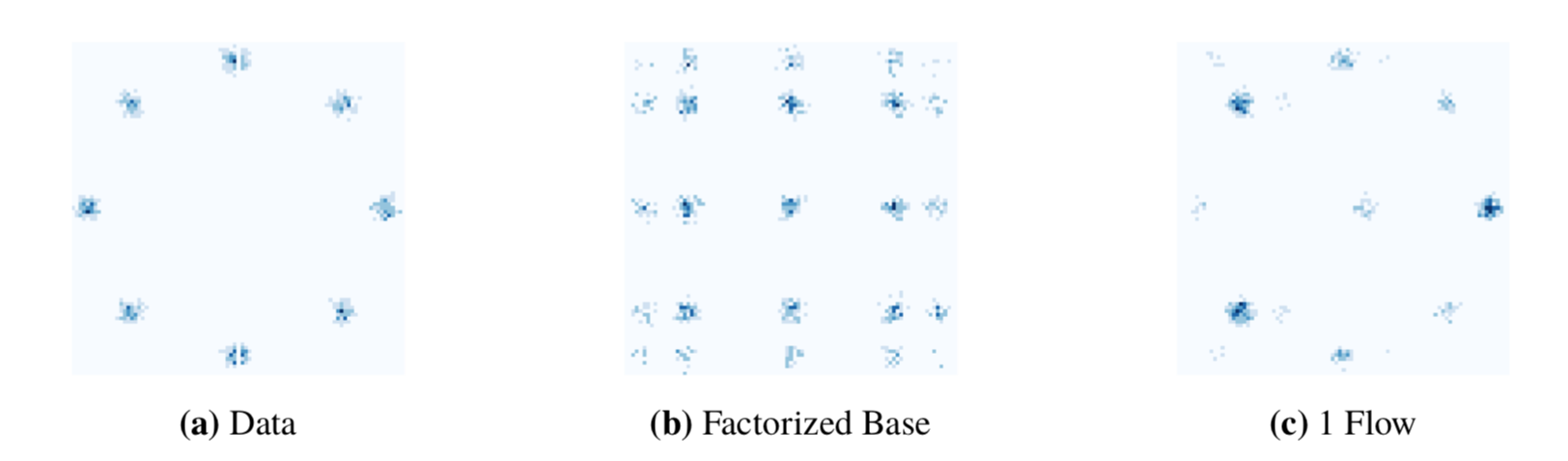
]]>While normalizing flows have led to significant advances in modeling high-dimensional continuous distributions, their applicability to discrete distributions remains unknown. In this work, we show that flows can in fact be extended to discrete events—and under a simple change-of-variables formula not requiring log-determinant-Jacobian computations. Discrete flows have numerous applications. We consider two flow architectures: discrete autoregressive flows that enable bidirectionality, allowing, for example, tokens in text to depend on both left-to-right and right-to-left contexts in an exact language model; and discrete bipartite flows that enable efficient non-autoregressive generation as in RealNVP. Empirically, we find that discrete autoregressive flows outperform autoregressive baselines on synthetic discrete distributions, an addition task, and Potts models; and bipartite flows can obtain competitive performance with autoregressive baselines on character-level language modeling for Penn Tree Bank and text8.
D. Tran, K. Vafa, K. K. Agrawal, L. Dinh, and B. Poole. Discrete Flows: Invertible Generative Models of Discrete Data. In Proceedings of NeurIPS, 2019.
Black Box Variational Inference (BBVI) offers a solution to this problem. Instead of computing all the updates in closed form, BBVI uses sampling to approximate the gradient of our bound, and then uses stochastic optimization to optimize this bound. Below, I’ll briefly go over the main ideas behind BBVI, and then demonstrate how easy it makes inference for Bayesian logistic regression. I want to emphasize that the original BBVI paper describes the method better than I ever could, so I encourage you to read the paper as well.
Black Box Variational Inference: A Brief Overview
In the context of Bayesian statistics, we’re frequently modeling the distribution of observations, \(x\), conditioned on some (random) latent variables \(z\). We would like to evaluate \(p(z \vert x)\), but this distribution is often intractable. The idea behind variational inference is to introduce a family of distributions over \(z\) that depend on variational parameters \(\lambda\), \(q(z \vert \lambda)\), and find the values of \(\lambda\) that minimize the KL divergence between \(q(z \vert \lambda)\) and \(p(z \vert x)\). One of the most common forms of \(q\) comes from the mean-field variational family, where \(q\) factors into conditionally independent distributions each governed by some set of parameters, \(q(z \vert \lambda) = \prod_{j=1}^m q_j(z_j \vert \lambda)\). Minimizing the KL divergence is equivalent to maximizing the Evidence Lower Bound (ELBO), given by
\[L(\lambda) = E_{q_{\lambda}(z)}[\log p(x,z) - \log q(z)].\]It can involve a lot of tedious computation to evaluate the gradient in closed form (when a closed form expression exists). The key insight behind BBVI is that it’s possible to write the gradient of the ELBO as an expectation:
\[\nabla_{\lambda}L(\lambda) = E_q[(\nabla_{\lambda} \log q(z \vert \lambda)) (\log p(x,z) - \log q(z \vert \lambda))].\]So instead of evaluating a closed form expression for the gradient, we can use Monte Carlo samples and take the average to get a noisy estimate of the gradient. That is, for our current set of parameters \(\lambda\), we can sample \(z_s \sim q(z \vert \lambda)\) for \(s \in 1, \dots, S\), and for each of these samples evaluate the above expression, replacing \(z\) with the sample \(z_s\). If we take the mean over all samples, we will have a (noisy) estimate for the gradient. Finally, by applying an appropriate step-size at every iteration, we can optimize the ELBO with stochastic gradient descent.
The above expression may look daunting, but it’s straightforward to evaluate. The first term is the gradient of \(\log q(z \vert \lambda)\), which is also known as the score function. As we’ll see in the logistic regression example, this expression is straightforward to evaluate for many distributions, but we can even use automatic differentiation to streamline this process if we have a more complicated model (or if we’re feeling lazy). The next two terms are log-likelihoods that we specify, so we can compute them with a sample \(z_s\).
BBVI for Bayesian Logistic Regression
Consider data \(\boldsymbol X \in \mathbb{R}^{N \times P}\) with binary outputs \(\boldsymbol y \in \mathbb{R}^{N}\). We can model \(P(y_i \vert \boldsymbol x_i, \boldsymbol z) \sim \text{Bern}(\sigma(\boldsymbol z^T \boldsymbol x_i))\), with \(\sigma(\cdot)\) the inverse-logit function and \(\boldsymbol z\) drawn from a \(p\)-dimensional multivariate normal with independent components, \(\boldsymbol z \sim \mathcal N(\boldsymbol 0, \boldsymbol I_p)\). We would like to evaluate \(p(\boldsymbol z \vert \boldsymbol X, \boldsymbol y)\), but this is not available in closed form. Instead, we posit a variational distribution over \(\boldsymbol z\), \(q(\boldsymbol z \vert \lambda) = \prod_{j=1}^P \mathcal N(z_i \vert \mu_j, \sigma_j^2)\). To be clear, we model each \(z_j\) as an independent Gaussian with mean \(\mu_j\) and \(\sigma_j^2\), and we use BBVI to learn the optimal values of \(\lambda = \{\mu_j,\sigma_j^2\}_{j=1}^P\). We’ll use the shorthand \(\boldsymbol \mu = (\mu_1, \dots, \mu_P)\) and \(\boldsymbol \sigma^2 = (\sigma_1^2, \dots, \sigma_P^2)\).
Since \(\sigma_j^2\) is constrained to be positive, we will instead optimize over \(\alpha_i = \log(\sigma_j^2)\). First, evaluating the score function, it’s straightforward to see
\[\nabla_{\mu_j}\log q(\boldsymbol z \vert \lambda ) = \nabla_{\mu_j} \sum_{i=1}^P -\frac{\log(\sigma_i^2)}{2}-\frac{(z_i-\mu_i)^2}{2\sigma_i^2} = \frac{(z_j-\mu_j)}{\sigma^2_j}.\\ \nabla_{\alpha_j}\log q(\boldsymbol z \vert \lambda ) = \nabla_{\sigma_j} \left(\sum_{i=1}^P -\frac{\log(\sigma_i^2)}{2}-\frac{(z_i-\mu_i)^2}{2\sigma_i^2}\right) * \nabla_{\alpha_j}(\sigma_j^2) = \left(-\frac{1}{2\sigma_j^2} + \frac{(z_j-\mu_j)^2}{2(\sigma_j^2)^2}\right) * (\sigma_j^2).\]Note that we use the chain rule in the derivation for \(\nabla_{\alpha_j}\log q(\boldsymbol z \vert \lambda )\). For the complete data log-likelihood, we can decompose \(\log p( \boldsymbol y, \boldsymbol X, \boldsymbol z) = \log p( \boldsymbol y \vert \boldsymbol X, \boldsymbol z) + \log p(\boldsymbol z)\), using the chain rule of probability (and noting that \(\boldsymbol X\) is a constant). Thus, it’s straightforward to calculate
\[\log p(\boldsymbol y, \boldsymbol X, \boldsymbol z) = \sum_{i=1}^N [y_i \log(\sigma(\boldsymbol z^T \boldsymbol x_i)) + (1-y_i)\log(1-\sigma(\boldsymbol z^T \boldsymbol x_i))] + \sum_{j=1}^P \log \varphi(z_j \vert 0, 1).\\ \log q(\boldsymbol z \vert \lambda) = \sum_{j=1}^P \log \varphi(z_j \vert \mu_j, \sigma_j^2).\]The notation \(\varphi(z_j \vert \mu, \sigma^2)\) refers to evaluating the standard normal pdf with mean \(\mu\) and variance \(\sigma^2\) at the point \(z_j\).
And that’s it. Thus, given a sample z_sample from \(q(\boldsymbol z \vert \lambda) \sim \mathcal N(\boldsymbol \mu, \text{diag}(\boldsymbol \sigma^2))\) and current variational parameters mu \(= \boldsymbol \mu\) and sigma \(= \boldsymbol \sigma^2\), we can approximate the gradient using the following Python code:
def elbo_grad(z_sample, mu, sigma):
    score_mu = (z_sample - mu)/(sigma)
    score_logsigma = (-1/(2*sigma) + np.power((z_sample - mu),2)/(2*np.power(sigma,2))) * sigma
    log_p = np.sum(y * np.log(sigmoid(np.dot(X,z_sample))) + (1-y) * np.log(1-sigmoid(np.dot(X,z_sample))))
        + np.sum(norm.logpdf(z_sample, np.zeros(P), np.ones(P)))
    log_q = np.sum(norm.logpdf(z_sample, mu, np.sqrt(sigma)))
    return np.concatenate([score_mu,score_logsigma])*(log_p - log_q)
To test this out, I simulated data from the model with \(N = 100\) and \(P = 4\). I set the step-size with AdaGrad, I used 10 samples at every iteration, and I stopped optimizing when the distance between variational means was less than 0.01. The following plot shows the true values of \(z_1, \dots, z_4\), along with their learned variational distributions (the curves belonging to each parameter are a different color):

It appears that BBVI does a pretty decent job of picking up the distribution over true values. The following plots depict the value of each variational mean at every iteration (left), along with the change in variational means (right).

Again, I highly recommend checking out the original paper. This Python tutorial by David Duvenaud and Ryan Adams, which uses BBVI to train Bayesian neural networks in only a few lines of Python code, is also a great resource.
All my code is available here.
]]>Here are the (new) results performing PCA on the voting record:
Here are the (older) results using ideal point modeling:
It’s interesting to compare the methods (the scale on the x-axis is irrelevant). Both models do a good job of capturing the more moderate senators, since Susan Collins, Lisa Murkowski, and Kelly Ayotte are in the middle in both methods. The furthest left senator using PCA is Maria Cantwell, who is also pretty far left with ideal points. Meanwhile, the furthest right senator with PCA is Tom Coburn (whose Wikipedia page describes him as “the godfather of the modern conservative, austerity movement”), yet he is further left than 8 senators with ideal point modeling.
Overall, I was surprised by how similar these results were, given how differently the two methods are motivated. Ideal point modeling yields scores for every bill and senator (along with a predictive interpretation), while PCA can reduce the voting data to any dimension to capture senator voting habits (not to mention it’s much faster). I would definitely be interested in exploring these methods with more rigor.
]]>I’m going to assume the reader is somewhat familiar with the basic ideas behind variational inference. If you’ve never seen variational infererence before, I strongly recommend this tutorial by David Blei, Alp Kucukelbir, and Jon McAuliffe. These course notes from David Blei are also very handy.
Variational Inference: A (Very) Brief Overview
Bayesian statistics often requires computing the conditional density \(p(\boldsymbol z \vert \boldsymbol x)\) of latent variables \(\boldsymbol z = z_{1:m}\) given observed variables \(\boldsymbol x = x_{1:n}\). Since this distribution is typically intractable, variational inference learns an approximate distribution \(q(\boldsymbol z)\) that is meant to be “close” to \(p(\boldsymbol z \vert \boldsymbol x)\), using Kullback-Leibler divergence as a measure.
Thus, there are two steps. The first comes from providing a form for the variational distribution, \(q(\boldsymbol z)\). The most frequently used form comes from the mean-field variational family, where \(q\) factors into conditionally independent distributions each governed by some set of parameters, \(q(\boldsymbol z) = \prod_{j=1}^m q_j(z_j)\). Once we have specified the factorization of the distribution, we are still required to figure out the optimal form of each factor, both in terms of its family and parameters (although these can be conisdered the same thing). Thus, the second step is optimizing \(KL(q \vert \vert p)\).
It turns out the optimal form of each factor is straightforward: \(q_j^*(z_j) \propto \exp\left\{E_{-j}[\log p(\boldsymbol z, \boldsymbol x)]\right\}\), where \(E_{-j}[\cdot]\) refers to the expectation when omitting variable \(z_j\). To minimize \(KL(q \vert \vert p)\), we cycle between latent factors \(q_j\) and update the mean (with respect to the current parameters) according to the equation above. If these results are unfamiliar, definitely check out the tutorial I mentioned earlier.
Variational Inference for Bayesian Probit Regression
Consider a probit regression problem, where we have data \(\boldsymbol x \in \mathbb{R}^{N \times 1}\) and a binary outcome \(\boldsymbol y \in \{0,1\}^{N}\). In probit regression, we assume \(p(y_i = 1) = \Phi(a + bx_i)\), where \(a\) and \(b\) are unknown and random, with a uniform prior, and \(\Phi(\cdot)\) is the standard normal CDF. To simplify things, we can introduce variables \(z_i \sim \mathcal{N}(a+bx_i,1)\) so \(y_i = 1\) if \(z_i > 0\) and \(y_i = 0\) if \(z_i \leq 0\).
The first step is writing down the log posterior density \(\log p(a,b,\boldsymbol z \vert \boldsymbol y)\) up to a constant. It is straightforward to see
\[\log p(a, b, \boldsymbol z \vert \boldsymbol y) \propto \sum_{i=1}^n y_i \log I(z_i > 0) + (1-y_i)\log(I(z_i \leq 0)) - \frac{\sum_{i=1}^n (z_i - (a+bx_i))^2}{2}.\]The next step is defining our variational distribution \(q\). We will provide one factor for each \(z_i\), along with indendent factors for \(a\) and \(b\) each. Therefore, \(q\) consists of \(n + 2\) independent factors:
\[q(a, b, \boldsymbol z) = q_a(a) q_b(b) \prod_{j=1}^m q_j(z_j).\]To learn the optimal form of each factor, we use the rule described above. That is, consider a single \(z_j\). The optimal distribution is therefore \(q_j^*(z_j) \propto \exp \left\{E_{a,b,\boldsymbol z_{-j}}[\log p(a, b, \boldsymbol z \vert \boldsymbol y)]\right\}\). Writing this out, we see
\[E_{a,b,\boldsymbol z_{-j}}[\log p(a, b, \boldsymbol z \vert \boldsymbol y)] \propto y_j \log I(z_j > 0) + (1-y_j)\log I(z_j \leq 0) - \frac{E_{a,b}(z_j-(a+bx_i))^2}{2}.\]Thus, after exponentiating, we have that the ideal form is a truncated normal distribution. That is, \(q_j(z_j) \sim \mathcal N^+(E(a)+E(b)x_i,1)\) if \(y_j = 1\) and \(q_j(z_j) \sim \mathcal N^-(E(a)+E(b)x_i,1)\) if \(y_j = 0\), where \(\mathcal N^+\) and \(\mathcal N^-\) are normal distributions truncated to be positive and negative, respecitively.
Similarly, for \(a\), we have \(E_{b,\boldsymbol z}[\log p(a, b, \boldsymbol z \vert \boldsymbol y)] \propto E_{b,\boldsymbol z}\left(-\frac{\sum_{i=1}^n (z_i - (a+bx_i))^2}{2}\right)\). Removing terms that do not depend on \(a\) and completing the square, we have the optimal form as \(q_a(a) \sim \mathcal N\left(\frac{\sum_{i=1}^n [E(z_i)-E(b)x_i]}{n},\frac{1}{n}\right)\).
Finally, for \(b\), we have \(E_{a,\boldsymbol z}[\log p(a, b, \boldsymbol z)] \propto E_{a, \boldsymbol z}\left(-\frac{\sum_{i=1}^n (z_i - (a+ bx_i))^2}{2}\right)\). Again removing the terms that do not depend on \(b\) and completing the square, we have the following optimal form:
\[q_b(b) \sim \mathcal N \left(\frac{\sum_{i=1}^n x_i[E(z_i)-E(a)]}{\sum_{=1}^n x_i^2}, \frac{1}{\sum_{i=1}^n x_i^2}\right).\]Now that we know the form of all the factors, it’s time to optimize. To do this, we set each parameter to the mean of its optimal factored distribution. The updates can take the following form in R:
update_M_zj = function(M_a,M_b,j) {
  mu = M_a + M_b*x[j]
  if (y[j] == 1) {
    return(mu + dnorm(-1*mu)/(1-pnorm(-1*mu)))
  } else {
    return(mu - dnorm(-1*mu)/(pnorm(-1*mu)))
  }
}
update_M_a = function(M_z,M_b) {
  return(sum(M_z-M_b*x)/n)
}
update_M_b = function(M_z,M_a) {
  return(sum(x*(M_z-M_a))/sum(x^2))
}
Thefore, a single updating step would look like
for (i in 1:n) {
  M_z[iteration] = update_M_zj(M_a,M_b,i)
}
M_a = update_M_a(M_z,M_b)
M_b = update_M_b(M_z,M_a)
as[iteration] = M_a
bs[iteration] = M_b
Again, variational inference is an incredibly powerful tool, and I cannot overstate how helpful the links I posted above are in understanding all of this. Hopefully this tutorial clears up some of the confusion about variational inferece.
]]>First, some results. The following plot shows the ideal points (essentially inferred ideologies) of US senators based solely on roll call voting from 2013-2015 (scroll over the points to see names):
More extreme scores (i.e. away from zero) represent more extreme political views. While the liberal-conservative spectrum is not explicitly encoded into the model, the model picks this up naturally from voting patterns. On the far left are some of the most liberal members of the US Senate, such as Brian Schatz, while the far right has some of the most conservative members, such as Jim Risch and Ted Cruz. In the middle are senators sometimes referred to as DINOs and RINOs, such as Joe Manchin, Susan Collins, and Lisa Murkowski.
The basic model is as follows. Consider a legislator \(u\) and a particular bill \(d\). The vote \(u\) places on \(d\) is denoted as a binary variable, \(v_{ud} = 1\) for Yea and \(v_{ud} = 0\) for Nay. Each legislator has an ideal point \(x_u\); a value of 0 is political neutrality, whereas large values in either direction indicate more political extremism in the respective direction. Every bill has its own discrimination \(b_d\), which is on the same scale as the ideal points for legislators. If \(x_u*b_d\) is high, the legislator is likely to vote for the bill, and if the value is low, the legislator is less likely to vote. Finally, each bill also has an offset \(a_d\) that indicates how popular the bill is overall, regardless of political affiliation. Formally, the model is as follows:
\[P(v_{ud} = 1) = \sigma(x_ub_d + a_d),\]where \(\sigma(\cdot)\) is some sigmoidal function, such as the inverse-logit or the standard normal CDF. If a senator didn’t vote on a particular bill, this data is considered missing at random.
Inference requires learning the vectors \(X, B\), and \(A\). I took a Bayesian approach and put (independent) normal priors on each variable. I then used an EM algorithm derived by Kosuke Imai et al. The E-Step and M-Step are described in full detail in the paper, and I followed their setup, except I removed senators with less than 50 votes, and I stopped after 500 iterations.
All my code is available here.
]]>rnorm).
One of the most interesting and counterintuitive sampling techniques is the Box-Muller transform. I’m not sure how widely it’s used today, but given two samples from a uniform distribution, it can generate two independent samples from a standard normal distribution.
The idea behind the Box-Muller transform is to imagine two independent samples \(X, Y \sim \mathcal{N}(0,1)\) plotted in the Cartesian plane, and then represent these points as polar coordinates. Recall, to transform to polar, we need the distance \(R\) between \((X,Y)\) and the origin along with \(\theta\), the angle this line segment makes with the x-axis.
We start with the distance from the origin, \(R = \sqrt{X^2 + Y^2}\). For simplicity, we work with \(R^2 = X^2 + Y^2\). The sum of two independent squared standard normals follows a chi-squared distribution with 2 degrees of freedom. It is also a known fact that a chi-squared distribution with 2 degrees of freedom is equivalent to a \(\text{Gamma}(1,\frac{1}{2})\) random variable, which is itself equivalent to a \(\text{Expo}(\frac{1}{2})\) variable. Finally, we can express an exponential random variable as the log of a uniform. More succinctly,
\[R^2 \sim \chi^2_{df=2} \sim \text{Gamma}\left(1,\frac{1}{2}\right) \sim \text{Expo}\left(\frac{1}{2}\right) \sim -2\log U_1\]where \(U_1 \sim \text{Unif}(0,1).\)
What about the angle, \(\theta\)? If we write the joint density of \(X\) and \(Y\), we can see
\[f_{X,Y}(x,y) = \frac{1}{2\pi} e^{-\frac{X^2}{2}}e^{-\frac{Y^2}{2}} = \frac{1}{2\pi}e^{-\frac{(X^2+Y^2)}{2}} = \frac{1}{2\pi}e^{-\frac{R^2}{2}}.\]Thus, once we have \(R^2\), the squared distance between \((X,Y)\) and the origin, the joint distribution of \(X\) and \(Y\) is uniform. That is, as long as \((X,Y)\) is a pair satisfying \(X^2 + Y^2 = R^2\), it can be any point on the circle with radius \(R\). As a result, we can simply take \(\theta = 2\pi U_2\), where \(U_2 \sim \text{Unif}(0,1).\)
Putting all these results together, if we take \(R = \sqrt{-2\log U_1}\) and \(\theta = 2\pi U_2\) for \(U_1, U_2 \sim \text{Unif}(0,1)\), we have the polar coordinates for two independent standard normal draws. Thus, converting back to Cartesian, we have
\[X = R\cos\theta = \sqrt{-2\log U_1}\cos(2\pi U_2)\\ Y = R\sin\theta = \sqrt{-2\log U_1}\sin(2\pi U_2).\]This is straightforward to implement in R:
nsims = 10000
samples = rep(NA,nsims*2)
for (sim in 1:nsims) {
  us = runif(2)
  R = sqrt(-2*log(us[1]))
  theta = 2*pi*us[2]
  samples[2*sim] = R*cos(theta)
  samples[2*sim-1] = R*sin(theta)
}
Using the above code, I compared the histogram of Box-Muller samples to those using rnorm, which were nearly identical:

Interesting, but this is nothing more than a cool sampling trick, right? Wrong. If we represent normal random variables in Box-Muller form, it can become easier to prove results about the normal distribution.
For example, consider the problem of proving that for independent draws \(X,Y \sim \mathcal{N}(0,1)\), \(X+Y\) is independent of \(X-Y\), and both distributed as \(\mathcal{N}(0,2)\). A proof that doesn’t require the use of pdfs involves representing \(X\) and \(Y\) in Box-Muller form (I first saw this solution in Joe Blitzstein’s class Stat 210, which I encourage any Harvard student who’s reading this to take). Let \(R^2 \sim \chi^2_{df=2}\) and \(U \sim \text{Unif}(0,1)\), as in the representation above. Thus, \(X = R\cos(\theta) = R\cos(2\pi U)\), and \(Y = R\sin(\theta) = R\sin(2\pi U)\). This form gives us
\[X + Y = R\cos(2\pi U) + R\sin(2\pi U) = \sqrt{2}R\sin(2\pi U + \pi/4)\\ X - Y = R\cos(2\pi U) - R\sin(2\pi U) = \sqrt{2}R\cos(2\pi U + \pi/4)\]Note that we use the trigonometric identities for \(\cos(\alpha + \beta)\) and \(\sin(\alpha + \beta)\) in the derivation. The final form should look familiar – we’ve recovered the Box-Muller representation, albeit with some modifications. The \(\sqrt{2}\) in front scales the standard normal so it now has a variance of 2. Additionally, note that we are using \(2\pi U + \pi/4\) as \(\theta\) instead of \(2\pi U\). However, we do not have to worry about it as it still results in a uniform sample over the possible angles.
Thus, \(X+Y\) and \(X-Y\) are independent draws from the distribution \(\mathcal{N}(0,2)\).
]]>First, the (fictional) data, which is taken from Section 3.3 of Causality. Say we have results from an observational (i.e. non-randomized) study, that aims to assess the affect of smoking on developing lung cancer. For every person, we have a binary variable \(X\) that indicates whether that person is a smoker and a binary outcome variable \(Y\) that indicates whether that person developed lung cancer. Additionally, we have a binary variable \(Z\) that indicates whether each person had a significant amount of tar in their lungs.
The results from the (fictional) study are depicted in the table below:
\begin{array}{c|c|c|c}
\text{Smoker } (X) & \text{Tar }(Z) & \text{Group Size (% of population)} & \text{Cancer Prevalence (% of group)} \
\hline
0 & 0 & 47.5\% & 10\%\
0 & 1 & 2.5\% & 5\%\
1 & 0 & 2.5\% & 90\%\
1 & 1 & 47.5\% & 85\%\
\end{array}
At first glance, it seems that smoking is likely to cause cancer. Ignoring \(Z\), both groups of \(X = 1\) have a far larger prevalence of cancer than \(X = 0\). Even considering \(Z\), smokers with tar buildup are more likely to have cancer than nonsmokers with tar buildup, and smokers without tar buildup are still more likely to have cancer than nonsmokers without tar buildup.
Indeed, simple calculations using Bayes’ rule verify \(P(Y = 1 \vert X =0) = .10\) and \(P(Y = 1 \vert X = 1) = .85\), indicating one is much more likely to have lung cancer if that person is also a smoker.
However, this might be misleading. The Bayes’ rule calculation above corresponds to a prediction problem: What’s the probability someone has cancer if she’s a smoker? In real life, we may be more curious about the causal problem: What’s the probability that smoking will cause someone to have cancer? The distinction may seem like a subtle one but it’s important. It may be possible that lung cancer and smoking are correlated due to a common cause, but that lung cancer does not directly (or indirectly) cause smoking. Since we’re concerned with an intervention (i.e. choosing to smoke or not), we would like to estimate the direct cause of this intervention.
This problem came up in a causal inference class I’m taking this semester, and our professor likes to say it’s easy to go down philosophical rabbit holes when defining causality. I’ll leave that to the experts (there are excellent textbooks by Guido Imbens and Don Rubin along with Stephen Morgan and Christopher Winship).
An intuitive approach for me is through the use of causal graphs. I won’t go over all the details, but the main idea is that every node in the graph represents a variable in the causal problem of interest, and the arrows between each node show the causal direction. Nodes can either be observed (shaded) or latent (unshaded).
For example, in the smoking example, we would depict \(X\), \(Y\), and \(Z\) with observed nodes. It’s fair to imagine that the decision to smoke will cause the amount of tar buildup in the lungs, and we can also assume that lung cancer is only caused by tar in the lungs. In this case, we would have an arrow from \(X\) to \(Z\) followed by another arrow from \(Z\) to \(Y\).
This is unrealistic, however, as there are likely unknown, unobserved causes that confound these variables. For example, genetics can influence our decision to smoke, and it can also determine our predisposition to cancer. It wouldn’t be a stretch to assume that tar buildup is determined only by smoking. (These assumptions are definitely simplifying and unrealistic, but that’s besides the point for this example.) Accounting for this confounder illuminates the difficulties posed by the causal approach: people who are genetically inclined to smoke may also be more genetically likely to have cancer, correlating these two variables without a causal relationship.
Denoting genetics as the latent variable \(U\), the causal graph is depicted in subfigure (a) below:

If we’re interested in the causal effect of \(X\) on \(Z\), we are thinking in terms of interventions; that is, \(X\) would no longer depend on \(U\) if someone is forced to smoke or to not smoke. Thus, Pearl introduces the \(do(\cdot)\) operator, which imagines the causal graph under intervention. If \(do(X = 1)\), we force \(X\) to be 1, and imagine that \(X\) is only caused by the “do-er” as opposed to any of its causal predecessors, since we can intervene. Thus, the causal effect of interest becomes \(P(Y = 1 \vert do(X = 1))\) as opposed to \(P(Y = 1 \vert X = 1)\). This scenario is depicted in subfigure (b) above.
Because of the confounding variable \(U\), the numbers at the beginning of this post do not accurately reflect the causal effect. There are several set of criteria for calculating causal effects based off causal graphs, most notably the back-door and front-door criteria. Using the front-door criterion (which I won’t elaborate on here but deserves its own post), we can see that \(Z\) is an intermediate causal effect. That is, \(Z\) only depends on \(X\) through \(X\).
We can then calculate the effect of \(Z\) on \(Y\); however, there exists what’s called a back-door path from \(Z\) to \(Y\) through \(X\). That is, if we just calculate the causal effect of \(Z\) on \(Y\), because of the confounder \(U\), we would include spurious effects that are due to \(X\). Therefore, we must block \(X\) by accounting for it when calculating the causal effect. Chapter 3.3 of Pearl’s textbook goes through these derivations in more depth.
Mathematically, then, we can calculate
\[P(Y = 1 \vert do(X = x)) = \sum_{z=0}^1 P(Z = z \vert X = x) \sum_{x'=0}^{1} P(Y = 1 \vert X = x', Z = z)P(X = x').\]The \(P(Z = z \vert X = x)\) term accounts for the intermediate causal effect of \(X\) on \(Z\). The term in the sum estimates \(P(y = 1 \vert do(Z = z))\) by conditioning on \(X\) to account for the final causal effect of \(Z\) on \(Y\). Using this formula with the same data (re-posted below), we can calculate \(P(Y = 1 \vert do(X = 1)) = 0.45\) and \(P(Y = 1 \vert do(X = 0)) = 0.50\), indicating that smoking would actually decrease the chance of lung cancer.
Intuitively, what’s going on? It appears that smoking increases the amount of tar buildup in the lungs, which is easily verified in the table below, since \(P(Z = 1 \vert X = 1) = 0.95\) and \(P(Z = 1 \vert X = 0) = 0.05\). However, we can see that conditioning on \(X\), tar buildup decreases your likelihood of getting lung cancer. That is, \(P(Y = 1 \vert X = 1, Z = 0) > P(Y = 1 \vert X = 1, Z =1)\) and \(P(Y = 1 \vert X = 0, Z = 0) > P(Y = 1 \vert X = 0, Z = 1).\) Thus, combining these results: smoking causes a larger amount of tar buildup in the lungs, and large tar buildups in the lungs prevent cancer.
\begin{array}{c|c|c|c}
\text{Smoker } (X) & \text{Tar }(Z) & \text{Group Size (% of population)} & \text{Cancer Prevalence (% of group)} \
\hline
0 & 0 & 47.5\% & 10\%\
0 & 1 & 2.5\% & 5\%\
1 & 0 & 2.5\% & 90\%\
1 & 1 & 47.5\% & 85\%\
\end{array}
I want to stress this data is fictional, and the arguments are simplistic. One could easily come up with another causal diagram to show that smoking increases the likelihood of cancer. However, I think this example illustrates the importance of being careful when performing causal inference analyses, along with the differences between causal inference and prediction problems.
]]>I’m interested in estimating the number of tweets President Trump will post in a given week so I can use the model to bet on PredictIt. My post last week demonstrated that a stationary Poisson process had some weaknesses – the rate wasn’t constant everywhere, and Trump’s tweets seemed to self-excite (i.e. if he’s in the middle of a tweet storm, he’s likely to keep tweeting).
In this post, I’ll focus on modeling tweet counts as a Poisson generalized linear model (GLM). (You probably won’t need to know much about GLMs to understand this post, but if you’re interested, the canonical text is by Peter McCullagh and John Nelder. I also highly recommend Alan Agresti’s textbook, which I used in his class.) The model will be autoregressive, as I will include the tweet counts for the previous few days among my set of predictors.
First I’ll go over the results, so jump ahead if you’re interested in the more technical model details.
Results
In short, my model uses simulations to predict the weekly tweet count probabilities. That is, it simulates 5,000 possible versions of the week, and counts how many of these simulations are in each PredictIt bucket. It uses these counts to assign probabilities to each bucket.
I ran the model last night and compared the results to the probabilities on PredictIt – all of my predictions were within three percentage points of those online, with the exception of one bucket that was eight off (the “55 or more” bucket, which my model thought was less likely than the market). Running it again this morning, however, something was off – the odds in the market had shifted considerably toward preferring less tweets, at odds with my model.
Confused, I read the comments, which indicated that seven tweets had been removed from Trump’s account this morning. However, the removed tweets were from a while ago, so I was confused why they would make a difference in this week’s count. Then I read the market rules:
“The number of total tweets posted by the Twitter account realDonaldTrump shall exceed 34,455 by the number or range identified in the question…The number by which the total tweets at expiration exceeds 34,455 may not equal the number of tweets actually posted over that time period … [since] tweets may be deleted prior to expiration of this market.”
D’oh. That didn’t seem like the smartest rule. It meant the number of weekly tweets could be negative if Trump deleted a whole bunch of tweets from before the week. There weren’t many options for modeling these purges with the data at hand. Therefore, I decided to assume that no more tweets would be deleted this week, and subtracted the 7 missing tweets from the simulation.
I ran the model on Friday evening, with the following histogram depicting the distribution of simulated total weekly tweet counts:

The following plot shows the simulated trajectories for the week, with 4 paths randomly colored for emphasis:

Finally, the following table shows my model probabilities, compared to those on PredictIt as of this writing:
\begin{array}{c|cccc}
\text{Number of tweets} & \text{“Yes” Price} & \text{Model “Yes” Probability} & \text{“No” Price} & \text{Model “No” Probability} \
\hline\text{24 or fewer} & $0.11 & 1\% & $0.90 & 99\%\
\text{25 - 29} & $0.14 & 7\% & $0.88 & 93\%\
\text{30 - 34} & $0.23 & 24\% & $0.79 & 76\%\
\text{35 - 39} & $0.31 & 35\% & $0.73 & 65\%\
\text{40 - 44} & $0.19 & 23\% & $0.84 & 77\%\
\text{45 - 49} & $0.09 & 9\% & $0.93 & 91\%\
\text{50 - 54} & $0.05 & 2\% & $0.96 & 98\%\
\text{55 or more} & $0.04 & 0.3\% & $0.97 & 99.7\%\
\end{array}
Thus, compared to my model, the market believes Trump will have a quiet week. This may reflect the possibility of Trump deleting more tweets, or it could be some market knowledge that Trump will be preoccupied by various presidential engagements.
In general, however, the market prices align nicely with the model; no two buckets (beside the first two) disagree with the model probability by more than 4%. I think this is definitely a more robust model than the simple Poisson process, as the probabilities align quite well with the market. Thus, not expecting much in returns, I bought shares of “No” for “24 or fewer” and “25-29” and “Yes” for “35-39” and “40-44”.
Model
For this analysis, I thought it made sense to predict tweets as daily counts as opposed to weekly counts, so the predictions would be more fine-tuned. Thus, denote by \(y_t\) the number of tweets made by Trump on day \(t\). Given a vector of predictors \(\boldsymbol x_t\) for day \(t\) and a vector of (learned) coefficients \(\boldsymbol \beta\), the model I used was
\[y_t \sim \text{Pois}(\exp(\boldsymbol x_t^T \boldsymbol \beta)).\]Note that because we are exponentiating \(\boldsymbol x_t^T \boldsymbol\beta\), the rate parameter will never be negative, so there are no constraints on the sign of \(\boldsymbol \beta\).
To keep the model simple, I was fairly limited in my set of predictors. I included an intercept term, the day of the week, and binary variables to indicate if the tweet occurred after Trump won the election and whether the tweet occurred after the inauguration (the graph from my previous post indicates a significant changepoint after the election). I also included an indicator variable indicating whether there was a presidential or vice presidential debate – although these won’t happen again, they explain spikes in the existing data.
It also seemed reasonable that the number of Trump’s tweets today would depend on how many tweets he had in the previous few days. Thus, as a first attempt, I included the past 5 days of history, and used the following model:
\[y_t |\boldsymbol x_t,y_{t-1}, \dots, y_{t-5} \sim \text{Pois}\left(\exp\left(\boldsymbol\beta^T \boldsymbol x_t + \sum_{k=1}^5 \gamma_k y_{t-k} \right)\right).\]Here, \(\boldsymbol x_t\) is the vector of aforementioned predictors, i.e. intercept, day of week, etc. At time \(t\), the scalars \(y_{t-1}, \dots, y_{t-5}\) indicate the counts of the previous 5 days, and each count has its own parameter to be estimated, \(\gamma_k\). Thus, this model requires that we estimate \(\boldsymbol \beta\) along with \(\gamma_1, \dots, \gamma_5\).
I used the built-in glm function in R to estimate these variables using maximum likelihood. If you’re unfamiliar with maximum likelihood, the basic idea is that we can maximize \(\sum_{t=1}^T \log p(y_t\vert x_t,y_{t-1}, \dots, y_{t-5})\) by taking the gradient with respect to our parameters \(\boldsymbol \gamma\) and \(\boldsymbol \beta\) and using an iterative method to set the gradient to 0. (I’d like to get a blog post up someday about GLMs in general so I could focus on maximum likelihood estimation and discuss some other nice properties.)
After fitting to the current data, I found that among the \(\boldsymbol\gamma\), only \(\gamma_1\) and \(\gamma_2\) were deemed statistically significant (and even these predicted values were quite small). Besides the intercept and debate indicator, the most statistically significant \(\boldsymbol\beta\) coefficient was for the indicator of being after the election, at \(-0.44\) (recall that these end up getting exponentiated). Thus, I re-ran the model using only the past two days of history (as opposed to five) in the autoregressive component. The following graph shows how the model mean fits to the training data:

Not perfect, but reasonable given the basic set of predictors, and it appears to get the general trends right. Note that the four spikes correspond exactly to the debates.
I was initially worried about overdispersion – recall that in a Poisson model, the variance of the output \(y_t\) is equal to the mean, so if the variance in reality is larger than the mean, a Poisson would be a poor approximation. Thus, I also tried using a negative binomial to model the data, which performed worse in training log-likelihood and training error. As a result, I stuck with the original Poisson model.
After estimating all the coefficients, it was time to model the probability of finishing in each bucket on PredictIt. Because the number of tweets in one day would affect the number of tweets for the next day, I couldn’t model these probabilities analytically. Thus, I ran 5,000 simulations to approximate the probability of being in each bucket by Wednesday noon.
One final note about the model – it predicts tweets for full-day length intervals, i.e. noon Monday to noon Tuesday. However, what if it’s 8 pm on Sunday, and we’re curious how often Trump will tweet before Wednesday at noon? Predicting for 2 more rows would not be enough (finishing Tuesday at 8 pm), and using 3 would be too much (finishing Wednesday at 8 pm). Thus, I decided to run an additional model that rounded at the nearest noon. That is, I duplicated the above model, except I used the number of tweets between now and the next noon as the response variable. For example, if I were running the program at 8 pm on Sunday, I would model how often Trump tweets between 8 pm and the following day’s noon for every day in the history. Then, I would use this set of coefficients to predict the tweets between now and the next noon, and then finish off all remaining full days with the coefficients from the aforementioned model. (If none of this paragraph makes sense, don’t worry about it, as it’s a pretty minor detail.)
In the future, I’d be interested in more complicated variations, such as modeling tweet deletions or using a larger set of predictors (along with performing a more rigorous dispersion analysis).
All code is available here.
Update
I bought shares in four markets (two Yes’s and two No’s). The tweet count ended up being in one of the Yes markets, good enough for a 25% return. That’s a great return, but it’s too early to say anything conclusive about the model because \(N = 1\). That being said, I’ll continue to use the GLM because the results seem promising so far.
Acknowledgments
Thanks to Scott Linderman for suggesting an autoregressive GLM model. Also thanks to Teddy Kim for various suggestions and brainstorming help. A final thank you to Owen Ward for suggesting the connection between spikes and debates in the model.
]]>