| CARVIEW |
Eight to Late
Sensemaking and Analytics for Organizations
Archive for the ‘Data Visualization’ Category
A gentle introduction to data visualisation using R
Data science students often focus on machine learning algorithms, overlooking some of the more routine but important skills of the profession. I’ve lost count of the number of times I have advised students working on projects for industry clients to curb their keenness to code and work on understanding the data first. This is important because, as people (ought to) know, data doesn’t speak for itself, it has to be given a voice; and as data-scarred professionals know from hard-earned experience, one of the best ways to do this is through visualisation.
Data visualisation is sometimes (often?) approached as a bag of tricks to be learnt individually, with no little or no reference to any underlying principles. Reading Hadley Wickham’s paper on the grammar of graphics was an epiphany; it showed me how different types of graphics can be constructed in a consistent way using common elements. Among other things, the grammar makes visualisation a logical affair rather than a set of tricks. This post is a brief – and hopefully logical – introduction to visualisation using ggplot2, Wickham’s implementation of a grammar of graphics.
In keeping with the practical bent of this series we’ll focus on worked examples, illustrating elements of the grammar as we go along. We’ll first briefly describe the elements of the grammar and then show how these are used to build different types of visualisations.
A grammar of graphics
Most visualisations are constructed from common elements that are pieced together in prescribed ways. The elements can be grouped into the following categories:
- Data – this is obvious, without data there is no story to tell and definitely no plot!
- Mappings – these are correspondences between data and display elements such as spatial location, shape or colour. Mappings are referred to as aesthetics in Wickham’s grammar.
- Scales – these are transformations (conversions) of data values to numbers that can be displayed on-screen. There should be one scale per mapping. ggplot typically does the scaling transparently, without users having to worry about it. One situation in which you might need to mess with default scales is when you want to zoom in on a particular range of values. We’ll see an example or two of this later in this article.
- Geometric objects – these specify the geometry of the visualisation. For example, in ggplot2 a scatter plot is specified via a point geometry whereas a fitting curve is represented by a smooth geometry. ggplot2 has a range of geometries available of which we will illustrate just a few.
- Coordinate system – this specifies the system used to position data points on the graphic. Examples of coordinate systems are Cartesian and polar. We’ll deal with Cartesian systems in this tutorial. See this post for a nice illustration of how one can use polar plots creatively.
- Facets – a facet specifies how data can be split over multiple plots to improve clarity. We’ll look at this briefly towards the end of this article.
The basic idea of a layered grammar of graphics is that each of these elements can be combined – literally added layer by layer – to achieve a desired visual result. Exactly how this is done will become clear as we work through some examples. So without further ado, let’s get to it.
Hatching (gg)plots
In what follows we’ll use the NSW Government Schools dataset, made available via the state government’s open data initiative. The data is in csv format. If you cannot access the original dataset from the aforementioned link, you can download an Excel file with the data here (remember to save it as a csv before running the code!).
The first task – assuming that you have a working R/RStudio environment – is to load the data into R. To keep things simple we’ll delete a number of columns (as shown in the code) and keep only rows that are complete, i.e. those that have no missing values. Here’s the code:
A note regarding the last line of code above, a couple of schools have “np” entered for the student_number variable. These are coerced to NA in the numeric conversion. The last line removes these two schools from the dataset.
Apart from student numbers and location data, we have retained level of schooling (primary, secondary etc.) and ICSEA ranking. The location information includes attributes such as suburb, postcode, region, remoteness as well as latitude and longitude. We’ll use only remoteness in this post.
The first thing that caught my eye in the data was was the ICSEA ranking. Before going any further, I should mention that the Australian Curriculum Assessment and Reporting Authority (the organisation responsible for developing the ICSEA system) emphasises that the score is not a school ranking, but a measure of socio-educational advantage of the student population in a school. Among other things, this is related to family background and geographic location. The average ICSEA score is set at an average of 1000, which can be used as a reference level.
I thought a natural first step would be to see how ICSEA varies as a function of the other variables in the dataset such as student numbers and location (remoteness, for example). To begin with, let’s plot ICSEA rank as a function of student number. As it is our first plot, let’s take it step by step to understand how the layered grammar works. Here we go:
This displays a blank plot because we have not specified a mapping and geometry to go with the data. To get a plot we need to specify both. Let’s start with a scatterplot, which is specified via a point geometry. Within the geometry function, variables are mapped to visual properties of the using aesthetic mappings. Here’s the code:
The resulting plot is shown in Figure 1.

Figure 1: Scatterplot of ICSEA score versus student numbers
At first sight there are two points that stand out: 1) there are fewer number of large schools, which we’ll look into in more detail later and 2) larger schools seem to have a higher ICSEA score on average. To dig a little deeper into the latter, let’s add a linear trend line. We do that by adding another layer (geometry) to the scatterplot like so:
The result is shown in Figure 2.

Figure 2: scatterplot of ICSEA vs student number with linear trendline
The lm method does a linear regression on the data. The shaded area around the line is the 95% confidence level of the regression line (i.e that it is 95% certain that the true regression line lies in the shaded region). Note that geom_smooth provides a range of smoothing functions including generalised linear and local regression (loess) models.
You may have noted that we’ve specified the aesthetic mappings in both geom_point and geom_smooth. To avoid this duplication, we can simply specify the mapping, once in the top level ggplot call (the first layer) like so:
geom_point()+
geom_smooth(method=”lm”)
From Figure 2, one can see a clear positive correlation between student numbers and ICSEA scores, let’s zoom in around the average value (1000) to see this more clearly…
The coord_cartesian function is used to zoom the plot to without changing any other settings. The result is shown in Figure 3.

Figure 3: Zoomed view of Figure 2 for 900 < ICSEA <1100
To make things clearer, let’s add a reference line at the average:
The result, shown in Figure 4, indicates quite clearly that larger schools tend to have higher ICSEA scores. That said, there is a twist in the tale which we’ll come to a bit later.

Figure 4: Zoomed view with reference line at average value of ICSEA
As a side note, you would use geom_vline to zoom in on a specific range of x values and geom_abline to add a reference line with a specified slope and intercept. See this article on ggplot reference lines for more.
OK, now that we have seen how ICSEA scores vary with student numbers let’s switch tack and incorporate another variable in the mix. An obvious one is remoteness. Let’s do a scatterplot as in Figure 1, but now colouring each point according to its remoteness value. This is done using the colour aesthetic as shown below:
geom_point()
The resulting plot is shown in Figure 5.

Figure 5: ICSEA score as a function of student number and remoteness category
Aha, a couple of things become apparent. First up, large schools tend to be in metro areas, which makes good sense. Secondly, it appears that metro area schools have a distinct socio-educational advantage over regional and remote area schools. Let’s add trendlines by remoteness category as well to confirm that this is indeed so:
The plot, which is shown in Figure 6, indicates clearly that ICSEA scores decrease on the average as we move away from metro areas.

Figure 6: ICSEA scores vs student numbers and remoteness, with trendlines for each remoteness category
Moreover, larger schools metropolitan areas tend to have higher than average scores (above 1000), regional areas tend to have lower than average scores overall, with remote areas being markedly more disadvantaged than both metro and regional areas. This is no surprise, but the visualisations show just how stark the differences are.
It is also interesting that, in contrast to metro and (to some extent) regional areas, there negative correlation between student numbers and scores for remote schools. One can also use local regression to get a better picture of how ICSEA varies with student numbers and remoteness. To do this, we simply use the loess method instead of lm:
geom_point() + geom_hline(yintercept=1000) + geom_smooth(method=”loess”)
The result, shown in Figure 7, has a number of interesting features that would have been worth pursuing further were we analysing this dataset in a real life project. For example, why do small schools tend to have lower than benchmark scores?

Figure 7: ICSEA scores vs student numbers and remoteness with loess regression curves.
From even a casual look at figures 6 and 7, it is clear that the confidence intervals for remote areas are huge. This suggests that the number of datapoints for these regions are a) small and b) very scattered. Let’s quantify the number by getting counts using the table function (I know, we could plot this too…and we will do so a little later). We’ll also transpose the results using data.frame to make them more readable:
The number of datapoints for remote regions is much less than those for metro and regional areas. Let’s repeat the loess plot with only the two remote regions. Here’s the code:
geom_point() + geom_hline(yintercept=1000) + geom_smooth(method=”loess”)
The plot, shown in Figure 8, shows that there is indeed a huge variation in the (small number) of datapoints, and the confidence intervals reflect that. An interesting feature is that some small remote schools have above average scores. If we were doing a project on this data, this would be a feature worth pursuing further as it would likely be of interest to education policymakers.

Figure 8: Loess plots as in Figure 7 for remote region schools
Note that there is a difference in the x axis scale between Figures 7 and 8 – the former goes from 0 to 2000 whereas the latter goes up to 400 only. So for a fair comparison, between remote and other areas, you may want to re-plot Figure 7, zooming in on student numbers between 0 and 400 (or even less). This will also enable you to see the complicated dependence of scores on student numbers more clearly across all regions.
We’ll leave the scores vs student numbers story there and move on to another geometry – the well-loved bar chart. The first one is a visualisation of the remoteness category count that we did earlier. The relevant geometry function is geom_bar, and the code is as easy as:
The plot is shown in Figure 9.

Figure 9: School count by remoteness categories
The category labels on the x axis are too long and look messy. This can be fixed by tilting them to a 45 degree angle so that they don’t run into each other as they most likely did when you ran the code on your computer. This is done by modifying the axis.text element of the plot theme. Additionally, it would be nice to get counts on top of each category bar. The way to do that is using another geometry function, geom_text. Here’s the code incorporating the two modifications:
theme(axis.text.x=element_text(angle=45, hjust=1))
The result is shown in Figure 10.

Figure 10: Bar plot of remoteness with counts and angled x labels
Some things to note: : stat=count tells ggplot to compute counts by category and the aesthetic label = ..count.. tells ggplot to access the internal variable that stores those counts. The the vertical justification setting, vjust=-1, tells ggplot to display the counts on top of the bars. Play around with different values of vjust to see how it works. The code to adjust label angles is self explanatory.
It would be nice to reorder the bars by frequency. This is easily done via fct_infreq function in the forcats package like so:
geom_bar(mapping = aes(x=fct_infreq(ASGS_remoteness)))+
theme(axis.text.x=element_text(angle=45, hjust=1))
The result is shown in Figure 11.

Figure 11: Barplot of Figure 10 sorted by descending count
To reverse the order, invoke fct_rev, which reverses the sort order:
geom_bar(mapping = aes(x=fct_rev(fct_infreq(ASGS_remoteness))))+
theme(axis.text.x=element_text(angle=45, hjust=1))
The resulting plot is shown in Figure 12.

Figure 12: Bar plot of Figure 10 sorted by ascending count
If this is all too grey for us, we can always add some colour. This is done using the fill aesthetic as follows:
geom_bar(mapping = aes(x=ASGS_remoteness, fill=ASGS_remoteness))+
theme(axis.text.x=element_text(angle=45, hjust=1))
The resulting plot is shown in Figure 13.

Figure 13: Coloured bar plot of school count by remoteness
Note that, in the above, that we have mapped fill and x to the same variable, remoteness which makes the legend superfluous. I will leave it to you to figure out how to suppress the legend – Google is your friend.
We could also map fill to another variable, which effectively adds another dimension to the plot. Here’s how:
geom_bar(mapping = aes(x=ASGS_remoteness, fill=level_of_schooling))+
theme(axis.text.x=element_text(angle=45, hjust=1))
The plot is shown in Figure 14. The new variable, level of schooling, is displayed via proportionate coloured segments stacked up in each bar. The default stacking is one on top of the other.

Figure 14: Bar plot of school counts as a function of remoteness and school level
Alternately, one can stack them up side by side by setting the position argument to dodge as follows:
geom_bar(mapping = aes(x=ASGS_remoteness,fill=level_of_schooling),position =”dodge”)+
theme(axis.text.x=element_text(angle=45, hjust=1))
The plot is shown in Figure 15.

Figure 15: Same data as in Figure 14 stacked side-by-side
Finally, setting the position argument to fill normalises the bar heights and gives us the proportions of level of schooling for each remoteness category. That sentence will make more sense when you see Figure 16 below. Here’s the code, followed by the figure:
geom_bar(mapping = aes(x=ASGS_remoteness,fill=level_of_schooling),position = “fill”)+
theme(axis.text.x=element_text(angle=45, hjust=1))
Obviously, we lose frequency information since the bar heights are normalised.

Figure 16: Proportions of school levels for remoteness categories
An interesting feature here is that the proportion of central and community schools increases with remoteness. Unlike primary and secondary schools, central / community schools provide education from Kindergarten through Year 12. As remote areas have smaller numbers of students, it makes sense to consolidate educational resources in institutions that provide schooling at all levels .
Finally, to close the loop so to speak, let’s revisit our very first plot in Figure 1 and try to simplify it in another way. We’ll use faceting to split it out into separate plots, one per remoteness category. First, we’ll organise the subplots horizontally using facet_grid:
facet_grid(~ASGS_remoteness)
The plot is shown in Figure 17 in which the different remoteness categories are presented in separate plots (facets) against a common y axis. It shows, the sharp differences between student numbers between remote and other regions.

Figure 17: Horizontally laid out facet plots of ICSEA scores for different remoteness categories
To get a vertically laid out plot, switch the faceted variable to other side of the formula (left as an exercise for you).
If one has too many categories to fit into a single row, one can wrap the facets using facet_wrap like so:
geom_point(mapping = aes(x=student_number,y=ICSEA_Value))+
facet_wrap(~ASGS_remoteness, ncol= 2)
The resulting plot is shown in Figure 18.

Figure 18: Same data as in Figure 17, with facets wrapped in a 2 column format
One can specify the number of rows instead of columns. I won’t illustrate that as the change in syntax is quite obvious.
…and I think that’s a good place to stop.
Wrapping up
Data visualisation has a reputation of being a dark art, masterable only by the visually gifted. This may have been partially true some years ago, but in this day and age it definitely isn’t. Versatile packages such as ggplot, that use a consistent syntax have made the art much more accessible to visually ungifted folks like myself. In this post I have attempted to provide a brief and (hopefully) logical introduction to ggplot. In closing I note that although some of the illustrative examples violate the principles of good data visualisation, I hope this article will serve its primary purpose which is pedagogic rather than artistic.
Further reading:
Where to go for more? Two of the best known references are Hadley Wickham’s books:
I highly recommend his R for Data Science , available online here. Apart from providing a good overview of ggplot, it is an excellent introduction to R for data scientists. If you haven’t read it, do yourself a favour and buy it now.
People tell me his ggplot book is an excellent book for those wanting to learn the ins and outs of ggplot . I have not read it myself, but if his other book is anything to go by, it should be pretty damn good.
Written by K
October 10, 2017 at 8:17 pm
Posted in Data Analytics, Data Science, Data Visualization, R
A gentle introduction to network graphs using R and Gephi
Introduction
Graph theory is the an area of mathematics that analyses relationships between pairs of objects. Typically graphs consist of nodes (points representing objects) and edges (lines depicting relationships between objects). As one might imagine, graphs are extremely useful in visualizing relationships between objects. In this post, I provide a detailed introduction to network graphs using R, the premier open source tool statistics package for calculations and the excellent Gephi software for visualization.
The article is organised as follows: I begin by defining the problem and then spend some time developing the concepts used in constructing the graph Following this, I do the data preparation in R and then finally build the network graph using Gephi.
The problem
In an introductory article on cluster analysis, I provided an in-depth introduction to a couple of algorithms that can be used to categorise documents automatically. Although these techniques are useful, they do not provide a feel for the relationships between different documents in the collection of interest. In the present piece I show network graphs can be used to to visualise similarity-based relationships within a corpus.
Document similarity
There are many ways to quantify similarity between documents. A popular method is to use the notion of distance between documents. The basic idea is simple: documents that have many words in common are “closer” to each other than those that share fewer words. The problem with distance, however, is that it can be skewed by word count: documents that have an unusually high word count will show up as outliers even though they may be similar (in terms of words used) to other documents in the corpus. For this reason, we will use another related measure of similarity that does not suffer from this problem – more about this in a minute.
Representing documents mathematically
As I explained in my article on cluster analysis, a document can be represented as a point in a conceptual space that has dimensionality equal to the number of distinct words in the collection of documents. I revisit and build on that explanation below.
Say one has a simple document consisting of the words “five plus six”, one can represent it mathematically in a 3 dimensional space in which the individual words are represented by the three axis (See Figure 1). Here each word is a coordinate axis (or dimension). Now, if one connects the point representing the document (point A in the figure) to the origin of the word-space, one has a vector, which in this case is a directed line connecting the point in question to the origin. Specifically, the point A can be represented by the coordinates 

Figure 1
As another example consider document, B, which consists of only two words: “five plus” (see Fig 2). Clearly this document shares some similarity with document but it is not identical. Indeed, this becomes evident when we note that document (or point) B is simply the point $latex(1, 1, 0)$ in this space, which tells us that it has two coordinates (words/frequencies) in common with document (or point) A.

Figure 2
To be sure, in a realistic collection of documents we would have a large number of distinct words, so we’d have to work in a very high dimensional space. Nevertheless, the same principle holds: every document in the corpus can be represented as a vector consisting of a directed line from the origin to the point to which the document corresponds.
Cosine similarity
Now it is easy to see that two documents are identical if they correspond to the same point. In other words, if their vectors coincide. On the other hand, if they are completely dissimilar (no words in common), their vectors will be at right angles to each other. What we need, therefore, is a quantity that varies from 0 to 1 depending on whether two documents (vectors) are dissimilar(at right angles to each other) or similar (coincide, or are parallel to each other).
Now here’s the ultra-cool thing, from your high school maths class, you know there is a trigonometric ratio which has exactly this property – the cosine!
What’s even cooler is that the cosine of the angle between two vectors is simply the dot product of the two vectors, which is sum of the products of the individual elements of the vector, divided by the product of the lengths of the two vectors. In three dimensions this can be expressed mathematically as:

where the two vectors are 


The upshot of the above is that the cosine of the angle between the vector representation of two documents is a reasonable measure of similarity between them. This quantity, sometimes referred to as cosine similarity, is what we’ll take as our similarity measure in the rest of this article.
The adjacency matrix
If we have a collection of 

Since every document is identical to itself, the diagonal elements of the matrix will all be 1. These similarities are trivial (we know that every document is identical to itself!) so we’ll set the diagonal elements to zero.
Another important practical point is that visualizing every relationship is going to make a very messy graph. There would be 
Building the adjacency matrix using R
We now have enough background to get down to the main point of this article – visualizing relationships between documents.
The first step is to build the adjacency matrix. In order to do this, we have to build the document term matrix (DTM) for the collection of documents, a process which I have dealt with at length in my introductory pieces on text mining and topic modeling. In fact, the steps are actually identical to those detailed in the second piece. I will therefore avoid lengthy explanations here. However, I’ve listed all the code below with brief comments (for those who are interested in trying this out, the document corpus can be downloaded here and a pdf listing of the R code can be obtained here.)
OK, so here’s the code listing:
docs <- tm_map(docs, toSpace, “-“)
docs <- tm_map(docs, toSpace, “’”)
docs <- tm_map(docs, toSpace, “‘”)
docs <- tm_map(docs, toSpace, “•”)
docs <- tm_map(docs, toSpace, “””)
docs <- tm_map(docs, toSpace, ““”)
pattern = “organiz”, replacement = “organ”)
docs <- tm_map(docs, content_transformer(gsub),
pattern = “organis”, replacement = “organ”)
docs <- tm_map(docs, content_transformer(gsub),
pattern = “andgovern”, replacement = “govern”)
docs <- tm_map(docs, content_transformer(gsub),
pattern = “inenterpris”, replacement = “enterpris”)
docs <- tm_map(docs, content_transformer(gsub),
pattern = “team-“, replacement = “team”)
“also”,”howev”,”tell”,”will”,
“much”,”need”,”take”,”tend”,”even”,
“like”,”particular”,”rather”,”said”,
“get”,”well”,”make”,”ask”,”come”,”end”,
“first”,”two”,”help”,”often”,”may”,
“might”,”see”,”someth”,”thing”,”point”,
“post”,”look”,”right”,”now”,”think”,”‘ve “,
“‘re “,”anoth”,”put”,”set”,”new”,”good”,
“want”,”sure”,”kind”,”larg”,”yes,”,”day”,”etc”,
“quit”,”sinc”,”attempt”,”lack”,”seen”,”awar”,
“littl”,”ever”,”moreov”,”though”,”found”,”abl”,
“enough”,”far”,”earli”,”away”,”achiev”,”draw”,
“last”,”never”,”brief”,”bit”,”entir”,”brief”,
“great”,”lot”)
The rows of a DTM are document vectors akin to the vector representations of documents A and B discussed earlier. The DTM therefore contains all the information we need to calculate the cosine similarity between every pair of documents in the corpus (via equation 1). The R code below implements this, after taking care of a few preliminaries.
A few lines need a brief explanation:
First up, although the DTM is a matrix, it is internally stored in a special form suitable for sparse matrices. We therefore have to explicitly convert it into a proper matrix before using it to calculate similarity.
Second, the names I have given the documents are way too long to use as labels in the network diagram. I have therefore mapped the document names to the row numbers which we’ll use in our network graph later. The mapping back to the original document names is stored in filekey.csv. For future reference, the mapping is shown in Table 1 below.
| File number | Name |
| 1 | BeyondEntitiesAndRelationships.txt |
| 2 | bigdata.txt |
| 3 | ConditionsOverCauses.txt |
| 4 | EmergentDesignInEnterpriseIT.txt |
| 5 | FromInformationToKnowledge.txt |
| 6 | FromTheCoalface.txt |
| 7 | HeraclitusAndParmenides.txt |
| 8 | IroniesOfEnterpriseIT.txt |
| 9 | MakingSenseOfOrganizationalChange.txt |
| 10 | MakingSenseOfSensemaking.txt |
| 11 | ObjectivityAndTheEthicalDimensionOfDecisionMaking.txt |
| 12 | OnTheInherentAmbiguitiesOfManagingProjects.txt |
| 13 | OrganisationalSurprise.txt |
| 14 | ProfessionalsOrPoliticians.txt |
| 15 | RitualsInInformationSystemDesign.txt |
| 16 | RoutinesAndReality.txt |
| 17 | ScapegoatsAndSystems.txt |
| 18 | SherlockHolmesFailedProjects.txt |
| 19 | sherlockHolmesMgmtFetis.txt |
| 20 | SixHeresiesForBI.txt |
| 21 | SixHeresiesForEnterpriseArchitecture.txt |
| 22 | TheArchitectAndTheApparition.txt |
| 23 | TheCloudAndTheGrass.txt |
| 24 | TheConsultantsDilemma.txt |
| 25 | TheDangerWithin.txt |
| 26 | TheDilemmasOfEnterpriseIT.txt |
| 27 | TheEssenceOfEntrepreneurship.txt |
| 28 | ThreeTypesOfUncertainty.txt |
| 29 | TOGAFOrNotTOGAF.txt |
| 30 | UnderstandingFlexibility.txt |
Table 1: File mappings
Finally, the distance function (as.dist) in the cosine similarity function sets the diagonal elements to zero because the distance between a document and itself is zero…which is just a complicated way of saying that a document is identical to itself 🙂
The last three lines of code above simply implement the cutoff that I mentioned in the previous section. The comments explain the details so I need say no more about it.
…which finally brings us to Gephi.
Visualizing document similarity using Gephi
Gephi is an open source, Java based network analysis and visualisation tool. Before going any further, you may want to download and install it. While you’re at it you may also want to download this excellent quick start tutorial.
Go on, I’ll wait for you…
To begin with, there’s a little formatting quirk that we need to deal with. Gephi expects separators in csv files to be semicolons (;) . So, your first step is to open up the adjacency matrix that you created in the previous section (AdjacencyMatrix.csv) in a text editor and replace commas with semicolons.
Once you’ve done that, fire up Gephi, go to File > Open, navigate to where your Adjacency matrix is stored and load the file. If it loads successfully, you should see a feedback panel as shown in Figure 3. By default Gephi creates a directed graph (i.e one in which the edges have arrows pointing from one node to another). Change this to undirected and click OK.
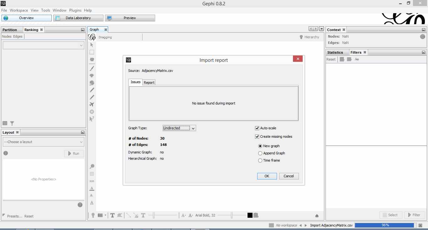
Figure 3: Gephi import feedback
Once that is done, click on overview (top left of the screen). You should end up with something like Figure 4.
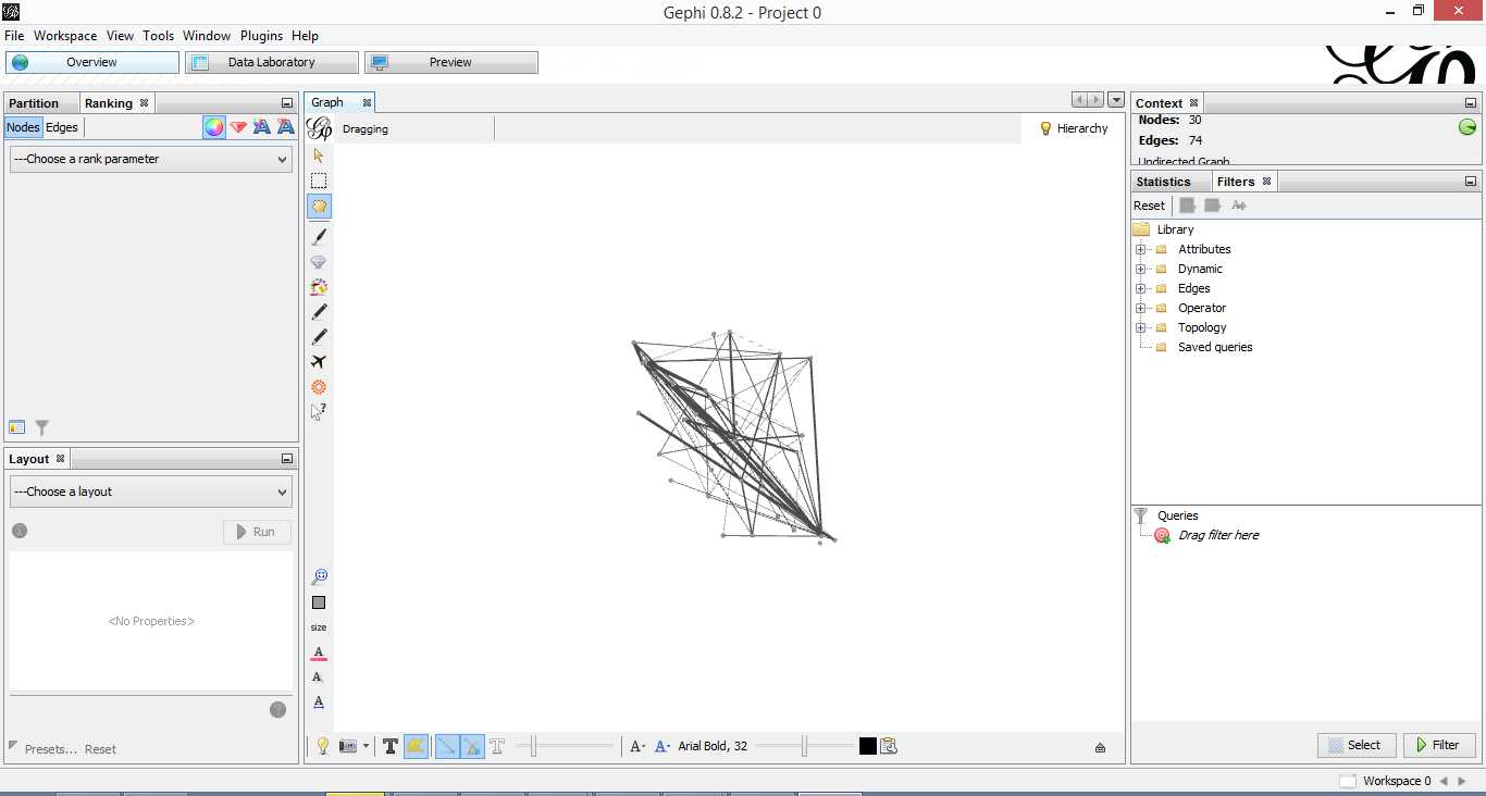
Figure 4: Initial overview after loading adjacency matrix
Gephi has sketched out an initial network diagram which depicts the relationships between documents…but it needs a bit of work to make it look nicer and more informative. The quickstart tutorial mentioned earlier describes various features that can be used to manipulate and prettify the graph. In the remainder of this section, I list some that I found useful. Gephi offers many more. Do explore, there’s much more than I can cover in an introductory post.
First some basics. You can:
- Zoom and pan using mouse wheel and right button.
- Adjust edge thicknesses using the slider next to text formatting options on bottom left of main panel.
- Re-center graph via the magnifying glass icon on left of display panel (just above size adjuster).
- Toggle node labels on/off by clicking on grey T symbol on bottom left panel.
Figure 5 shows the state of the diagram after labels have been added and edge thickness adjusted (note that your graph may vary in appearance).

Figure 5: graph with node labels and adjusted edge thicknesses
The default layout of the graph is ugly and hard to interpret. Let’s work on fixing it up. To do this, go over to the layout panel on the left. Experiment with different layouts to see what they do. After some messing around, I found the Fruchtermann-Reingold and Force Atlas options to be good for this graph. In the end I used Force Atlas with a Repulsion Strength of 2000 (up from the default of 200) and an Attraction Strength of 1 (down from the default of 10). I also adjusted the figure size and node label font size from the graph panel in the center. The result is shown in Figure 6.

Figure 6: Graph after using Force Atlas layout
This is much better. For example, it is now evident that document 9 is the most connected one (which table 9 tells us is a transcript of a conversation with Neil Preston on organisational change).
It would be nice if we could colour code edges/nodes and size nodes by their degree of connectivity. This can be done via the ranking panel above the layout area where you’ve just been working.
In the Nodes tab select Degree as the rank parameter (this is the degree of connectivity of the node) and hit apply. Select your preferred colours via the small icon just above the colour slider. Use the colour slider to adjust the degree of connectivity at which colour transitions occur.
Do the same for edges, selecting weight as the rank parameter(this is the degree of similarity between the two douments connected by the edge). With a bit of playing around, I got the graph shown in the screenshot below (Figure 7).

Figure 5: Connectivity-based colouring of edges and nodes.
If you want to see numerical values for the rankings, hit the results list icon on the bottom left of the ranking panel. You can see numerical ranking values for both nodes and edges as shown in Figures 8 and 9.

Figure 8: Node ranking (see left of figure)

Figure 9: Edge ranking
It is easy to see from the figure that documents 21 and 29 are the most similar in terms of cosine ranking. This makes sense, they are pieces in which I have ranted about the current state of enterprise architecture – the first article is about EA in general and the other about the TOGAF framework. If you have a quick skim through, you’ll see that they have a fair bit in common.
Finally, it would be nice if we could adjust node size to reflect the connectedness of the associated document. You can do this via the “gem” symbol on the top right of the ranking panel. Select appropriate min and max sizes (I chose defaults) and hit apply. The node size is now reflective of the connectivity of the node – i.e. the number of other documents to which it is cosine similar to varying degrees. The thickness of the edges reflect the degree of similarity. See Figure 10.

Figure 10: Node sizes reflecting connectedness
Now that looks good enough to export. To do this, hit the preview tab on main panel and make following adjustments to the default settings:
Under Node Labels:
1. Check Show Labels
2. Uncheck proportional size
3. Adjust font to required size
Under Edges:
1. Change thickness to 10
2. Check rescale weight
Hit refresh after making the above adjustments. You should get something like Fig 11.

Figure 11: Export preview
All that remains now is to do the deed: hit export SVG/PDF/PNG to export the diagram. My output is displayed in Figure 12. It clearly shows the relationships between the different documents (nodes) in the corpus. The nodes with the highest connectivity are indicated via node size and colour (purple for high, green for low) and strength of similarity is indicated by edge thickness.
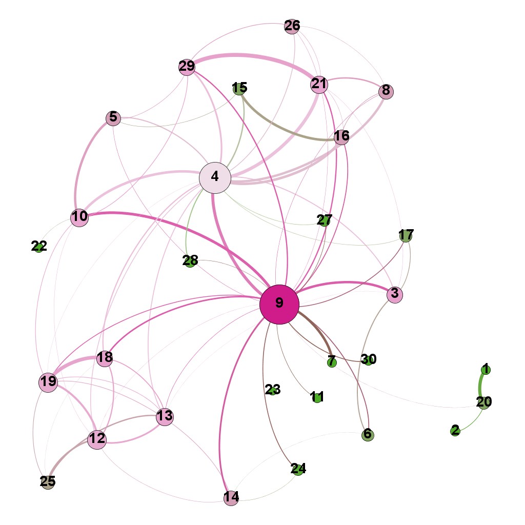
Figure 12: Gephi network graph of document corpus
…which brings us to the end of this journey.
Wrapping up
The techniques of text analysis enable us to quantify relationships between documents. Document similarity is one such relationship. Numerical measures are good, but the comprehensibility of these can be further enhanced through meaningful visualisations. Indeed, although my stated objective in this article was to provide an introduction to creating network graphs using Gephi and R (which I hope I’ve succeeded in doing), a secondary aim was to show how document similarity can be quantified and visualised. I sincerely hope you’ve found the discussion interesting and useful.
Many thanks for reading! As always, your feedback would be greatly appreciated.
Written by K
December 2, 2015 at 7:20 am
Posted in Data Analytics, Data Science, Data Visualization, R, Statistics, Text Analytics
Tagged with Data Visualization, Network Graphs
Search
Author
Copyright

My book

Top Posts & Pages
- A gentle introduction to logistic regression and lasso regularisation using R
- The effect of task duration correlations on project schedules - a study using Monte Carlo simulation
- The drunkard’s dartboard: an intuitive explanation of Monte Carlo methods
- The system and the lifeworld: a note on the gap between work and life
- Boundaries and horizons
- Newton's apple and Einstein's photons: on the role of analogy in human cognition
- Cox’s risk matrix theorem and its implications for project risk management
- The Heretic's Guide to Best Practices
- Some perspectives on quality
- A gentle introduction to text mining using R
Recent Posts
- Analogy, relevance realisation and the limits of AI
- Newton’s apple and Einstein’s photons: on the role of analogy in human cognition
- Meditations on change
- On the anticipation of unintended consequences
- The Shot Tower – reflections on surprise and serendipity
Categories
- AI
- AI Fiction
- Argumentation
- Best Practice
- Bias
- Book Review
- Business Fables
- Business Intelligence
- Causality
- Communication
- Consulting
- Corporate IT
- Data Analytics
- Data Science
- Data Visualization
- Decision Making
- Design Rationale
- Dialogue Mapping
- Emergent Design
- Enterprise Architecture
- Estimation
- General Management
- Issue Based Information System
- Issue Mapping
- IT Management
- Knowledge Management
- Leadership
- Limericks
- Management
- Metalogues
- mismanagement
- Monte Carlo Simulation
- Organizational Culture
- Organizational Paradoxes
- Organizations
- Paper Review
- People Management
- Personal
- portfolio management
- Power Laws
- Predictive Analytics
- Probability
- Project Management
- R
- Risk analysis
- Sensanalytics
- Sensemakers
- sensemaking
- Statistics
- Systems Thinking
- Tacit Knowledge
- Text Analytics
- Text Mining
- Understanding AI
- Verse
- Wicked Problems
- Writing
Archives
- September 2025
- August 2025
- May 2025
- February 2025
- December 2024
- November 2024
- October 2024
- September 2024
- July 2024
- June 2024
- May 2024
- December 2023
- November 2023
- October 2023
- September 2023
- August 2023
- June 2023
- May 2023
- April 2023
- January 2023
- November 2022
- October 2022
- May 2022
- January 2022
- October 2021
- September 2021
- June 2021
- May 2021
- March 2021
- December 2020
- May 2020
- February 2020
- January 2020
- October 2019
- September 2019
- May 2019
- February 2019
- January 2019
- December 2018
- July 2018
- June 2018
- March 2018
- February 2018
- December 2017
- November 2017
- October 2017
- September 2017
- July 2017
- April 2017
- March 2017
- February 2017
- January 2017
- December 2016
- October 2016
- September 2016
- July 2016
- June 2016
- May 2016
- March 2016
- February 2016
- January 2016
- December 2015
- November 2015
- October 2015
- September 2015
- August 2015
- July 2015
- June 2015
- May 2015
- April 2015
- March 2015
- February 2015
- January 2015
- December 2014
- November 2014
- October 2014
- September 2014
- August 2014
- July 2014
- June 2014
- May 2014
- April 2014
- March 2014
- February 2014
- January 2014
- December 2013
- November 2013
- October 2013
- September 2013
- August 2013
- July 2013
- June 2013
- May 2013
- April 2013
- March 2013
- February 2013
- January 2013
- December 2012
- November 2012
- October 2012
- September 2012
- August 2012
- July 2012
- June 2012
- May 2012
- April 2012
- March 2012
- February 2012
- January 2012
- December 2011
- November 2011
- October 2011
- September 2011
- August 2011
- July 2011
- June 2011
- May 2011
- April 2011
- March 2011
- February 2011
- January 2011
- December 2010
- November 2010
- October 2010
- September 2010
- August 2010
- July 2010
- June 2010
- May 2010
- April 2010
- March 2010
- February 2010
- January 2010
- December 2009
- November 2009
- October 2009
- September 2009
- August 2009
- July 2009
- June 2009
- May 2009
- April 2009
- March 2009
- February 2009
- January 2009
- December 2008
- November 2008
- October 2008
- September 2008
- August 2008
- July 2008
- June 2008
- May 2008
- April 2008
- March 2008
- February 2008
- January 2008
- December 2007
- November 2007
- October 2007
- September 2007
Blogroll
- Craig Brown
- Glen Alleman
- Nicholas Carr
- Paul Culmsee
- Ricardo Guido Lavalle
- Scott McCrickard
- Tim van Gelder
- Toby Elwin
Other links
- Australian Financial Review article on "The Heretic's Guide to Management"
- Book Excerpt – Platitudes in Organizations
- DataCamp course on support vector machines
- Eight to Late featured in oDesk's Top 25 PM Blogs
- Eight to Late in Capterra's list of 58 Most "Insanely Useful" Project Management Blogs
- Interview – Smart Company (w/ Paul Culmsee)
- Uncertainty in The Workplace – ABC Radio interview /w Richard Aedy
-
Subscribe
Subscribed
Already have a WordPress.com account? Log in now.
