|
|
|
| CARVIEW |
Lionel needs a fun and visually inspiring way to easily and quickly find inexpensive and personalized gifts for his clients so that he can show them that he understands them, as well as their needs/wants.
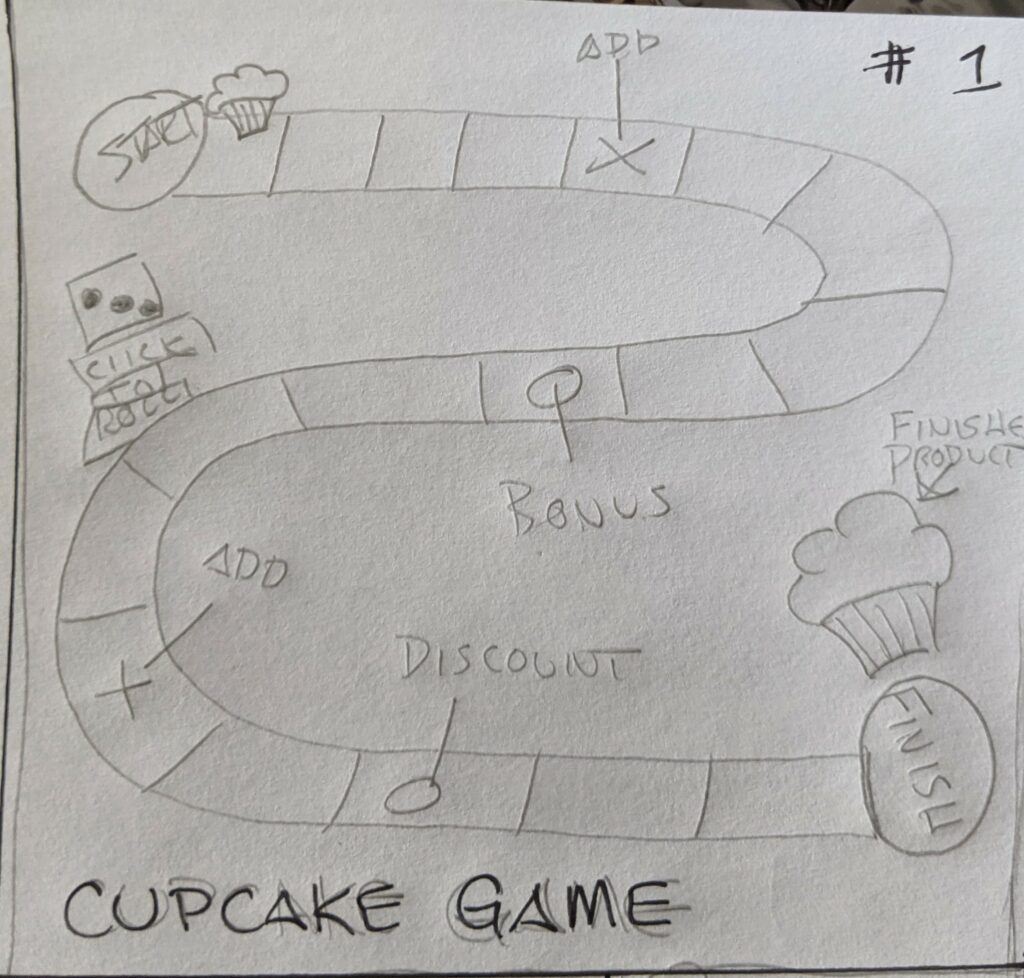
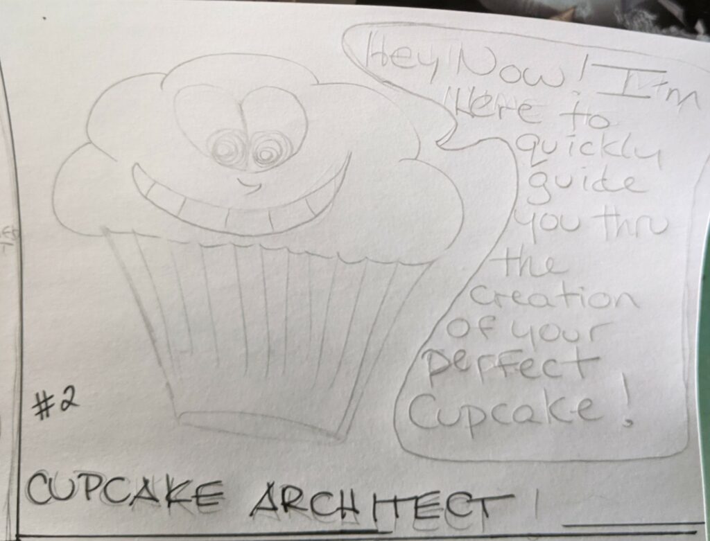
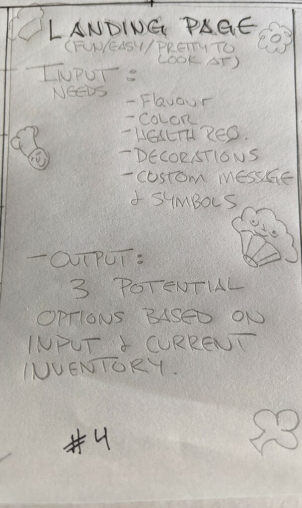
Sketches:
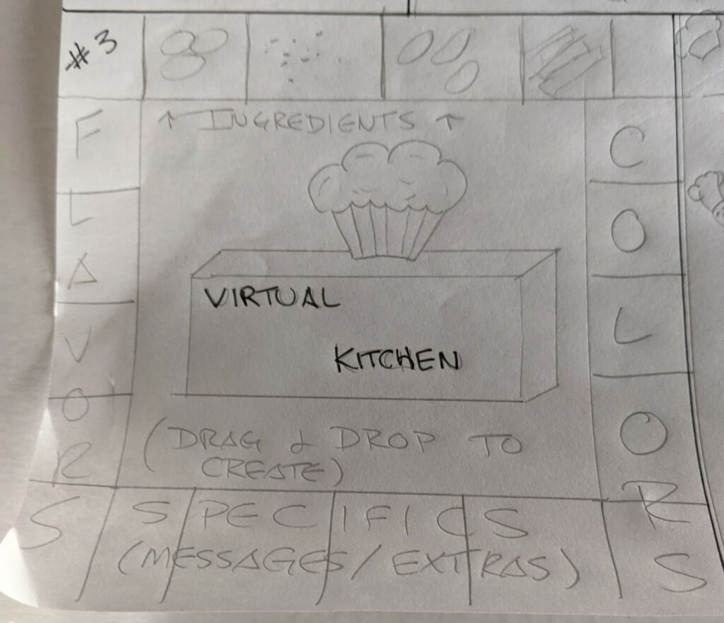
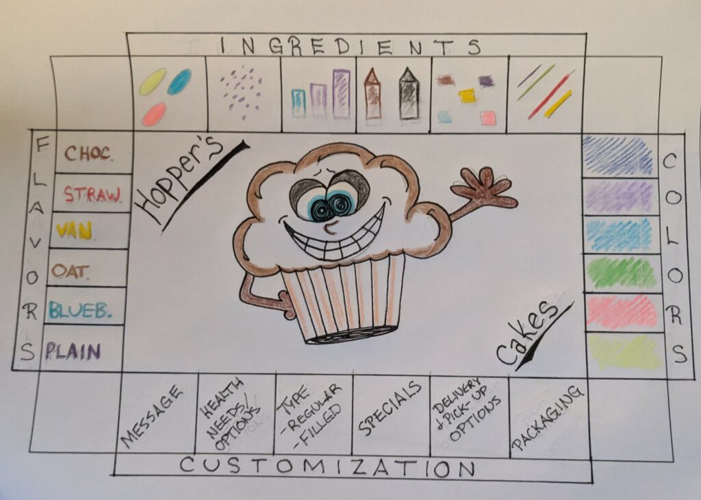
Final Sketch (Combination of sketches #2 and #3):
Communication Strategy:
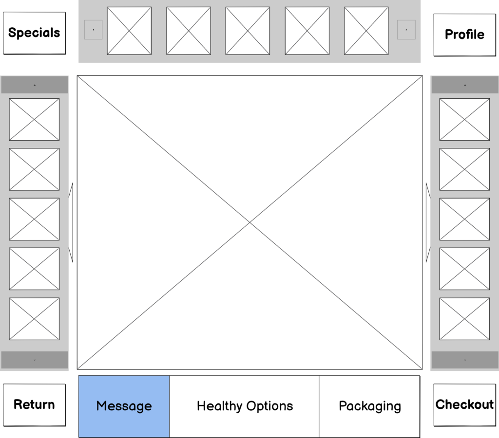
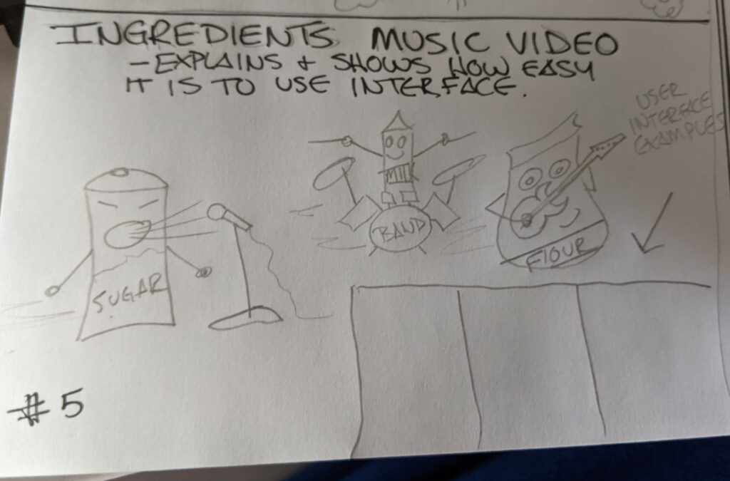
When you open the app you will be brought directly to the fun and interactive “Hooper’s Cakes” kitchen, where Cooper the Cupcake Architect will help walk you through the interface so you can quickly and easily design your perfect cupcake.
The app will be designed so you can simply drag and drop desired items from the slots around the cupcake. As you add items, Cooper’s visuals will change to reflect your choices, and let you see your ongoing progress. To make changes, you can drag unwanted items off of the cupcake to easily mix and match until you are satisfied with the cupcake.
Once the cupcake creating is complete, new users will be presented with the option of being directed to a page to create a quick profile to ensure the app remembers your preferences upon return to the app. (I chose to design the cupcake before completing the profile as I want new users to enjoy the process, visuals, and completed cupcake so much that they won’t mind the quick profile stop.) Once complete, you will be directed to the checkout area.
Returning users will be taken to the checkout page where their current order details will be displayed, allowing them to make any last minute changes, and then confirm and complete their order.
]]>-Fully ideate the final product – how it will function, how it will look
-Create branding for the product – including a logo and complete style guide
-Provide status reports to executives
-Manage project scope.
2. UX Designer Responsibilities (Team Member#2)
-Create wireframes (which show what will be on each page in the app) and prototypes (interactive drafts of the app that people can try out)
-Conduct user testing with a group of pilot participants to find out if the app is easy to use and solves the problems you think it should solve
-Design the final prototypes to pass to the person who will code the app
3. Tech Lead Responsibilities (Team Member #3)
-Code the front of the app (what the user sees and interacts with in the browser)
-Code the back end of the app (creates a database to pull content about different flight locations, utilizes API’s for weather and other information, etc)
-Maintaining a productive working environment for development teams
Acquiring appropriate budget for development to support business goals
4. Marketing Director (Team Member #4)
-Come up with a digital marketing plan that includes ads, social media marketing and more
-Develop and implement an SEO strategy
-Stay up to date with the latest technology and best practices
-Research competition, investigate benchmarks and provide suggestions for improvement
5. Content Developer (Team Member #5)
-Create written content for all marketing
-Create assets for all marketing and branding
-Work closely with Marketing Director to ensure all content and assets are appropriate and adequate to efficiently and accurately represent and meet all needs of the client.
]]>Bit is a great tool for remote teams, as it will bring all of our company documentation, media, files and knowledge to one accessible place. We can collaborate on interactive digital workplace documents and access all of our digital content from Google Spreadsheets to Airtable Databases. Also, Bit will allow our team to save and access any type of digital content we add to our documents or workspaces for the purpose of easy re-use.
3. Version Control: BEANSTALK
I feel like BEANSTALK will be a great option for our team, as I believe we will be doing a fair amount of outsourcing, as well as the added functionality BEANSTALK brings by allowing the use of both browser and cloud. As it is easy to use and can integrate with any messaging or email platforms, I feel like its perfect for us. BEANSTALK provides excellent encryption, can cater to any team size, and will keep us well informed during deployment with its “release note” feature.
4. Prototyping: Justinmind
Justinmind will likely be the best prototyping tool for us, as it is an all-in-one tool that will help us build wireframes to prototypes without any coding. Justinmind specializes in building exceptional user experiences, by letting you design from scratch while accessing a huge range of web interactions and mobile gestures. Ensuring that our designs adapt to fit multiple screen resolutions, prototyping smart forms and data lists without coding, and providing regularly updated UI kits for web and mobile are just some of the ways it will benefit our team.
5. Time Tracking: Hubstaff
This is a very easy to use solution for us, and probably my first choice for our team. Hubstaff works very well for remote teams as it offers some employee monitoring capabilities, and makes its time tracking apps available for all major platforms which is key to the success of our team. Many features work online, but this software will also allow us to work offline as well!
6. Project Management: Basecamp
Basecamp is definitely my first choice for a Project Management option for this team. Its simple, easy to use, easy to understand, and just works. Not only is it flexible and reasonably priced, but it integrates with a wide variety of other services that will greatly benefit us. Basecamp has been around since 2004, and has a commanding handle on what it takes to be effective when it comes to remote project management. The best part of all is that Teachers and Students can use Basecamp for free!
7. Code Testing: Atom
Aside from having one of the most visually pleasing home pages, Atom is an amazing choice for us. Atom is to GitHub, what Visual Studio Code is to Microsoft. While these two options are very similar, Atoms Material UI has taken it one step ahead of Visual Studio Code on the design front. Atom uses an extension-based approach to almost everything. I feel that we can live with the slight lag in performance, as we will benefit more from the vast amount of flexibility the plug-ins will allow us.
8. Digital Marketing Analytics: Google Analytics
Being one of the most used saas tools around the world when it comes to remote work, I believe this is the answer for us. It is a great tool for gaining user insights and performance analysis, boasting features such as; analytics Intelligence, user interaction tracking, data visualization, detailed reporting, and time on site tracking. Google Analytics is a freemium solution for us, and will even allow our team to examine advertising ROI, social networking site, video, as well as applications running on site.
9.SEO: Google Search Console
Definitely my first choice for our team, Google Search Console will be extremely beneficial to us. GSC lets us monitor how our website appears on Google search results. We can see what queries our web pages appear for, and how often people click through to our site. It will allow us to check that our site is indexing correctly, fix problems and request re-indexing, as well as send alerts when Google has a problem with our site. I almost forgot to mention, it is completely free to use. If you have a site, you qualify for an account!
10. Page Speed Testing: Google PageSpeed Insights
This tool will provide us with suggestions to improve LCP, and confirm whether our site passes the Core Web Vitals test. The provided tools will display the total LCP, FCP, the time to interact, and the full blocking time. Basically, it will analyze the content of a web page, and then give us numerous suggestions as to how to make the page faster. It is fast, free, easy to use, and the obvious choice for our new team!
]]>After completing the page audit I have determined that while the page could be improved, it is in fact meeting accessibility standards.
Cognitive Load:
-The content has been grouped and chunked in a way that makes it very clear for the user to understand. The first thing you see is a clear explanation as to what is being offered, followed by relevant sub-categories with follow-up information. Hierarchy is clearly communicated through the use of a well developed pyramidal structure. Anchors are consistently used to allow the reader to skip about if they so choose, but not in a way that might add to confuse.
Language Usage:
-The page is very long, which goes against keeping it short and sweet, but is a necessary trade off to meet some cognitive needs I believe. The information would be no good if not everyone could read it. It is honest and does not deceive, doesn’t confuse by using different languages, and offers clear explanations. I feel that this area has been covered quite well with this page. I did find some Grammar mistakes and missed words that may cause confusion with a small amount of people, but nothing that creates confusion.
Color:
-I did not see any major “no-no’s” here, such as using only hue or saturation to convey information or indicate action, or any difficult to read text. I do think that the color options could be re-visited though. Black type on a white background can be difficult on the eyes. An off-white or a tan background might be a more suitable choice. Also, some of the headings are in a dark blue font with a black paragraph, whereas others have a black heading with a dark blue font. I am not sure where this sits as far as importance goes, but it is definitely not consistent. That being said, I found the way the font is reversed in the contact form area to be much easier on the eyes.
Typography:
-I think the choices here are very good. The typeface is clear and easy to read, the font size is all up to par, nothing is too small to read and all choices meet the minimum requirements as far as “stroke” and “X height” are concerned. Font size is all 16pt and above, spacing is sufficient, and line length is well under 100 characters.
For the score out of 5, I’ve scored each category individually as follows:
Perceivable 3/5:
-The contrast on the site is clear and the choice of typeface does not create confusion, but could be even better with an off white or tan background. If there is a way for users to select visual or audio preferences, I was unable to find it. Overall I found the site to be perceivable yes, but with room for improvements.
Understandable 4/5:
-The Interface Elements are clear and consistent, I believe most people would be able to understand without issue. Its made quite clear where you are and what you can do while on the page. Language is plainly used, I didn’t see any abbreviations or confusing acronyms. The text has all been broken up really well with clear headings and small sections, however, I did find some minor Grammatical errors, and a few missed words.
Operable 5/5:
-I found the landing page to be very efficient in this category. The page interface is simple and easy to use and understand. Links are accessible from a keyboard, and all clickable targets are big and easy to get at. The titles are clear, and the use of hierarchy makes the site easy to navigate.
Robust 4/5:
The page has done very well in this category also. Semantic HTML is used, as well as an extra layer of SSL to ensure security. The page functions perfectly on a mobile device, and is accessible for a vast many different browser types.
SUMMARY
Based on the previous observations, for an overall score I would give this page a 4/5.
As far as its accessibility challenges are concerned, I would rate this page as Minor. While I was able to find some areas for improvement that are technically issues, i.e. grammar errors, minor contrast issues, an inability to choose preferences etc., There are no areas that I believe will cause problems for people.
Other than the absence of any type of audio recordings for people who are blind, there do not seem to be any major barriers for people with disabilities. I did not know how to add this in to the scoring system, as I am unsure if there are computer settings that will read text to people, or if it is up to the page/site to provide that.
]]>
Disney Plus is an American streaming service that distributes films and TV series produced by Walt Disney Studios. It was launched in November of 2019, and already has over 86 million users worldwide. It is basically the “all-Disney” version of Netflix, and generates income using a very similar subscription based model. Users pay a monthly fee in order to enjoy access to all content with the option of various upgrades, that of course in turn cost more money. Disney+ was very well received due to its affordable prices and extensive content, which among many others includes both the Marvel, and Star Wars franchises in their entirety.
]]>DocuSign is an SaaS based e-signature transaction management service that was founded in 2003. Based out of San Francisco, DocuSign has over 500,000 customers as well as hundreds of millions of users worldwide. It allows people to send, sign, and manage legally binding documents. DocuSign offers limited access to users as a “loss leader” in order to spark interest, then provides full access to all features upon subscribing. It does not make money by charging the users who sign the documents, but rather the correlative entities that initiate the contracts.
]]>DeviantArt is a community art display/social networking service featuring artwork, videography, and photography. Launched in 2000, the site is considered a “peer evaluation application” as it facilitates users to leave comments and critiques on other individuals work. It is a free-to-use site that offers users further service if they purchase a subscription. These services include an ad free experience, the ability to post artwork, as well as access to numerous personalization features. DeviantArt primarily generates income through advertising in the form of banner and page ads. These ads are image based, embedded into a web page, and are a very popular form of website advertising.
]]>