 @zoltandulac
 @zoltandulac
 Zoltan Hawryluk
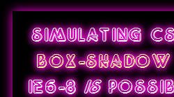 Using CSS3, developers can create simple, glowing and blurred box-shadows in all modern web browsers. But what about IE6-8? This article will discuss how you can simulate them using a variety of Visual Filters to simulate them. This article will cover a few CSS3 box-shadow effects, the equivalent Visual Filter recipes for IE 6-8, and the differences between them.
| CARVIEW |
Select Language
HTTP/2 200
content-type: text/html; charset=UTF-8
x-ws-ratelimit-limit: 1000
x-ws-ratelimit-remaining: 999
date: Sat, 11 Oct 2025 02:14:48 GMT
server: Apache
x-powered-by: PHP/8.3.26
link: ; rel="alternate"; title="JSON"; type="application/json"
content-encoding: gzip
box-shadow
Skip to Main Content
Skip to Main Navigation
How to Simulate CSS3
User Agent Man ·
Discoveries of a Client Side Web Developer
Categories
Entries Tagged as 'box-shadow'
How to Simulate CSS3 box-shadow in IE6-8 Without JavaScript.
August 24th, 2011 by zoltan · 35 Comments
Tags: box-shadow · CSS3 · IE Visual Filters
Cross Browser CSS Transforms – even in IE
March 9th, 2010 by zoltan · 127 Comments
The CSS transform property allows developers to rotate, scale, and skew blocks of HTML via CSS. There are variants that work natively on all major browsers … except for IE. I created a new library, cssSandpaper, that implements CSS3 transforms (as well as gradients and box-shadows) in IE. It also allows developers to use one transform declaration, instead of three vendor-specific ones for Opera, Firefox and WebKit browsers.
Tags: box-shadow · CSS · CSS3 · gradients · IE Visual Filters · JavaScript · Polyfills · transform
© 2009 - 2025 — Zoltan "Du Lac" Hawryluk