Adding Partial Horizontal Lines with ggplot2 in R
Last Updated :
14 Jan, 2025
Visualizing data effectively often requires emphasizing specific aspects or values. In ggplot2, horizontal lines help highlight thresholds, averages, or other reference values. While geom_hline() allows adding full horizontal lines across the entire plot, there are situations where you may want to draw partial horizontal lines that span only a portion of the graph.
This article will provide a complete guide on how to add and customize partial horizontal lines using ggplot2 in R.
Understanding Horizontal Lines in ggplot2
In ggplot2, the function to add horizontal lines is geom_hline(). This is useful when we want a straight horizontal line at a particular y-value, spanning the full width of the plot.
Example:
R
library(ggplot2)
# Create a basic scatter plot
p <- ggplot(mtcars, aes(x = wt, y = mpg)) +
  geom_point()
# Add a full-width horizontal line at y = 20
p + geom_hline(yintercept = 20, color = "red")
Output:
 Basic Example
How to Adding a Partial Horizontal Lines?
To draw partial horizontal lines, we can use the geom_segment() function. This function allow us to specify the starting and ending points for both the x and y coordinates. This way, we can control how long the horizontal line should be.
Example:
Now add a horizontal line that starts from an x-value of 2.5 and ends at 4.5, at a y-value of 20.
R
library(ggplot2)
# Create a scatter plot with a partial horizontal line
p <- ggplot(mtcars, aes(x = wt, y = mpg)) +
  geom_point() +
  geom_segment(aes(x = 2.5, xend = 4.5, y = 20, yend = 20),
               color = "blue", size = 1.2)
# Display the plot
p
Output:
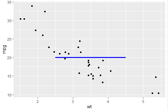 Add a partial hotrizontal line
 Here,
x = 2.5 and xend = 4.5 define the start and end x-coordinates for the line.y = 20 and yend = 20 specify that the line should stay at a constant y-value of 20.- The
color and size arguments control the appearance of the line.
Customizing the Line
We can adjust the appearance of the line by modifying the color and size arguments.
R
library(ggplot2)
p <- ggplot(mtcars, aes(x = wt, y = mpg)) +
  geom_point() +
  geom_segment(aes(x = 1.5, xend = 4, y = 15, yend = 15),
               color = "green", size = 2)
p
Output:
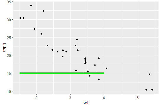 Customize the line
Adding Multiple Partial Horizontal Lines
Now we add multiple partial horizontal lines to the plot.
R
library(ggplot2)
p <- ggplot(mtcars, aes(x = wt, y = mpg)) +
  geom_point() +
  geom_segment(aes(x = 2, xend = 5, y = 10, yend = 10), color = "purple") +
  geom_segment(aes(x = 3, xend = 4, y = 25, yend = 25), color = "orange")
p
Output:
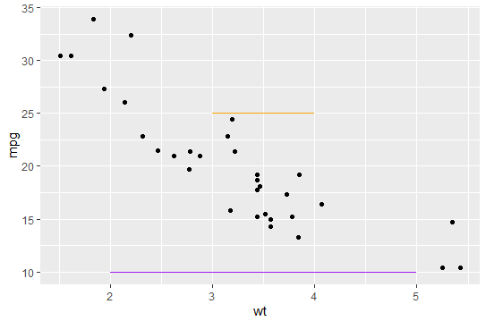 Adding multiple line
Dynamic Partial Lines Using Data
Instead of hardcoding the x and y values for the partial lines, we can add dynamic lines based on our data.
R
library(ggplot2)
# Data frame with line coordinates
line_data <- data.frame(x = c(2, 3), xend = c(4, 5), y = c(18, 25), yend = c(18, 25))
# Create the plot
p <- ggplot(mtcars, aes(x = wt, y = mpg)) +
  geom_point() +
  geom_segment(data = line_data, aes(x = x, xend = xend, y = y, yend = yend),
               color = "red", size = 1)
p
Output:
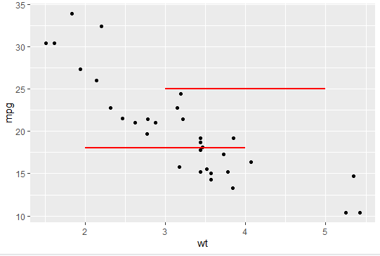 Dynamic Partial Line
Using Conditional Partial Horizontal Lines
In certain scenarios, we may want to add horizontal lines conditionally, based on specific conditions in the dataset.
R
library(ggplot2)
p <- ggplot(mtcars, aes(x = wt, y = mpg)) +
  geom_point()
# Add partial lines conditionally
p + geom_segment(data = subset(mtcars, mpg > 20),
                 aes(x = 2, xend = 4, y = mpg, yend = mpg),
                 color = "blue")
Output:
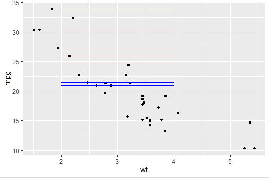 Add conditional partial horizontal line
 Combining Partial Horizontal Lines with Other Layers
Since ggplot2 is a layer-based system, we can combine partial horizontal lines with other layers like vertical lines, shaded regions, or annotations to create more informative visualizations.
R
library(ggplot2)
p +
  geom_segment(aes(x = 2, xend = 4, y = 20, yend = 20), color = "blue") +
  geom_vline(xintercept = 3, color = "red", linetype = "dotted", size = 1)
Output:
 Combine with other layers
Practical Use Cases
- Threshold Marking: Highlighting specific cut-off points in data, such as pass/fail thresholds in exam scores.
- Control Charts: Indicating control limits (upper and lower bounds) in quality control charts.
- Comparative Analysis: Showing specific values like mean, median, or target values only for a subset of data points.
- Annotated Visualizations: Using partial lines to emphasize key data segments in presentations or reports.
Partial horizontal lines in ggplot2 are a useful tool for enhancing data visualizations by highlighting specific values or regions. While geom_hline() draws full-width lines, geom_segment() allows for precise control over where a line starts and ends on the x-axis. This flexibility makes it possible to add lines that emphasize key parts of a plot.