How to plot on secondary Y-Axis with Plotly Express in Python?
Last Updated :
23 Jul, 2025
Perquisites: Python Plotly
In this article, we will learn how to plot on secondary y-Axis with plotly express.
One of the most deceptively-powerful features of Plotly data visualization is the ability for a viewer to quickly analyze a sufficient amount of information about data when pointing the cursor over the point label appears. It provides us the easiest way to read and analyze information from the document. Multi-Axis charts are used to plot data points from a query along two or more axes. Here we will discuss different methods to plot multiple y-axis in plotly express to make it more clear.
Syntax: yaxis=dict(title="yaxis title", overlaying="y", side="left", position=[0-1])
Parameters:
- title: str, (name of the axis)
- overlaying: str, (name of the bars are plotted over one another)
- side: ['top', 'bottom', 'left', 'right']
- position: int/float, [in range between 0-1].
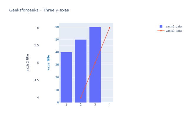
Example 1: Two Y-Axis
In this example, we are taking two data plots, the first one is Bar chart and another is a Scatter chart. Update_layout the properties of the figure’s layout with a dict and/or with keyword arguments, In which we will define consecutive secondary yaxis (i.e yaxis, yaxis2 ) with the help of the above-given syntax for each axis.
Python3
import plotly.graph_objects as go
fig = go.Figure()
fig.add_trace(go.Bar(x=[1, 2, 3], y=[40, 50, 60],
                     name="yaxis1 data", yaxis='y'))
fig.add_trace(go.Scatter(x=[2, 3, 4], y=[4, 5, 6],
                      name="yaxis2 data", yaxis="y2"))
# Create axis objects
fig.update_layout(xaxis=dict(domain=[0.3, 0.7]),
    #create 1st y axis
    yaxis=dict(
        title="yaxis title",
        titlefont=dict(color="#1f77b4"),
        tickfont=dict(color="#1f77b4")),

    #create 2nd y axis
    yaxis2=dict(title="yaxis2 title",overlaying="y",
                side="left",position=0.15))
# title
fig.update_layout(
    title_text="Geeksforgeeks - Three y-axes",
    width=800,
)
fig.show()
Output:
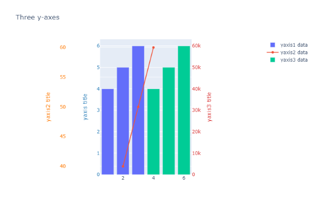
Example 2: Three Y-axis
In this example, we are taking three data plots, the first one is Bar chart and another is a Scatter chart and the last one is another Bar Chart. Update_layout the properties of the figure’s layout with a dict and/or with keyword arguments. In which we will define consecutive secondary y-axis (i.e yaxis, yaxis2, yaxis3... ) with the help of the above-given syntax for each axis
Python3
import plotly.graph_objects as go
fig = go.Figure()
fig.add_trace(go.Bar(x=[1, 2, 3], y=[4, 5, 6],
                     name="yaxis1 data", yaxis='y'))
fig.add_trace(go.Scatter(x=[2, 3, 5], y=[40, 50, 60],
                         name="yaxis2 data", yaxis="y2"))
fig.add_trace(go.Bar(x=[4, 5, 6], y=[40000, 50000, 60000],
                     name="yaxis3 data", yaxis="y3"))
# Create axis objects
fig.update_layout(xaxis=dict(domain=[0.3, 0.7]),
                  # create 1st y axis
                  yaxis=dict(
    title="yaxis title",
    titlefont=dict(color="#1f77b4"),
    tickfont=dict(color="#1f77b4")),
    # create 2nd y axis
    yaxis2=dict(title="yaxis2 title", overlaying="y",
                side="left", position=0.15),
    # create 3rd y axis
    yaxis3=dict(
        title="yaxis3 title",
        anchor="x", overlaying="y", side="right"))
# title
fig.update_layout(
    title_text="Geeksforgeeks - Three y-axes",
    width=800,
)
fig.show()
Output:
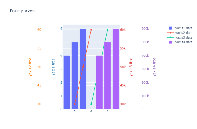
Example 3: Four Y-axis
In this example, we are taking two data plots of Bar charts and two plots of Scatters charts. Update_layout the properties of the figure’s layout with a dict and/or with keyword arguments. In which we will define consecutive secondary y-axis (i.e yaxis, yaxis2, yaxis3, yaxis4 ) with the help of above-given syntax for each axis
Python3
import plotly.graph_objects as go
fig = go.Figure()
fig.add_trace(go.Bar(x=[1, 2, 3], y=[4, 5, 6],
                     name="yaxis1 data"))
fig.add_trace(go.Scatter(x=[2, 3, 4], y=[40, 50, 60],
                         name="yaxis2 data", yaxis="y2"))
fig.add_trace(go.Scatter(x=[4, 5, 6],
                         y=[40000, 50000, 60000],
                         name="yaxis3 data", yaxis="y3"))
fig.add_trace(go.Bar(
    x=[5, 6, 7], y=[400000, 500000, 600000],
    name="yaxis4 data", yaxis="y4"))
# Create axis objects
fig.update_layout(
    xaxis=dict(
        domain=[0.3, 0.7]
    ),
    yaxis=dict(
        title="yaxis title", titlefont=dict(color="#1f77b4"),
        tickfont=dict(color="#1f77b4")),
    yaxis2=dict(
        title="yaxis2 title",
        titlefont=dict(color="#ff7f0e"),
        tickfont=dict(color="#ff7f0e"),
        anchor="free", overlaying="y",
        side="left", position=0.15),
    yaxis3=dict(
        title="yaxis3 title",
        titlefont=dict(color="#d62728"),
        tickfont=dict(color="#d62728"),
        anchor="x", overlaying="y", side="right"),
    yaxis4=dict(
        title="yaxis4 title",
        titlefont=dict(color="#9467bd"),
        tickfont=dict(color="#9467bd"),
        anchor="free", overlaying="y",
        side="right", position=0.85)
)
# Update layout properties
fig.update_layout(
    title_text="Four y-axes",
    width=800,
)
fig.show()
Output: