How to Add Line Breaks to Plotly Hover Labels in R
Last Updated :
23 Jul, 2025
Plotly is a powerful library for R, which can provide interactive visualizations. One of the most useful features is the ability to hover labels, showing additional information when hovering over data points. However, displaying the long or complex hover text can become cluttered. To make the hover labels more readable, we can insert the line breaks. This article will guide you on how to add the line breaks to the hover labels in the Plotly in R.
Understanding the Hover Labels in Plotly
In Plotly, hover labels are the small pop-up boxes that appear when you hover the mouse over the data point on the plot. These labels can contain information such as the data point's value, its coordinates, and other customized text. Plotly can allow for the high customization of these labels, including the line breaks for improved readability.
Inserting Line Breaks in Hover Labels
To insert the line breaks in the hover labels in the Plotly, we can use the HTML's <br> tag. When specifying the text for the hover label, we can insert the <br> tag wherever you want to create the new line. In Plotly, this can be done using the hoverinfo and text parameters when constructing the plot, or by setting the hover template for the more advanced customization. The <br> tag can ensures that the text after the tag will appear on the new line within the hover label.
Customizing the Hover Labels
We can further customize the hover labels by modifying the attributes such as:
- Font Size: Using the hoverlabel = list(font = list(size = 14)) to change the font size.
- Background color: With the hoverlabel = list(bgcolor = 'red') to change the border color of the label.
- Border Color: Use the hoverlabel = list(bordercolor = 'yellow') to change the border color of the label.
Now we will discuss Step by step implementation to add the line breaks to Plotly hover labels in R Programming Language.
Step 1: Install and Load the Plotly Library
To create the interactive plots, we will need to install and load the Plotly library in the R.
R
# Install Plotly if you haven't already
install.packages("plotly")
# Load Plotly library
library(plotly)
Step 2: Create the Sample Data
Create the data frame with sample data for the plotting. In this example, we will use the two numerical columns(x and y) and categorical column (category).
R
# Sample data frame
data <- data.frame(
  x = c(1, 2, 3, 4, 5),    # x-axis values
  y = c(10, 15, 13, 17, 14), # y-axis values
  category = c("Category A", "Category B", "Category C", "Category D", "Category E")
)
Step 3: Create the Basic Scatter Plot
Now, we can create the simple scatter plot using the plot_ly() function. This will plot the points without the any hover customization.
R
# Basic scatter plot
plot <- plot_ly(data, x = ~x, y = ~y, type = 'scatter', mode = 'markers')
# Display the plot
plot
Output:
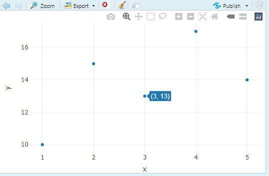 Create the Basic Scatter Plot
Step 4: Add the Hover Labels with Line Breaks
To add the custom hover labels with line breaks, we can use the text argument inside the plot_ly() function. We will use the paste() function in R to combine the hover text, and insert the <br> tags to create the line breaks.
R
# Scatter plot with hover labels containing line breaks
plot <- plot_ly(data, x = ~x, y = ~y, type = 'scatter', mode = 'markers',
                text = ~paste("X Value:", x, "<br>Y Value:", y, "<br>Category:", category),
                hoverinfo = 'text')
plot
Output:
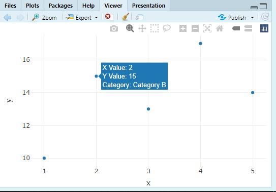 Add the Hover Labels with Line Breaks
- The text argument can defines the content of the hover label. Here, it can uses the paste() function to the concatenate strings (e.g., "X Value:", "Y Value:", and "Category:") with the corresponding the column values (x, y, category).
- The <br> tag can be used to insert the line break in the hover label between the each piece of the information.
- hoverinfo = 'text': It can ensures that the hover labels display only the custom text.
Step 5: Customize the Hover Labels
We can further the customize the appearance of the hover labels, such as changing the background color, border color, and font size.
R
# Customize hover labels
plot <- plot_ly(data, x = ~x, y = ~y, type = 'scatter', mode = 'markers',
                text = ~paste("X Value:", x, "<br>Y Value:", y, "<br>Category:", category),
                hoverinfo = 'text',
                hoverlabel = list(
                  bgcolor = 'lightblue',    # Background color of hover label
                  bordercolor = 'darkred', # Border color of hover label
                  font = list(size = 12)    # Font size of hover label text
                ))
# Display the plot
plot
Output:
 Customize the Hover Labels
- bgcolor: It can changes the background color of the hover label.
- bordercolor: It can changes the border color of the hover label.
- font: It can customize the font size for the hover label.
Conclusion
Adding the line breaks to hover the labels in the Plotly enhances the readability, especially when you need to display the multiple pieces of the information. By using the <br> HTML tag and customizing the hover labels appearance, we can make the interactive plots more user friendly and informative in the R.