Plotting Multiple X-Axes Using Plotly
Last Updated :
23 Jul, 2025
The Plotly is a versatile plotting library that enables the creation of the interactive and complex visualizations with the ease. One common requirement in the data visualization is displaying the multiple x-axes on the same subplot to the better compare and contrast different datasets or scales. This article will guide we through the steps needed to the show more than two x-axes titles/ranges on the same subplot using the Plotly in Python.
Understanding Plotly Subplots
Plotly is an open-source graphing library that makes interactive publication-quality graphs online supporting a wide range of the plotting functionalities from the basic line plots to the complex 3D charts.
Before diving into the specifics of multiple x-axes, it's important to understand how subplots work in Plotly. Subplots allow you to create multiple plots within the same figure, which can be arranged in various grid configurations. Each subplot can have its own set of axes, titles, and other customizations.
Why Multiple X-Axes?
Using the multiple x-axes in a single plot allows to:
- Compare datasets with the different x-axis ranges.
- Overlay different scales on the same plot.
- Provide the additional context or reference points.
Creating a Basic Plot with Multiple X-Axes
Let's start by creating a basic plot with multiple x-axes. We'll use the make_subplots function to create a subplot and then add multiple x-axes to it.
Step 1: Define Your Data
Start by defining the data that we want to the plot. Let's create a simple example with the three datasets.
Python
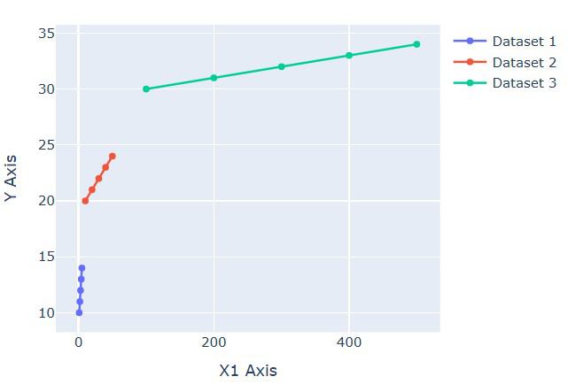
x1 = [1, 2, 3, 4, 5]
y1 = [10, 11, 12, 13, 14]
x2 = [10, 20, 30, 40, 50]
y2 = [20, 21, 22, 23, 24]
x3 = [100, 200, 300, 400, 500]
y3 = [30, 31, 32, 33, 34]
Step 2: Create Subplots
Use make_subplots to the create a subplot layout. In this example, we will use a single row with the three columns each sharing the y-axis but having the separate x-axes.
Python
fig = make_subplots(rows=1, cols=1)
Step 3: Add Traces
Add the data traces to the subplot. Each trace will be linked to the different x-axis.
Python
fig.add_trace(go.Scatter(x=x1, y=y1, name='Dataset 1'), row=1, col=1)
fig.add_trace(go.Scatter(x=x2, y=y2, name='Dataset 2', xaxis='x2'), row=1, col=1)
fig.add_trace(go.Scatter(x=x3, y=y3, name='Dataset 3', xaxis='x3'), row=1, col=1)
Step 4: Update Layout with Multiple X-Axes
Update the layout to the define and position the additional x-axes.
Python
fig.update_layout(
    xaxis=dict(
        title='X1 Axis',
        domain=[0, 1],
        anchor='y'
    ),
    xaxis2=dict(
        title='X2 Axis',
        domain=[0, 1],
        anchor='y',
        overlaying='x'
    ),
    xaxis3=dict(
        title='X3 Axis',
        domain=[0, 1],
        anchor='y',
        overlaying='x'
    ),
    yaxis=dict(
        title='Y Axis'
    )
)
fig.show()
Output:
Combining Multiple X and Y Axes
You can combine multiple x and y axes in the same plot to create complex visualizations. Here's an example:
Python
import plotly.graph_objects as go
from plotly.subplots import make_subplots
fig = make_subplots(specs=[[{"secondary_y": True}]])
fig.add_trace(go.Scatter(x=[1, 2, 3], y=[10, 11, 12], name="Trace 1"), secondary_y=False)
fig.add_trace(go.Scatter(x=[2, 3, 4], y=[20, 21, 22], name="Trace 2", xaxis='x2'), secondary_y=False)
fig.add_trace(go.Scatter(x=[3, 4, 5], y=[30, 31, 32], name="Trace 3", xaxis='x3'), secondary_y=False)
fig.add_trace(go.Scatter(x=[1, 2, 3], y=[40, 50, 60], name="Trace 4"), secondary_y=True)
fig.update_layout(
    xaxis=dict(domain=[0, 0.45], title_text="Primary X-Axis"),
    xaxis2=dict(domain=[0.55, 1], anchor='y', overlaying='x', side='top', title_text="Secondary X-Axis"),
    xaxis3=dict(domain=[0.55, 1], anchor='y', overlaying='x', side='bottom', position=0.15, title_text="Tertiary X-Axis"),
    yaxis=dict(title_text="Primary Y-Axis"),
    yaxis2=dict(title_text="Secondary Y-Axis", overlaying='y', side='right')
)
fig.show()
Output:
 Combining Multiple X and Y Axes
Conclusion
Adding multiple x-axes titles/ranges on the same subplot using Plotly is a powerful feature that allows you to create complex and informative visualizations. By understanding the basics of Plotly's layout and trace structure, you can customize your plots to meet your specific needs. Whether you're working with time series data, comparing different datasets, or creating interactive dashboards, Plotly provides the flexibility and functionality to make your visualizations stand out.