| CARVIEW |
Select Language
HTTP/2 200
date: Wed, 15 Oct 2025 04:31:09 GMT
content-type: text/html; charset=utf-8
cache-control: max-age=0, private, must-revalidate
cf-cache-status: DYNAMIC
link: ; rel=preload; as=style; nopush,; rel=preload; as=script; nopush,; rel=preload; as=style; nopush,; rel=preload; as=script; nopush,; rel=preload; as=script; nopush
nel: {"report_to":"heroku-nel","response_headers":["Via"],"max_age":3600,"success_fraction":0.01,"failure_fraction":0.1}
referrer-policy: strict-origin-when-cross-origin
report-to: {"group":"heroku-nel","endpoints":[{"url":"https://nel.heroku.com/reports?s=sfn1byS1XQw2QPjVAXwBH6Or8e8g%2B%2ByC%2BK2k%2FFyD7w0%3D\u0026sid=e11707d5-02a7-43ef-b45e-2cf4d2036f7d\u0026ts=1760502669"}],"max_age":3600}
reporting-endpoints: heroku-nel="https://nel.heroku.com/reports?s=sfn1byS1XQw2QPjVAXwBH6Or8e8g%2B%2ByC%2BK2k%2FFyD7w0%3D&sid=e11707d5-02a7-43ef-b45e-2cf4d2036f7d&ts=1760502669"
server: cloudflare
strict-transport-security: max-age=0; includeSubDomains
vary: Accept,Accept-Encoding
via: 2.0 heroku-router
x-content-type-options: nosniff
x-permitted-cross-domain-policies: none
x-request-id: 10c829cb-b7c2-1ea2-9792-f45ad1669614
x-runtime: 0.139854
x-xss-protection: 0
content-encoding: gzip
set-cookie: _secure_speakerd_session=Oxyi0c5TFY7%2BWSVH58sEP2vwo8KLEkFeje54z9GqCACGrRBa8Hh%2BDEXT7FwsfuCAMEICbfzPliHlv6KzH0%2BEG78GAFhCbg4QuDjJxSAD0iUP5C2mheR0bLAA1W%2BW2bZciQFLjEV%2FRVQLmyt4b8HvwarPFrkSp2%2F0mxywxRi1oYaqkjilwneMe7X%2BzvbT9AlzeEHQppTa4XxwlFCJf3YZOJS0WFTkNZL%2BtK%2F8SzszuVndFQDyYW7W%2BTxonZOo9uofWja5cbus9VqV8nMiYzTVCLFofR%2BIBmKDDoCLjHaSs%2F6fNXF3OJTzfEuylM7%2FG5%2FUcEMB0Uy8VCSLsR0HWUSuTWEASl%2B9NvvLWuu2NSoelpVNsT6Hxljr7NdOApphvtX%2FyrjUhqnc5auz7xtqiqSDPMoK--ZTgcxQTdaPj3D1Fn--aESVc9sD6CkwhbWxMgSFlg%3D%3D; HttpOnly; SameSite=Lax; Secure; Path=/; Expires=Wed, 29 Oct 2025 04:31:09 GMT
cf-ray: 98ec95cf1f48e9c3-BLR
JavaScriptures 3 - Styled Components - Speaker Deck

More Decks by Artsy Open Source
 artsyopensource
Other Decks in Programming
 pascallemerrer
 mbook
mbook
 leveragestech
 shibayu36
 teamhimeh
 tokai235
 mot_techtalk
 masuda220
 eycjur
 ryotaros
 hiro_y
 hypebeans
Featured
 yeseniaperezcruz
 quramy
 afnizarnur
 samanthasiow
 lauravandoore
 bkeepers
 mojombo
 csswizardry
 aki_iinuma
 sonatard
 brettharned
 rasmusluckow
Transcript
-
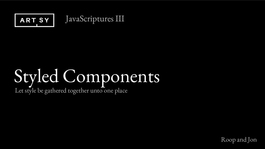
Styled Components Let style be gathered together unto one place
JavaScriptures III Roop and Jon -
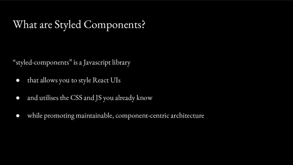
“styled-components” is a Javascript library • that allows you to
style React UIs • and utilises the CSS and JS you already know • while promoting maintainable, component-centric architecture What are Styled Components? -
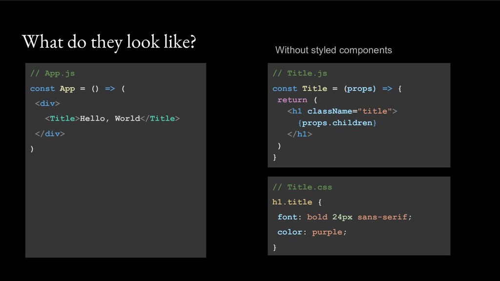
// App.js const App = () => ( <div> <Title>Hello,
World</Title> </div> ) What do they look like? // Title.js const Title = (props) => { return ( <h1 className="title"> {props.children} </h1> ) } // Title.css h1.title { font: bold 24px sans-serif; color: purple; } Without styled components -
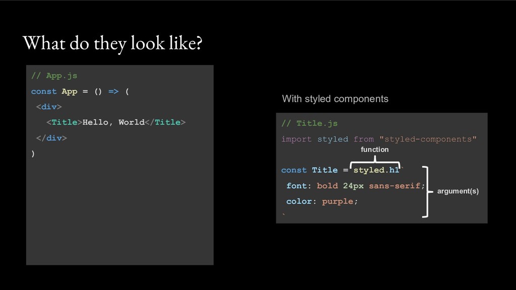
What do they look like? // App.js const App =
() => ( <div> <Title>Hello, World</Title> </div> ) // Title.js import styled from "styled-components" const Title = styled.h1` font: bold 24px sans-serif; color: purple; ` With styled components function argument(s) -
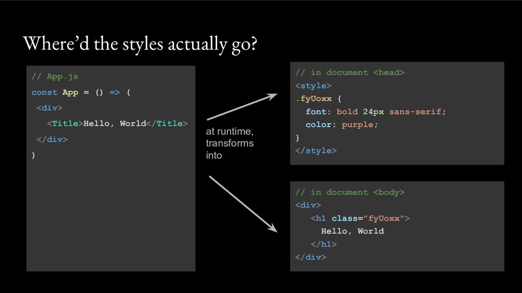
// in document <head> <style> .fyUoxx { font: bold 24px
sans-serif; color: purple; } </style> Where’d the styles actually go? // App.js const App = () => ( <div> <Title>Hello, World</Title> </div> ) at runtime, transforms into // in document <body> <div> <h1 class="fyUoxx"> Hello, World </h1> </div> -
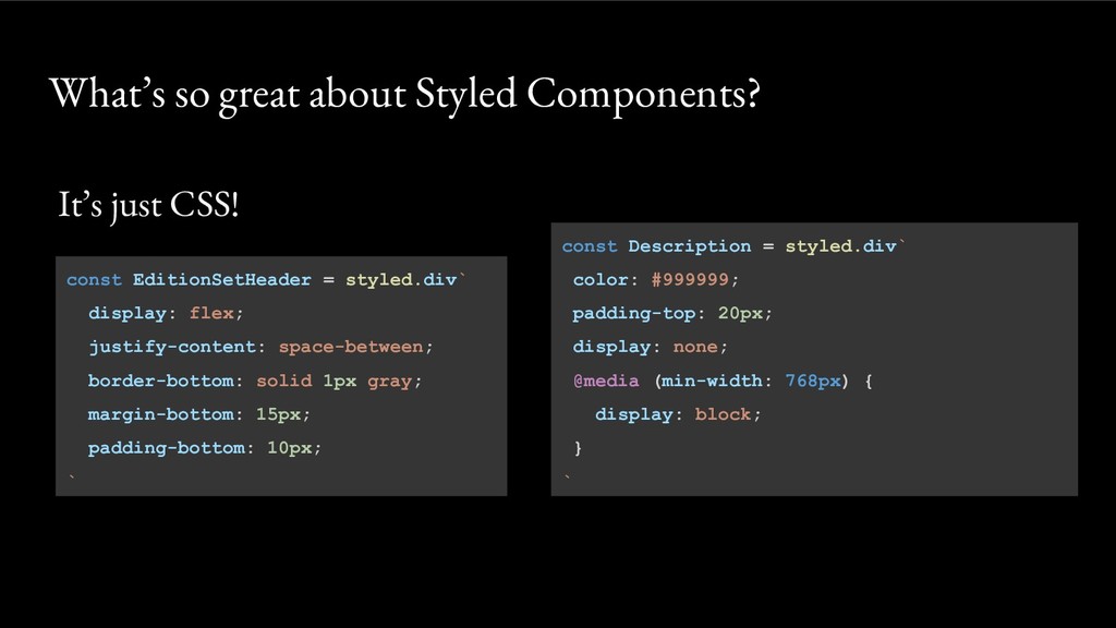
It’s just CSS! What’s so great about Styled Components? const
EditionSetHeader = styled.div` display: flex; justify-content: space-between; border-bottom: solid 1px gray; margin-bottom: 15px; padding-bottom: 10px; ` const Description = styled.div` color: #999999; padding-top: 20px; display: none; @media (min-width: 768px) { display: block; } ` -
But it’s not just CSS • Vendor prefixing, e.g. -webkit-text-orientation:
sideways; • Nested and parent selectors … What’s so great about Styled Components? const ImageLink = styled.a` border: solid 1px gray; &:hover { border-color: purple } img { opacity: 0.5 } ` -
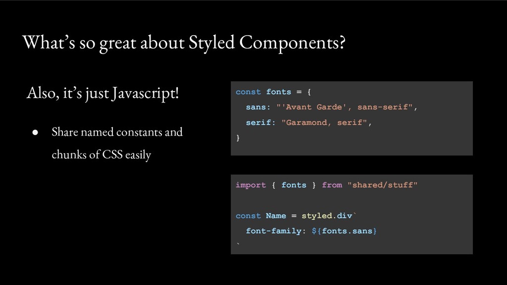
const fonts = { sans: "'Avant Garde', sans-serif", serif: "Garamond,
serif", } Also, it’s just Javascript! • Share named constants and chunks of CSS easily What’s so great about Styled Components? import { fonts } from "shared/stuff" const Name = styled.div` font-family: ${fonts.sans} ` -
const Button = styled.button` background: ${ (props) => (props.primary ?
"black" : "lightGray") }; color: ${ (props) => (props.primary ? "white" : "black") }; ` Also, it’s just Javascript! • Make your component adapt to its props What’s so great about Styled Components? const Tools = () => ( <div> <Button>Cancel</Button> <Button primary>Save</Button> </div> ) -
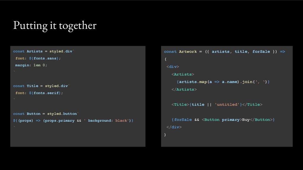
const Artists = styled.div` font: ${fonts.sans}; margin: 1em 0; `
const Title = styled.div` font: ${fonts.serif}; ` const Button = styled.button` ${(props) => (props.primary && ' background: black')} ` const Artwork = ({ artists, title, forSale }) => ( <div> <Artists> {artists.map(a => a.name).join(‘, ‘)} </Artists> <Title>{title || 'untitled'}</Title> {forSale && <Button primary>Buy</Button>} </div> ) Putting it together -
• We will refactor the styles in our JavaScriptures app
• Visit https://github.com/artsy/javascriptures • Go into project #4’s README • Follow along on CodeSandbox.io Let’s code! -
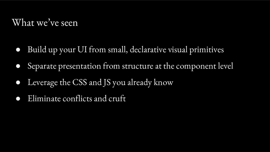
• Build up your UI from small, declarative visual primitives
• Separate presentation from structure at the component level • Leverage the CSS and JS you already know • Eliminate conflicts and cruft What we’ve seen -
• Style third-party libraries • Theming • Server-side rendering /
streaming • React Native What else can Styled Components do? -
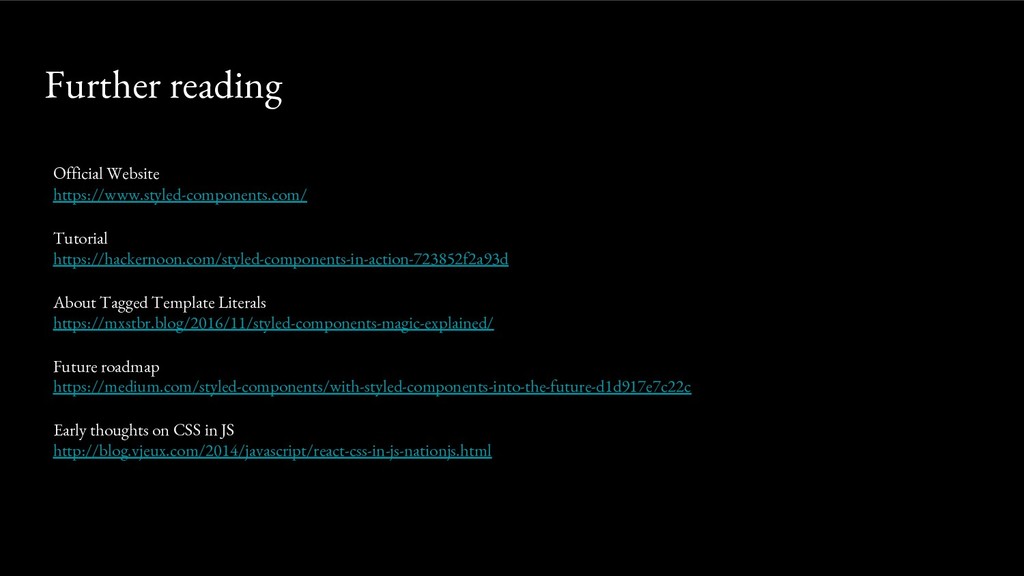
Official Website https://www.styled-components.com/ Tutorial https://hackernoon.com/styled-components-in-action-723852f2a93d About Tagged Template Literals https://mxstbr.blog/2016/11/styled-components-magic-explained/
Future roadmap https://medium.com/styled-components/with-styled-components-into-the-future-d1d917e7c22c Early thoughts on CSS in JS https://blog.vjeux.com/2014/javascript/react-css-in-js-nationjs.html Further reading