You signed in with another tab or window. Reload to refresh your session.You signed out in another tab or window. Reload to refresh your session.You switched accounts on another tab or window. Reload to refresh your session.Dismiss alert
If you are fine to only support i(Pad)OS 14, macOS 11, tvOS 14, watchOS 7 respectively those ^-- are definitely the way to go.
If you want to support i(Pad)OS 13, macOS 10.15, tvOS 13, watchOS 6 keep on reading.
📱 iOS 13+,💻 macOS 10.15+,📺 tvOS 13+,⌚ watchOS 6+
Simply pass the minimum width the grid cells should have and the spacing between them and it will adjust depending on the available width.
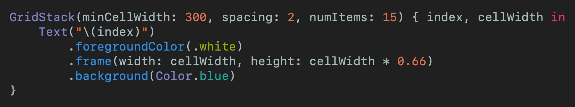
So writing this:
will give you you this:
It also adjusts correctly when the device is rotated:
🗺 Usage Overview
Think of the grid in the way of what is the minimum width you want your cells to be. That way it is easy to adjust to any available space. The only other size you need to provide is the spacing between the cells.
To actually create the grid we need to know the numbers of items. Then the content view builder will be called with each index and the cellWidth that you can then pass to the frame of whatever you want to display inside.
👕 Sizing your views inside the cells
The grid will wrap each item you provide with in a view that gets the cellWidth set as width. No height constraint is put on the cell. That is so that you can size your content as flexible as possible. Here are just a couple of examples what you can do.
Height defined by content
GridStack(...){ index, cellWidth inText("\(index)")
// Don't pass any height to the frame to let it be defined by it's content
.frame(width: cellWidth)}
Square items
GridStack(...){ index, cellWidth inText("\(index)")
// Pass the cellWidth as width and height to the frame to make a square
.frame(width: cellWidth, height: cellWidth)}
Aspect Ratio items
GridStack(...){ index, cellWidth inText("\(index)")
// Pass the cellWidth as width and a portion of it as height to get a certain aspect ratio
.frame(width: cellWidth, height: cellWidth *0.75)}
