You signed in with another tab or window. Reload to refresh your session.You signed out in another tab or window. Reload to refresh your session.You switched accounts on another tab or window. Reload to refresh your session.Dismiss alert
This is a workaround for iOS Safari and other mobile browsers.
The problem
In mobile browsers, the real height of the viewport is dynamic, as browser
"chrome" (panels) slide away on scrolling. The browser developers faced two
choices: either to reflow the page as the pixel value of a vh changes, or
ignore the fact that the browser panel covers part of the screen.
The browser panels are supposed to slide away smoothly, and because the layout
reflow during scrolling will not look smooth, the browser developers went for
the second option.
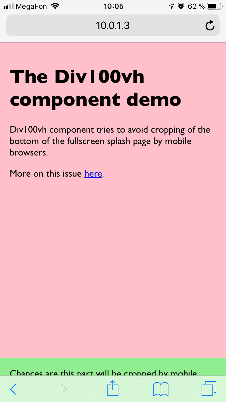
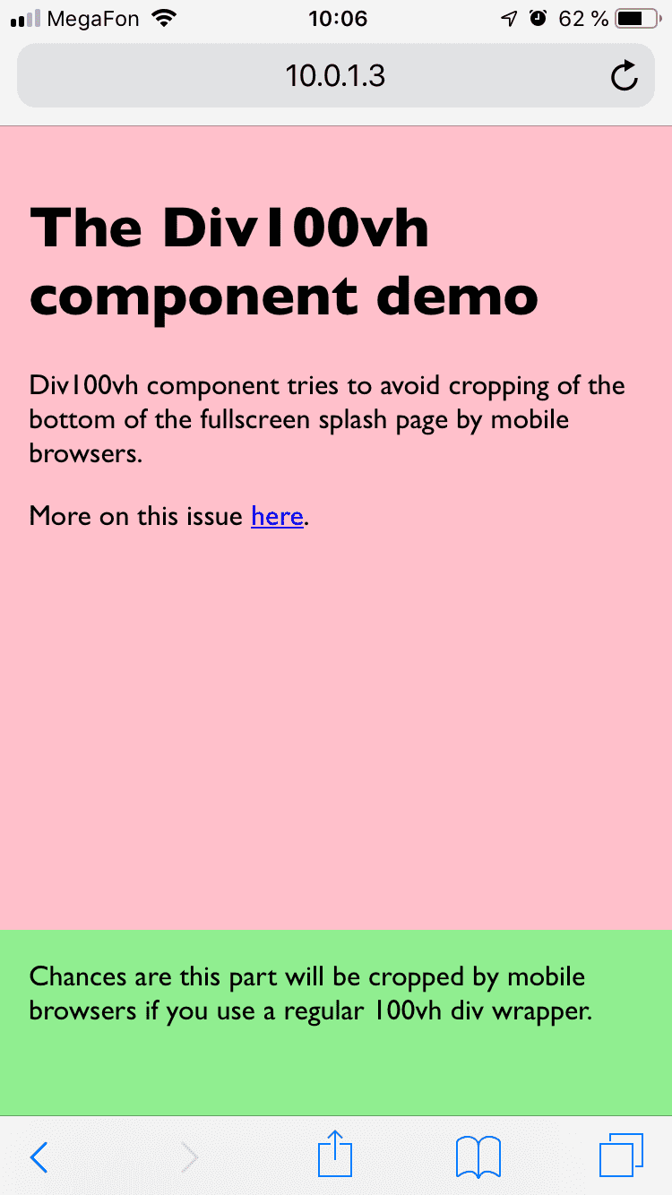
It may work for the most of use cases, but if you're looking for an app-like
full-screen experience, or want to make sure that the call to action button at
the bottom of your splash screen isn't covered, you may need to know the fair
value of a vh.
importDiv100vhfrom'react-div-100vh'constMyFullHeightComponent=()=>(<Div100vh><marquee>Look ma, no crop!</marquee></Div100vh>)
For more advanced use cases (for instance, if you need 50% of the real height),
there is a named export use100vh. This React hook provides an accurate
vertical height in pixels. The return type is a number in a browser and null
in Node environment. You may need to check if it's not null if you're doing
SSR, otherwise, manipulate the value as you wish and concatenate the result with
px:
import{use100vh}from'react-div-100vh'constMyHalfHeightExampleComponent=({ children })=>{constheight=use100vh()consthalfHeight=height ? height/2 : '50vh'return<divstyle={{height: halfHeight}}>{children}</div>}
Under the hood use100vh uses measureHeight function which is exported as
well, so feel free to use it, even without React. Currently it returns
window.innerHeight in a browser and null in Node.
Testing
This component is tested with .
About
A workaround for the '100vh' issue in mobile browsers
 .
.