You signed in with another tab or window. Reload to refresh your session.You signed out in another tab or window. Reload to refresh your session.You switched accounts on another tab or window. Reload to refresh your session.Dismiss alert
This python package adds a custom Pandas accessor to generate polar wind rose plots from a Pandas dataframe.
I don't mean to compete with the wonderful windrose package already available, but that package has a little too much complexity for what I wanted. This package is meant to provide a minimal, simple interface to making wind rose plots. This is done by using Pandas methods pd.cut and df.groupby and using Matplotlib regular polar axes.
Install
Install with pip. The requirements are only pandas, numpy, and matplotlib.
pip install pandas-rose
Usage
Pandas-rose is simple.
importpandasaspdimportrose# df is a pandas dataframe with columns# "wind_speed" and "wind_direction"df=pd.DataFrame({
"wind_speed":[1,2,3,4],
"wind_direction":[20, 10, 190,300]
})
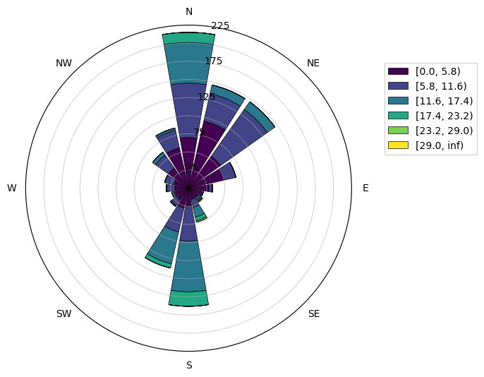
# Display a polar wind plot of the datadf.rose.plot()
You can specify the pandas column to use for wind direction and wind speed. You may also change the number of sectors to bin the wind direction .
df.rose.plot(
var_column="A", # name of variable columndir_column="B", # name of direction columnsectors=8, # number of sectors (direction bins)bins=range(0,30,5) # specify variable binsnormed=False# If True, values as percentage instead of countscolors='Blues'# Name of matplotlib colormap or list of colors
)
There are two other accessors that give some information.
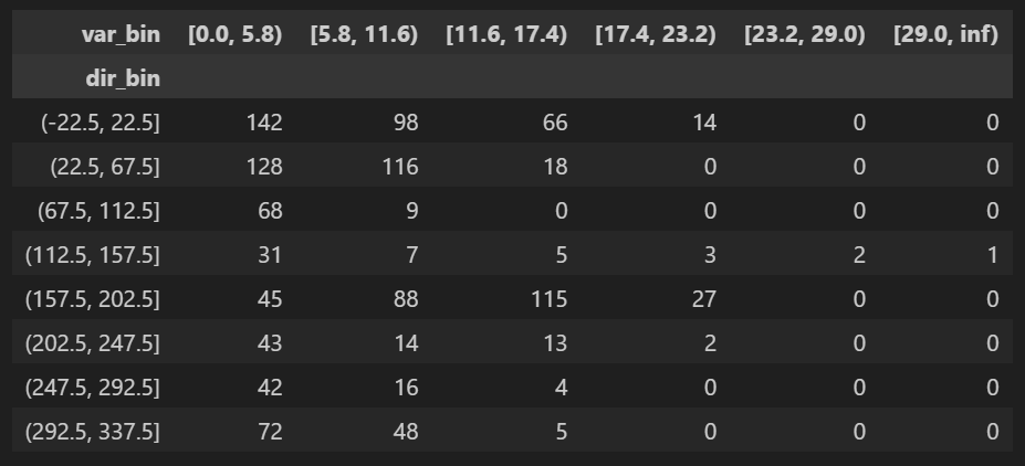
# Display a dataframe of the binned valuesdf.rose.table(sectors=8)
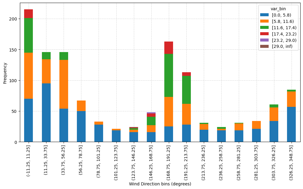
# Display the binned data as bar graph on regular axes.df.rose.bar()
About
🐼🌹 A simple Pandas accessor for making windrose plots.