| CARVIEW |
Navigation Menu
-
Notifications
You must be signed in to change notification settings - Fork 78
feat: update fundamental-styles to 0.7.0-rc.13 #890
New issue
Have a question about this project? Sign up for a free GitHub account to open an issue and contact its maintainers and the community.
By clicking “Sign up for GitHub”, you agree to our terms of service and privacy statement. We’ll occasionally send you account related emails.
Already on GitHub? Sign in to your account
Conversation
| @@ -3,6 +3,6 @@ | |||
| name: "Fundamental-React Size", | |||
| webpack: true, | |||
| path: "lib/index.js", | |||
| limit: "180 KB" | |||
| limit: "200 KB" | |||
There was a problem hiding this comment.
Choose a reason for hiding this comment
The reason will be displayed to describe this comment to others. Learn more.
it's only 186 but I'm giving myself some headroom
|
Deploy preview for fundamental-react ready! Built with commit bbd2af7 |
|
Deploy preview for fundamental-react ready! Built with commit 24a50ed |
| import { ComponentPage, Example } from '../_playground'; | ||
| import React, { Component } from 'react'; | ||
|
|
||
| export class DialogComponent extends Component { |
There was a problem hiding this comment.
Choose a reason for hiding this comment
The reason will be displayed to describe this comment to others. Learn more.
Could this be a functional component?
There was a problem hiding this comment.
Choose a reason for hiding this comment
The reason will be displayed to describe this comment to others. Learn more.
oh this is copied from the previous ModalComponent - it just looks new from the name change. I don't really want to rework all the docs 😆
| import classnames from 'classnames'; | ||
| import CustomPropTypes from '../utils/CustomPropTypes/CustomPropTypes'; | ||
| import FocusLock from 'react-focus-lock'; | ||
| import PropTypes from 'prop-types'; | ||
| import ReactDOM from 'react-dom'; | ||
| import React, { Component } from 'react'; | ||
| class Modal extends Component { | ||
| // select body element to add Modal component too | ||
| class Dialog extends Component { |
There was a problem hiding this comment.
Choose a reason for hiding this comment
The reason will be displayed to describe this comment to others. Learn more.
Doesn't need to happen here, but this could be a functional component pretty easy too.
| <MessageStrip {...createProps()}>Default MessageStrip</MessageStrip> | ||
| )) | ||
| .add('Dismissable', () => ( | ||
| <MessageStrip dismissable>MessageStrip</MessageStrip> |
There was a problem hiding this comment.
Choose a reason for hiding this comment
The reason will be displayed to describe this comment to others. Learn more.
Looks like it's spelled dismissible everywhere else. But dismissable does seem like the correct spelling...
There was a problem hiding this comment.
Choose a reason for hiding this comment
The reason will be displayed to describe this comment to others. Learn more.
oh good catch - I can't spell 🤣
There was a problem hiding this comment.
Choose a reason for hiding this comment
The reason will be displayed to describe this comment to others. Learn more.
dismissible is the correct spelling - I looked through the history and I've had to fix this a couple times because we(me) can't get it right. Maybe we change the prop name in the future 😆
| // expect(wrapper.state(['isActive'])).toBeTruthy(); | ||
|
|
||
| // wrapper.find('button.fd-message-strip__close').simulate('click'); | ||
| // expect(wrapper.state(['isActive'])).toBeFalsy(); |
There was a problem hiding this comment.
Choose a reason for hiding this comment
The reason will be displayed to describe this comment to others. Learn more.
?? Can we take these out now?
There was a problem hiding this comment.
Choose a reason for hiding this comment
The reason will be displayed to describe this comment to others. Learn more.
🔥
|
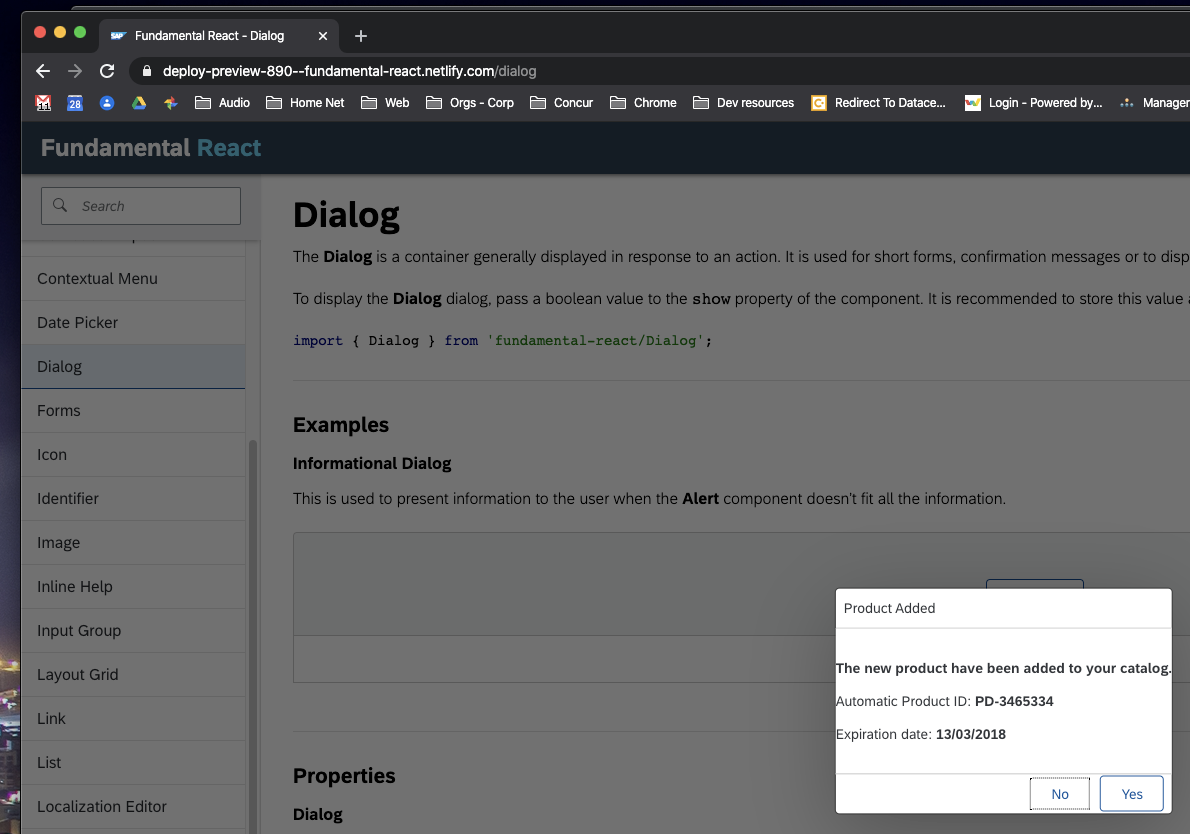
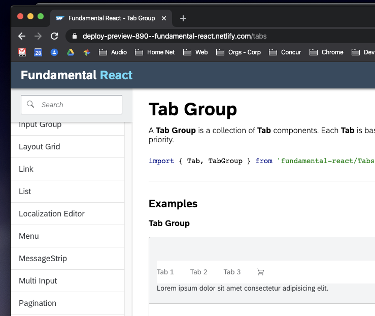
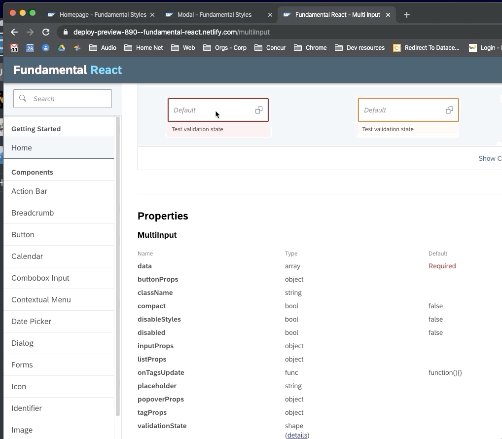
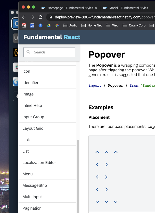
a Herculean effort 💪 nice work! Just a few items: modal looks like it is missing some padding: TabGroup looks... not right. validation state on multiinput cause field to shift around: ^ same issues in selects popover placement in docs seems smushed: |
|
There was a problem hiding this comment.
Choose a reason for hiding this comment
The reason will be displayed to describe this comment to others. Learn more.
LGTM!
The storyshots-test-js-storyshots-components-message-strip-dismissable-1-snap.png file could be deleted though
Description
Modal
DialogclosePropsactionsnow requiredButton
ButtonGroup
fd-segmented-buttondisabledpropspanaround tab text<a>is now<span><div>around Identifier componentSelectstandardpropPopoverbody now built withListcomponentstateprop replaced withvalidationState- takes objectlocalizedTextprop removedmenuprop renamedlist- now takesListcomponentstateprop nowvalidationState- takes an object<div>from<span>stateprop nowvalidationState- takes an objectFormMessagewhen passedvalidationStatestateprop nowvalidationState- takes an objectFormMessagewhen passedvalidationStatefeat: update fundamental-styles to 0.4.1 #885compactpropertylabelPropsno longer needed, additional props will be spread to the<label>elementFormItemchildrenpropvalueprop changedstatepropertyvalidationStatepropertyisHorizontalpropisInlineprop (was internal only)<div>instead of FragmentisCheckboxpropisRadiopropisTogglepropSee #888, #885 for a divided pr
Known Issues:
Toggle/Switch
- internalLabel prop not working in prop descriptions
- not an accessible pattern
- this is going to change ASAP as it is currently being redesigned
- icons are misaligned inside switch
Token:
- selected state - did not implement - what is this even used for?
Shellbar
-
fd-shellbar__buttonneeds more specificityListText
-
—no-wrapclass only works in selects - this should probably be part of select, not listSelect
- compact not working because
—fd-forms-height-compactis not part of our postcss pipeline anymore - just SAP variables: SAP/fundamental-styles#711MultiInput
-
fd-tokenizer__inputdoes not take priority overfd-input- getting the fd-input outline box (needs more specificity)Validation states
- validation state styling - FS has the validation message as a list item instead of a div:SAP/fundamental-styles#712
- “onClickOutside” is not being handled correctly